Wednesday, November 16, 2011

LIM41 - Leaves....and more


The Less is More challenge this week is a one layer card with the theme of leaves.  Of course, I just made a card last week using leaves....just saying, Chrissie and Mandi! LOL!  Oh well...last week's card wasn't one layer, so I had to do a little thinking about this one.

I'd also like to say Thank You to Chrissie and Mandi for selecting my card to be showCASed from week 39.  I was certainly surprised to see this ornament snowflake card in the showCASe!  I'd also like to say that I'm sorry that I haven't made it around to very many blogs in the last few weeks.  I do look at most of the cards, but life has been so hectic lately that I just haven't had time to leave comments! So Sorry!! I'll try to do better this week...although with this late start I'm getting, I'm not sure how that will work out!

Moving along...I've actually made two cards this week.  I'm still working on my Christmas cards, so I wanted to make one of them a Christmas card.


For this first card, when I was looking through my punches, I realized that I have three similar punches in three different sizes...so I decided to create something with them.  I punched the leaves (using the 3 different sizes) down the right front of my card base.  To add color without layers, I masked off part of the inside of the card (just enough to fill the leaves) and sponged on distress ink in Worn Lipstick, Spiced Marmalade, Pine Needles, and Mustard Seed.  With just the sponged ink the leaves looked a little blah, so I decided to add a touch of color in splotches. To do this, I crumpled up a piece of paper and tapped it on the darker ink pads and then used the crumpled paper to "stamp" some random lines/splotches on the sponged background for each leaf. On the bottom leaf I tapped with Worn Lipstick and Pine Needles and for the two smaller leaves I tapped it with Spiced Marmalade.  I think it gave a very nice effect. The sentiment is from Flourishes. Now...about that sponged strip on the left....I added that because I managed to get my inky fingers on the card and leave a smudge...so what to do?  Cover it up with a little sponging to match the inside!  Saved!


Here's a photo of the card from an angle so that you can see how the inking was done.


For my second card, I used a holly leaf stamp that I've had forever.  I'm not sure, but it might be an Inkadinkado stamp.  I stamped in Memento black.  The stamp has three leaves and some berries on it.  To make it conform to the shape I wanted, I drew a circle with a pencil so that I could line up my stamping.  I also cut a mask from a post it note.  The image was actually stamped 6 times to get this shape.  I colored with Copic markers, then using my Sakura clear star pen, I highlighted all the leaves and the berries.  After that dried, I went back and coated all the berries with glossy accents. In real life, this card is very sparkly and pretty. The sentiment is from Flourishes.


I wanted to share another layout while I'm posting.  This is the first layout I've completed since my hubby got home from the hospital...and it seemed to take forever to finish.  I hadn't scrapped in over a month, and it seemed like I'd forgotten what to do! LOL!  


This is my precious little granddaughter, Maggie.  Photography by Amy P Photography.  I just love these cute pictures...and Maggie is just adorable!!  For the layout, I used Echo Park Little Girl collection. The photos are backed with a dark pink card stock. All the little circles were punched from the design on on of the papers. All small circles are pop-dotted on the page. I added a touch of glitter to the center of each circle. The little birds on the bottom were also cut from one of the papers in this collection. I punched a dark pink border with a MS edge punch that embosses along the scallop. The title work was all cut with my new Cameo. The Cameo is new from Silhouette - it will cut up to 12x12 inches and all the files from my Silhouette work with it. So far, I'm loving it! The ballerina was also cut with the Cameo, and I added a sparkly top and a tulle skirt with a bow to the ballerina. I also added some sparkly toe shoes, but I don't think they show up very well. I used a dot of stickles on each of the letters and also on the tulle skirt. The title work and the ballerina are all on pop dots. IRL this is a very glittery, girly layout. I used a Sakura clear star pen to outline each of the title letters. The pen give just a hint of glitter to the edges. The journaling is tucked behind the top of the pink mat and reads: 


Maggie, you are so adorable in your little pink tutu. You have the brightest eyes and such a solemn expression on your face. Your crocheted hat is just precious with your tutu, but it covers up all your blond curls. You are so precious and I wish that I could see you more often than I do. These photos of you make me want to pick you up and give you lots of hugs and kisses. Photos – April 2011 

Here's a photo of my new toy cutting machine.... the Silhouette Cameo. THIS is a cool cutting machine!
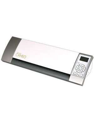
Silhouette Cameo 12" Digital Craft Cutting Tool

That's all for me today...bet you thought I'd never stop! LOL!  Thanks so much for stopping by! Your comments are greatly appreciated!  Until next time...

♥ Hugs! ♥


Pin It!

Tuesday, November 15, 2011

Challenge 48 - Circle, Square, and Triangle

This week, the challenge at I am the Diva blog is hosted by Sue Clark who is a CZT (certified Zentangle teacher).  Sue has challenged us to create a tile using three basic shapes (circle, square, and triangle) combining them to create a string. I've done two tiles using these "strings".

Sue also encouraged us to try some tangles we haven't tried before.  On this first one, I did just that.  The center one was supposed to be wisket, but I just can't seem to get it right.  Then I also tried Phuds, which looked okay, but my wisket looked wonky so I decided to try another tile.


 This first tile is on a 5x5 tile.  I decided to make the second one on a smaller tile which is 4x4 inches.


For this tile, I also used the square, circle, and triangle string, and I also used Phuds.  The "boards" were something I just decided to add in (don't think I've seen a tangle like this before - it's probably been done by somebody, I just haven't seen it).  I like the cleaner look of this tile.  

That's my take on the challenge....what do you think?

Thanks so much for stopping by!  Comments are always appreciated!! Until next time....


♥ Hugs! ♥


Pin It!

Thursday, November 10, 2011

Less is More 40 - Red and Orange

This week the Less is More challenge was a color challenge.  Here's what Mandi and Chrissie have to say about the challenge. I'm a little late getting my cards posted...but I was late getting them finished too.  I just don't have enough hours in the day to get everything I need to do done!

In the UK, it is traditionally on 'firework night' that the 'Gunpowder plot' of 1605 is commemorated. It was then that Guy Fawkes was arrested for laying explosives under the House of Lords.

Our first week of the month is another Colour challenge and redolent of bonfire flames we have chosen
Red and Orange

I made two different cards for this challenge.  I actually like red and orange together, but I seemed to have a bit of trouble combining the two this week.  


I'm not sure what I'll use this card for...I guess it could be a sympathy card, thinking of you, or just a note card.  Leaves are Flourishes stamps.  I stamped the image on white card stock, then colored with orange Copics and cut out each leaf.  Leaves are popped dotted on a white textured card stock that I also pop dotted on the red background. The sentiment is also from Flourishes. BTW, stamping on textured card stock is much more difficult than I thought it would be!

Since I'm in need of quite a few more Christmas cards, I wanted to try to make a Christmas themed one using these colors. Here's what I came up with...


The big flourish is from Papertrey Ink.  I used a textured white card base.  I stamped the large flourish in SU Pumpkin Pie and then highlighted it with some crystal stickles.  The word Peace was cut from red textured card stock using a PTI die and then pop dotted over the orange flourish. Here's a close up so you can see the dimension on the card. I couldn't get the glitter to show up on the flourish...but it's really pretty in real life!


I'm not too sure how I like this card...maybe it'll grow on me after I stare at it for a while! LOL!  

Thanks so much for stopping by! I truly appreciate each and every comment!  Until next time...

♥ Hugs! ♥


Pin It!

Tuesday, November 8, 2011

Challenge #47 - In Remembrance

The challenge this week from Laura at I am the Diva is based on the Poem "In Flanders Field" written by Canadian Lieutenant-Colonel John McCrae.


In Flanders fields the poppies blow
Between the crosses, row on row,
That mark our place; and in the sky
The larks, still bravely singing, fly
Scarce heard amid the guns below.

We are the Dead. Short days ago
We lived, felt dawn, saw sunset glow,
Loved and were loved, and now we lie
In Flanders fields.

Take up our quarrel with the foe:
To you from failing hands we throw
The torch; be yours to hold it high.
If ye break faith with us who die
We shall not sleep, though poppies grow
In Flanders fields.


When you create your tile or ZIA, the challenge is to remember - what this means to you.  Remember your fallen loved ones, your long lost friend from childhood, remember when your 3 year old was once a tiny bundle in your arms, remember the feel of your aging grandmother's hand... remember laughter and tears, friends and family, fallen heroes or quiet bravery. 


I've drawn my tile using black and white shaded with pencil and then I colored it just to see if I liked it.  Here's the two different tiles:


I love the background on this ZIA.  It seems to bubble off the page behind the poppy (or at least my interpretation of a poppy).  I did a little shading with some dots and then again with a #2 pencil.  This one is on a 5 x 5 inch tile.


After I scanned the original, I decided that I'd add a little color to the poppy.  I remember veterans selling poppies as lapel pins when I was a little girl, but I don't remember seeing them for a while.  To color my poppy, I used watercolor pencils to color and then touched it with a water pen to smooth out the color.  I keep playing with color, but I just can't make up my mind which I like the best...plain black and white or with a touch of color.

What do you think? Should I just stick with black and white....or do you like the color?

Thanks so much for stopping by for a visit.  I'd love for you to come back again.  As always, your comments are much appreciated.  Until next time....

♥ Hugs! ♥


Pin It!

Monday, November 7, 2011

OLW71 - Tag it

This week's OLW challenge is hosted by Jennifer at Styles Ink.  Jennifer has challenged us to create a tag...or 2 or 3.  I rarely use (or make) tags, but I wanted to play along, so I made three Christmas tags that I can use on gifts this year.

Here they are...


Snowflakes are from a very old stamp set and I couldn't tell you who makes them.  The small snowflakes are all on one stamp and the large snowflake is a single stamp. I stamped in Memento black then highlighted around the snowflakes with a Copics BG0000 marker.  Stamped the sentiment (PTI) and then added a touch of glitter for sparkle.


This second tag was made by stamping the ornament in Memento black, cutting a mask and then stamping the background with a music score stamp.

Same general idea for this tag...stamped the ornament, masked it, then stamped the music, the to/from and the sentiment.  I drew a line on this one to ground the ornament, but I don't think I really needed it.

These were all made using a ready made white tag.  I couldn't get good photos for the life of me...this was the best I could do. They're all sparkly and glittery in real life.

Thanks a bunch for stopping by! Hope to see you again soon!  Until next time...

♥ Hugs! ♥


Pin It!

Wednesday, November 2, 2011

Challenge 46 - Halloween

The weekly challenge from Laura at I am the Diva is to create a tile with a Halloween theme.  I often have difficulty with Halloween themed challenges, because Halloween is just not one of my favorite holidays, so I generally stick to more of a fall theme.  I decided to tangle on some pumpkins for my entry into the challenge.

Originally, I wanted to draw my pumpkin on a black tile and tangle with a white pen.  This tile is about 4x4 inches.

After I finished it, I decided I like the black on white better.  Which do you think looks the best?


The pumpkins for both tangles were sketched by hand...maybe if I'd used a pattern they'd be a little more even...but hey! Pumpkins are rarely even!

Since I'm already posting some Zentangle Inspired art...I thought I'd share a few more of my recent drawings.


I really like all of these.  Some of them look really intricate, but they're really not.  I spent about 2.5 to 3 hours on each of them.  They're all fairly large...about 6 x 6 inches.

I'm thinking I might get a few of my pieces framed. Not sure what to do with them then, but I do believe they'd look pretty good in a frame.

Thanks a bunch for stopping by!  I appreciate all your fabulous comments.  Until next time....

♥ Hugs! ♥


Pin It!

Sunday, October 30, 2011

LIM39 - Seeing Stars!

I'm a little late getting my card finished for the Less is More Challenge this week.  Mostly because I've been really busy...but also because I couldn't decide if I liked my cards.  I ended up making 3 different cards and decided to post them all.

This first card was made on a white card base.  The background paper is actually a sparkly silver paper.


I stamped the image (which is from PTI jar fillers) on white card stock, then colored around the stars and snowflakes with a Copic marker (BG0000).  I then cut the image out using a Spellbinder ornament die.  I coated each of the stars with silver glitter, and added white glitter dust to the snowflakes.  I also added fine silver glitter to the edges of the ornament.  I tied a three loop bow with some silver cord and suspended the ornament from the top of the silver background.  The silver background and the ornament are pop dotted for added dimension.

This second card was made by stamping the image (a very old SU) in Memento black.  I colored the image with Copics, then added a yellow highlighted background halo around the image.  For the white bands on his Santa suit and on his beard, I used a "snow" pen to color, then when it is heat set, it bubbles up for added dimension.  The stars he's tossing in the air are all covered with fine silver glitter, as are the stars in the pocket of the Santa suit.  I added a touch of glitter to the edges with a Sakura  clear star pen.  The sentiment was stamped on white card stock, and then cut with a Spellbinder banner die and mounted on the red textured and foil card stock like I used for the background.  The Santa image was cut out with a Spellbinder die and pop dotted on the red textured foil card stock.


This third card was made by embossing the white panel with a snowflake embossing folder and highlighting the snowflakes with a little glitter dust.  The sentiment is from Papertrey Ink.  The star Santa is a very old SU stamp (I believe it's from the same set as the first Santa).  I colored him with Copics, then added a yellow halo around the star.  There is a touch of Sakura clear star pen around the edges of the white star.  I backed the star with some of the red foil card stock.  The white embossed background was layered on some gold foil card stock. I'd forgotten I had these Santa stamps...but they were perfect for a "star-studded" card! LOL!

Thanks so much for stopping by! I truly appreciate all of your comments!  Until next time...

♥ Hugs! ♥


Pin It!

OLW68 - Red and White

This week's challenge at Simplicity was to create a one layer card using only red and white (or cream and white).   I decided to use a red card base for my first card.

 I stamped with versamark and white ink and then added fine detail white embossing powder.  I heat set the embossing powder.  The sentiment on the actual stamp is Season's Greetings, but I masked that off before stamping and then added the Merry Christmas sentiment and also embossed it with white.  The snowflakes are just stickles I added.

For my second card, I really kept it simple.  I stamped a music stamp by Flourishes and then added a sentiment (also Flourishes) at the bottom....super simple.


I think at first I wasn't too happy with this card...but it's growing on me now.

Thanks so much for stopping by! Your comments are much appreciated! Until next time....

♥ Hugs! ♥


Pin It!

Wednesday, October 26, 2011

LIM38 - Polka Dots and a New Layout

The challenge this week at Less is More is to create a card using polka dots.  I thought that would be super easy, but I was wrong.  I finally ended up with two cards to share with you.

This first card was made with a white card base.  I added a strip of polka dotted paper across the bottom and scored a line above it.  The sentiment is from PTI.  The candles are the new Flourishes Christmas stamps.  I stamped them with Memento ink and colored them with Copics.  Then I cut them out and pop dotted them on the polka dotted paper.  I added a little glitter in places and a bit of glaze to the ornaments, but it's hard to see here.  The glow around the flames of the candles was something I just added, that's not part of the stamp.


This is actually the first card I made and I wasn't really happy with it, but decided to post it anyway.  The ornament is a PTI die that I cut from white card stock then colored with a silver leafing pen.  I added red dots with some liquid pearls. The sentiment is from PTI, stamped in black and punched out with the slot punch then backed with red card stock.  I pop dotted the sentiment on the ornament.  The ribbon I used to string through the top of the ornament is some sparkly red braid I found in my stash.  The bow was tied with a neat little bow maker my hubby made for me.  I also have a dotted background by using an embossing folder, then backed it with red and popped it on the white card base.  The ornament is also pop dotted on the dotted background.

Thought I'd also share a new layout that I finished last weekend.  It's another photo of my maternal grandparents taken around 1952.


I used Basic Grey Curio papers for this layout. The flowers were all cut from one of the papers and pop dotted on the background.  I used a lot of inking and distressing on this layout.  The pretty lacy border across the bottom was cut with a Spellbinder die. The black corner scrolls are Bo Bunny rub ons.  The title work was cut with the Silhouette and colored with Copics to match the papers.  I added a bit of bling across the lacy border and 3 buttons at the top.  In the areas that are torn, I inked them heavily and added another piece of the Curio papers behind the tears.  I also added a tiny bronze tag that says "simple".  The photo is mounted on some photo corners that I punched with a punch I've had for years.The green leaves were cut with a Spellbinder die.  I tucked the journaling behind the striped mat and it reads:

These are my Mama’s parents, William and Ola Pace. I don’t remember too much about them because they were both gone before I was five years old. I have a cousin who has researched the history of the Pace family and my grandfather (William Pace) is a descendant of Richard Pace who received a land patent in 1620 and established Pace’s Paines Plantation which was across the James River from the settlement of Jamestown. It appears that my family has deep roots in America. 

I wanted to get this posted earlier in the week, but things have been rather hectic around here lately.  Hubby is home and doing much better and for that I am thankful.  It was a rough week or two.  Thanks for all your wonderful comments, they mean a lot to me.  Until next time.....

♥ Hugs! ♥


Pin It!

Challenge 45 - Punzel

This week, Laura at I am the Diva blog spot has challenged us to use the new tangle "Punzel".  This is a tangle by Rick and Maria at Zentangle®.  (The Zentangle® art form and method was created by Rick Roberts and Maria Thomas and is copyrighted. Zentangle® is a registered trademark of Zentangle, Inc. Learn more at zentangle.com) You can find directions for Punzel here.

This was a tough one for me.  I've been practicing it over and over and I still don't have it quite right.  I keep waiting for the steps to "click" with me! LOL!

Here's my take this week...


The first time I tried this, I realized that I had done the tangle Chainging, so I had to redo it. This is not perfect by any means, but I am reasonably happy with it.

Thanks so much for stopping by! Your comments are truly appreciated!  Until next time...

♥ Hugs! ♥


Pin It!

LinkWithin

Related Posts with Thumbnails