Tuesday, January 31, 2012

We Have a Winner!

At 5:30 pm today, I made a list of all the comments on the New Year's post so that I could select a winner for the drawing.  I had a total of 34 comments. I listed each name in the order that the comments were made and assigned each person a number.

Using Random.org, I generated the winning number (person).  And the winner is:


Number 16 - Judy1223

Judy, if you'll send me your information, I'll get the gift card out to you.  You can contact me by clicking on the envelope at the top of my blog that says "contact me". 

A big thank you for everyone who participated! I truly appreciate all the visits and the nice comments you all leave for me on my blog...it really makes blogging fun!  Until next time....

Hugs!
Photobucket


Pin It!

Challenge #56 - Non-Dominant

Our challenge this week from Laura at I am the Diva was a big surprise for me.  This week we've been challenged to do an ENTIRE tile or ZIA using only our non-dominant hand.  Since I'm right handed, I did my string, tangles, and shading with my left hand.  It was very difficult for me to "let go" and let my left hand take over control of my tangling while my right hand just sat idly by doing nothing!  The result is a bit wobbly and shaky, but here it is: 


I thought I would add....about 2 years ago I had surgery on my right thumb which put my right hand out of commission for about 3 or 4 months.  During that time, I had to use my left hand for some things, so even though my lines are a bit wobbly and shaky on this tile, I think if I had not had to use my left hand so much two years ago, it would definitely been messier looking.

Thanks so much for popping in! Love your awesome comments!  Have a wonderful day.  I'll be drawing for the winner of the gift card later today, so stay tuned to find out if you're a winner!!  You still have a few hours to post a comment on this post if you want your name entered in the drawing.  Good Luck!

Until next time...

Hugs!
Photobucket


Pin It!

Sunday, January 29, 2012

LIM52 - It's a Bit Sketchy

With just another day or two to go, you still have time to leave a comment for the drawing on January 31st.  Just pop over to this post and leave a comment.  I'll be giving one lucky person a nice gift card in celebration of my 4th anniversary as a blogger.  Come on, now...you know you'd like to have a gift card to buy a few more craft goodies!


This week marks one year of the Less is More challenges.  Chrissie and Mandi have challenged us (and I do mean challenged me!)  for a full year to create cards that are clean and simple.  I had some favorite weeks (loved the silhouettes, something with legs, red and orange, and leaves) and I've had some weeks that I almost gave up (snow, acrylics, and one word)...but I hung in there and always gave it my best.  I think I only missed one week of the challenge.  I can honestly say that I believe that playing along with this challenge has made me try things I might never have tried and I feel like my cards are much more CAS than they were a year ago.  In fact, I'm so used to the CAS style, I have a great deal of difficulty making anything else now! LOL!  Thanks so much, Chrissie and Mandi, for the challenges!

Okay...on to the challenge.  Here's our sketch this week.  We were given specific rules for this week and they are as follows:
We would like the card to be
  • rectangular
  • in landscape orientation
  • with the band remaining in a vertical position 
As it's a very simple sketch,  we would like it to remain as is without any rotation of either the card or the vertical band.


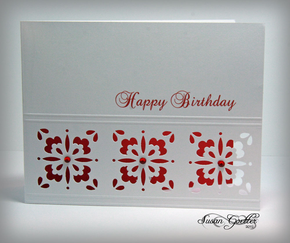
I've made three cards this week. The first one looked good in my head, but didn't transfer to paper very well.


This card is a 4 x 8 inch card.  I used PTI stamps for the vases and flowers.  The background piece was made with TH glimmer mists - two shades of blue and a touch of pearl.  The shelf under the vases was an afterthought...and it looked much better before I added the doodling with the white pen.  I also doodled on the vases after coloring them with Copics.  The "shelf" was made by punching an edge and trimming it down.  Sentiment is also PTI.


This card is a 5.50 x 4.25 inch card.  I cut a red strip, punched out part of a circle, then backed the red with the black card stock.  The hearts were punched with two different EK Success punches.  I punched out several of each of the hearts and then glued them together to make 3 thicker hearts.  Added a bit of twine and hung the hearts with a bow.  The sentiment was generated on the computer...so...no stamping on this one.  I also added a small piece of bling to each heart.


I like how this card turned out.  Images are from Flourishes.  I stamped the stems on the green card stock, then trimmed it down to the width I wanted, leaving the stems hanging off the edge.  I stamped the blooms on a piece of white card stock, then colored them with Copics.  I cut out each bloom and added them to the card....some are pop-dotted and some are flat to the card.  The sentiment is an old stamp...not sure who makes it. I backed the green strip with a pink strip to make the flowers "pop".

I thought I'd share a layout I finished last weekend too.


These photos of my darling little granddaughter, Maggie, were taken in April 2011. I used Echo Park Summer Days collection for this layout. I used my Cameo for a lot of the cutting for this layout. The swimsuits, the sun, the title work, and the "little miss sunshine" image. The clothes line is a QK die. Swimsuits are pop-dotted. I cut the sun to fit in the corner of the layout, popped it up with pop dots and coated it with yellow stickles. The little banner tags down the side of the photos were made from scraps of paper, then attached with multi-colored brads. LOTS of doodled stitching on this layout. I generated the photo collage in Picnik (which sadly is closing down on April 19). I guess I'll have to find another free program to create my photo collages! The little miss sunshine girl is a cutting file in the Silhouette library, but I used the print and cut feature of the Cameo...cool stuff! Journaling is tucked behind the photo mat. It's difficult to tell here, but I cut some 1/4 inch strips to put at the top of the green tab. I stacked about 3 strips on the tab to keep the journaling from slipping behind the photos...and as it worked out, the pink strips I added makes it "look" like the green journaling tag is behind the big pink background...pretty cool, huh?! (The black border is not on the layout, it was added in photoshop to keep the edges from fading.)  Journaling reads: 


Maggie, you're our little ray of sunshine! You brighten up a room just by walking in. You look so precious in your little bathing suit and wearing your sister's sunglasses. You're all decked out and ready to head out to the pool. Photos April 14, 2011 

Whew! That's all for today.  I'll be back in a couple of days to announce the winner of the drawing for the gift card.  Don't forget to pop over to this post and leave me a comment, if you haven't already done so! Everybody loves free stuff...Right?!
Thanks so much for stopping in! I always appreciate your sweet comments!! Until next time...

Hugs!

Photobucket


Pin It!

Thursday, January 26, 2012

OLW76 - Grey and White and a touch of Color

Don't Forget.....you still have time to leave a comment for the drawing on the 31st.....Take a moment to leave me a comment on this post.  I'm going to be giving away a nice gift card to one lucky person  in celebration of my 4 year anniversary as a blogger.   Couldn't YOU use a gift card for craft goodies?? 

I think we're getting back on track with out One Layer Wednesday challenges.  This week, Susan has challenged us to create a one layer card using only grey and white with a "pop" of color.  Here's my take on the challenge this week.


Okay....so I have absolutely NO stamping on this first card....yep, that's right!  This card is complete computer generated with my Silhouette software.  The lacy images are actually cutting files that I have filled with grey.  I did the same thing with the sentiment.  I made my paper size the same size as an unfolded card base would be (4.25" x 11") and then arranged my elements to fit the right hand half of the paper.  Printed it out on my ink jet printer. I was actually just playing around with this to see if I could do it, and lo and behold, it makes a right "purty" card!  I added a couple of teal bling pieces for my pop of color.


The second card is virtually the same thing, I just used a different cutting file to print onto my card stock and added a few pieces of red bling.


For my last card, I decided to play fair and use a stamp with some grey ink.  I used the SU big medallion stamp...inked it up with Memento's London Fog ink.  To get a good clear image, I inked the image and leaving it face up on the table, I placed the card down on the stamp and rubbed it to transfer the image.  I did the same think in the upper right corner of the card.  The sentiment is a SU sentiment that I've had forever!

When I first saw the challenge, I really thought these would be blah...yuck cards, but I really like the end results!

Thanks a bunch for stopping by! Love all your fab comments!! Until next time....

Hugs!
Photobucket


Pin It!

Wednesday, January 25, 2012

Challenge #55 - Moebius Syndrome Awareness Day

Edited to add:You still have time to leave a comment for the drawing on the 31st.....Did you take a moment to leave me a comment on this post?  I'm going to be giving away a nice gift card to one lucky person  in celebration of my 4 year anniversary as a blogger.   Couldn't YOU use a gift card for craft goodies?? 

January 24 was Moebius Syndrome Awareness Day. Laura at the DIVA's blog has a little guy, Artoo, that has Moebius Syndrome.   Moebius Syndrome is a congenital nerve disorder that affects nerves that control the lateral movement of the face.  The challenge this week was to use the Moebius Syndrome logo in our tangle.  Here's my take on the challenge:


Thought I'd share another of my recent tangles with you too.  This is one I've piddled with for two or three days and finally decided that I was finished.  I think I'll call it Wiggles.

Thanks so much for popping in! I appreciate your comments...they make my day!  Until next time...

Hugs!
Photobucket


Pin It!

Saturday, January 21, 2012

LIM51 - Aperture - aka - an opening

ATTENTION! 

You still have time to leave a comment for the drawing on the 31st.....Did you take a moment to leave me a comment on this post?  I'm going to be giving away a nice gift card to one lucky person  in celebration of my 4 year anniversary as a blogger.   Couldn't YOU use a gift card for craft goodies?? 


I can't believe it's only Saturday and I already have my card(s) for the Less is More challenge from Chrissie and Mandi. Of course, like many other LIMettes, I usually check first thing on Saturday morning to find out what our weekly challenge will be.  I had to think hard about this one.  As usual, I didn't peek at the early entries...that just makes the challenge more difficult for me!  So, after a fun filled day in my craft room, I've made three cards that I'd like to share with you.

I'm not sure why, but I had a very difficult time photographing these cards.  This first one looks like it's just a label on the card, but trust me...it's a big rectangle hole in the middle of the card.  The happy birthday is printed on the inside of the card.  After I cut the hole in the front, I printed the sentiment on the computer. Now that was a trick getting it in the right place! LOL!


Here's a close up of the front..hopefully you can see the aperture better here.  The label I used was a Spellbinder die.  I cut out 5 white labels and cut the centers out of each.   I drew around the inside of the die cut to get an even border for each of the labels.  
I cut one more label out in red and trimmed the center out of it also.  Then I ran all but one white label through my label maker (xryon).  Very carefully, stack all the layers with the red layer on the top.  This makes a very nice faux chipboard piece.  I carefully aligned the label over the hole in the front of the card, then added a couple of pearls to dress it up.  Very simple looking, but it did take a while to get all the layers trimmed and lined up.


I hope this second card counts as an aperture.  I used a Martha Stewart "anywhere" punch and punched it three times down the side of the card.  Then I scored a couple of lines on either side of the punches.  Now comes the tricky part....THEN I put it through my printer to get the sentiment on it! Am I crazy or what!  By the way, there is a trick to getting these punches lined up.  Look closely at the etchings on the metal part of the punch.
This last card took a while to come together.  I cut the oval with my Spellbinder. Then I made a frame using the two larges dies, and embossed them.  The blooms are Flourishes cone flowers. I colored them with Copics and then did a little fussy cutting.  I pop dotted the edges that sit on the card front so that the bloom would be level with the part hanging over the opening.  The sentiment is also Flourishes, and is stamped on white, and cut out with a Spellbinder banner tag.  I inserted the tag between the frame and the card and then adhered it on the right with a glue dot.  The card looked really plain, so I used the negative image from cutting the frame as a mask and sponged an oval inside the card behind the flower...leaving the center of the oval a little paler.


I finished a layout this weekend too...

These are some photos I took of my darling granddaughter, Katie, on New Years Eve (2011). I wanted to practice with the new lens I got for my birthday, and Katie was happy to model for me! I used Echo Park's Life is Good collection for this layout. The butterfly is a Memory Box die (and it's a very delicate butterfly). Circles were cut from ppr with my circle cutter and several different size circle punches. The scroll border is a Sizzix die, and the pink border was punched with a MS punch. The title work is some faux chipboard letters I made. To make the faux letters, just cut out the top letter in the paper you chose and then cut 5-6 more of each letter from plain white card stock. I cut "almost" with my Cameo, so it was kind of quick. The "13" was cut with Papertrey Ink number dies and I had to run it through my Cuttlebug a few times to get all the numbers cut. Then I ran all but one of each letter/number through my sticker maker to make the backs sticky. Almost done....then layer them one on top of the other and you'll end up with a nice thick letter. Really looks cool IRL. Blooms were from my stash. The leaves behind the flowers were cut with a Memory Box die. Flower centers were made with liquid pearls. I inked the edges of most all the pieces and added quite a bit faux stitching with both a black and a white pen. Journaling was printed on the computer and cut into strips and adhered across the bottom. Journaling reads: 

Katie, it’s hard to believe that in just a few short months you will be 13…a teenager! In the blink of an eye, you’ve lost your little girl look and have become a beautiful young lady. 


So...which card is your favorite?  Is there anything anyone would like for me to do a little tutorial on?  

Don't forget...go by this post and leave a comment so you'll be entered into the drawing.

Thanks so much for popping in! I appreciate your visit and your wonderful comments! Until next time...

Hugs!


Pin It!

OLW75 - Let's Hear it for the Boys!

ATTENTION! 

You still have time to leave a comment for the drawing on the 31st.....Did you take a moment to leave me a comment on this post?  I'm going to be giving away a nice gift card to one lucky person  in celebration of my 4 year anniversary as a blogger.   Couldn't YOU use a gift card for craft goodies?? 

Now....on to the challenge...

Susan at Simplicity posted challenged #75 on Wednesday.  I actually got a few cards made for the challenge but didn't really like any of them and wasn't going to post them, but....I changed my mind. Cards for a guy are really the most difficult to make for me.  I always struggle with getting a good balance and still keeping it masculine.


Out of the the four cards I made, this first one is probably my favorite.  Nothing special about it...it's just peaceful.  The image and the sentiment are both from Flourishes.  Did a little coloring and a bit of shading with my Copics and sponged in a touch of brown for the ground.  The sky was sponged over a torn edge that I just kept moving around.  I have a nice horizon...maybe I should have put some water on here?  Nah....


I've made one like this before, except this time I masked off the square and sponged it with DI - peeled paint.  The image and sentiment are both from Flourishes.


Same concept for this one basically.  I used a torn edge and sponged with the peeled paint DI.  Kind of gives it the look of torn paper and layers.  I used a straight strip of paper and masked the area where I wanted the sentiment, then put the torn paper over that before sponging the ink on.  Then because the sentiment strip looked stark, I sponged just a tad of green on the edges of it after taking the torn edge off.  Sentiment and image are from Flourishes.


Looks like it was a Flourishes kind of day for me.  This image is also from Flourishes (the same set as the chair).  I colored with Copics, sponged in a little ground. Then, because I wasn't crazy about the card, I just hand wrote the sentiment and added a few dots to it....should have used a stamp!

Thanks so much for stopping by!  I appreciate all your comments...and I really hope you'll stop by this post and leave a comment so that I can put your name in the drawing for the gift card.  Until next time....


Hugs!


Pin It!

Tuesday, January 17, 2012

My New Tangle - Dyzzee

Today, I'd like to share my new tangle with you.  I've been tangling quite a bit (for the therapeutic benefits) and I was excited when I finished this one.  I've named it Dyzzee (dizzy) because coloring in in made me feel a bit dizzy! LOL!

By the way...I've submitted this tangle to Tanglepatterns.com and it was accepted and should be posted there soon.

Anyway...here's the step-by-step ...


Here's my sample...see why I called it Dyzzee?

 That's it for me today!  Thanks so much for stopping in.  Leave me a comment and let me know what you think of my new tangle...I love your comments!  Until next time...

Hugs!


Pin It!

Sunday, January 15, 2012

LIM50 - Fly Away

ATTENTION! Did you take a moment to leave me a comment on this post?  In celebration of my 4 year anniversary as a blogger, I'm going to be giving away a nice gift card to one lucky person. I'll be drawing a name on January 31.  Couldn't YOU use a gift card for craft goodies??


Chrissie and Mandi at Less is More have challenged us to create a one layer card with the subject of birds. I think for some, this will be quite simple...but for me...WOW!  I have very few bird stamps!  I've been digging through my stamps for two days, and I couldn't find much to work with!  I finally remembered that I have some birds in my Silhouette program and thought maybe I could print those on a card and work from that.  After I totally messed up the 9th card, I almost called it quits!  I don't think I've had that many goof ups yet!  


I have two printers - an ink jet and a laser printer.  Never use the ink jet printer to print and image and then try to ink it....ask me how I know!  I tried coloring the images with my versamark pen and heat embossing, I tried to ink without embossing...nothing worked! The ink on the images just smears...and if that didn't happen, I managed to get my inky fingers on the white areas of the card! GAAH!!!


I finally tried printing the birds with my laser printer and I was able to get the card done.  This is the first card I tried.  I love the concept, but the bird's wings are smeared and it really looks icky!


I printed the birds with the ink jet printer and heat embossed them (not very well it seems).  Then I masked off a section on the card and used a circle to mask off the moon.  I inked with several shades of distress ink, then removed the moon mask and added just a touch of inking to the moon.  The last step was to add the trees stamped in Memento black.  If it wasn't for the smeared birds...I kinda like the card.  You'd think after 9 tries I would have gotten it right! LOL!


This one is a touch better, although I kind of over-inked the setting sun...but I do love the colors!  The sentiment is from PTI. Birds were printed from my Silhouette program files.


And finally...one of my very few bird stamps...my chickens and roosters!  I believe these are from the Clear Arts Stamps.  I stamped the birds in Memento ink, then colored them with Copics.  The "ground" was made by tapping a brown pen repeatedly across the bottom.  The sentiment was computer generated (after coloring the birds).  What a risk taker I am! I could have totally messed that up and had to redo it!!  Thought I'd send this to a guy friend of ours who has been in the hospital for a few days. It's kinda masculine, don't ya think?

I managed to finish a layout this weekend too.  


Photos of my grandson, Jacob at Christmas. For this layout I used Bella Blvd's Christmas Wishes collection. I used the MS loopy punch on two edges. The rick rack strip is one of the strips on the patterned paper. The cookie monster was an image I found online. I printed him on card stock, cut him out, and adhered him with pop dots. The cookies he's eating are some that I cut out from another photo that I made of just the cookies when I took these photos of Jacob. The embellies "nom...nom...nom..." were computer generated and matted with blue card stock, then adhered with pop dots. The "cookies" part of the title work was cut with the Cameo, colored with Copics, and highlighted with a white signo pen. The "me want" part of the title was cut with Papertrey Ink alpha dies. Journaling was computer generated and cut into strips and added to the bottom of the layout and reads: 


Every year we make cookies and candies for Christmas. This year (2011) Jacob watched everything we did and was always waiting for the first batch to come out of the oven. His eyes lit up with every batch! Our new favorite cookie recipe this year was Chewy Molasses Spice Cookies. 

There wasn't room on the front of the layout, so I added the recipe to the back of the layout, so that whoever ends up with these albums will have the recipe. Here it is in case you'd like to have it, too. These cookies are absolutely delicious!


Chewy Molasses Spice Cookies 


Makes 36 cookies 


2 cups all-purpose flour (spooned and leveled) 
1 1/2 teaspoons baking soda 
1 teaspoon ground cinnamon 
1/2 teaspoon ground nutmeg 
1/2 teaspoon salt 
1 1/2 cups sugar 
3/4 cup (1 1/2 sticks) unsalted butter, softened 
1 large egg 
1/4 cup molasses 
Directions 


Preheat oven to 350 degrees. In a medium bowl, whisk together flour, baking soda, cinnamon, nutmeg, and salt. In a shallow bowl, place 1/2 cup sugar; set aside. 
With an electric mixer, beat butter and remaining cup of sugar until combined. Beat in egg and then molasses until combined. Reduce speed to low; gradually mix in dry ingredients, just until a dough forms. 
Pinch off and roll dough into balls, each equal to 1 tablespoon. Roll balls in reserved sugar to coat. 

Whew! I was long winded today! If you made it all the way through...Thank You!  Don't forget to leave a comment on this post so you can be entered in the drawing for a gift card!  Thanks for stopping by!! Your comments are always appreciated!! Until next time....

Hugs!


Pin It!

OLW74 - Pink and Red

ATTENTION! Did you take a moment to leave me a comment on this post?  In celebration of my 4 year anniversary as a blogger, I'm going to be giving away a nice gift card to one lucky person. I'll be drawing a name on January 31.  Couldn't YOU use a gift card for craft goodies??

We've had a little break from our One Layer Wednesday challenge, but this week we back on again. Susan has challenged us to create a one layer card using ONLY pink and red.  That's a lot tougher than it sounds! I couldn't think of a think to do, but finally ended up with these three...but I really only like the first one! LOL!


For this first card, I used a PTI flourish and stamped it in SU Real Red.  I added pink highlights with a pink Copics.  The sentiment is also from PTI.  I think a few pieces of bling might be in order too!


The doilies on this card are from My Mind's Eye. I stamped them in SUs Pretty in Pink. The sentiment is one I've had forever and I stamped it in SU Real Red, but for some reason it looks burgundy here. Bling might be good on this card to...might liven it up a bit.


I wasn't too crazy about this card at all.  First I masked the card with a strip of paper about the size I wanted the candle to be, then I used an old HA cupcake stamp and stamped over it in SU Pretty in Pink.  I then drew my candle on it...kinda made a nice fit too.  The sentiment is from SU and is stamped in Real Red.

Thought I'd share a layout too... This is a photo of my hubby's aunt and uncle. I think it was taken sometime around 1934. All papers are some older Graphic 45. Title font was cut with the Papertrey Ink letters. Flowers were cut with a QK die and layered with a bling center. I used the Victorian punch on the edges of one paper...a little inking and some doodling. The three embellies were cut from one of the G45 papers and layered on blue and red, then I covered them with some glossy accents. 


Thanks so much for stopping by!! Don't forget to leave a comment on this post so that your name will be included in the drawing!  I do appreciate all you fabulous comments!! Until next time....

Hugs!


Pin It!

Monday, January 9, 2012

LIM 48 - The Color "Purple"

A quick reminder:  I'll be giving away a nice gift card to one lucky winner on January 31.  (Now who wouldn't like to have a gift card for some crafty shopping!?) If you'd like to be part of the drawing, just pop over to this post and leave a comment.  I'll gather all the names from the comments and have a drawing at the end of the month.  Don't forget!


Purple?  Really?  I rarely use purple...don't have anything against it, just never use it....so this week's challenge at Less is More really threw me for a bit.  I put my thinking cap on and came up with a few cards using mainly purple.  Now...before you say anything, let me tell you...these really are purple, I just couldn't get the photos to reflect the actual color.  For some reason they look all pinky-purple in the photos, but trust me, they are definitely purple!


This first card was made with some Bo Bunny scraps I had.  I cut the purple DP a bit smaller than the card front, then cut it apart and used an EK Success punch to punch the edges.  The sentiment is from PTI and is stamped in purple.  I colored two clear bling with my Copic pen (purple) and added to the sentiment. The purple panels are also pop-dotted for extra dimension.


This second card is actually the first card I made.  The blooms are a Flourishes stamp (Orchids).  I colored the image with  purple (now why does it look blue????) Prisma pencils and used OMS for blending.  I stamped the image again and colored the same, then cut out individual petals and pop-dotted them over the original petals for a bit of added dimension.  The flower panel is also pop dotted on the card base.


For this card I used a Spellbinder die for the butterfly and the doily behind it is a PTI stamp.  The image was stamped in purple, and the butterfly was colored with various purple Copic pens (and they look pink in this photo! Gaah!).  I added a little sparkle with some glitter to the butterfly.


This last card was made using a PTI text stamp (stamped in purple) and the Happy Birthday sentiment stamped repeatedly across under the text stamp.  The Happy Birthday stamp is from Hero Arts (I think).  The small butterflies were punched with a MS punch and the larger butterfly was cut with a Spellbinder die.  I used liquid pearls (in lavender) for the body of the butterflies and added a touch of glitter to each one.  Again, these really are purple butterflies...not pink!

Thanks so much for stopping by! I appreciate all your visits and your wonderful comments!  Don't forget to pop over to this post and leave a comment (and become a follower if you're not already following) so that I can include your name in the drawing!  Until next time...

Hugs!


Pin It!

Tuesday, January 3, 2012

LIM47 - One Word

The challenge issued by Chrissie and Mandi at Less is More for the last week of 2011 and the first week of 2012 was to create a card using a one word sentiment.  My time has been limited the past few weeks, what with all the kids coming home, a big family get together during and after Christmas...and just the general busyness of the season.

I hope everyone had a fabulous Christmas...and I hope your New Year brings peace and happiness to you and yours!

I've managed to get two cards finished for this challenge...neither one thrills me...but here they are:


I apologize for the photo, I was trying out my new lens that my hubby gave me for my birthday, and I still haven't mastered it yet.  This first card was directly inspired by one of Chrissie's cards (you can see here)  I used different colors...but the concept is the same.  I love my beautiful "sunset"...and the trees are some new stamps I ordered from Repeat Impressions.  I got the unmounted version and then painted the back with Aileen's Tack It so that I could use them on my acrylic blocks.


Started not to post this card...it's just sort of blah...but it is what it is.  I should have left the "moon" off and just sponged the sky area.  Butterflies are a MS punch that I punched from inked paper and then coated with glitter glue.  The Congratulations sentiment is an old HA stamp (I think).

Thought I'd share a photo of our Christmas tree this year.  We decided that this would be the last year for this tree...it's a nine foot tall, pre-lit, artificial Fraser Fir tree, but it's just too big for us anymore...the storing and the decorating.  I have to use a ladder to reach the top branches!  I do love how bright the tree is!  I was practicing taking photos with a little tutorial I found that said to totally over expose the pic to get this glowing tree...and it worked!!  I turned off all the lights in the house except for the tree lights and this is what I got! I was so excited when I saw how these photos turned out!

As I mentioned in an earlier post...this week marks the 4th anniversary of my blog, and I'm going to have a little RAK for one of my followers.  You can find the post with all the information here.  I hope you'll join in the fun!

Thanks so much for popping in! I do appreciate your visits and your comments are always welcomed!  Until next time...

Hugs!


Pin It!

LinkWithin

Related Posts with Thumbnails