
This week's challenge at Less is More is a themed challenge...and the theme is tearing ... in this instance, it means ripping paper...not shedding tears (although to be honest, sometimes I make such a big mess of things that it makes me want to shed a tear! LOL!) I love tearing paper...it's very therapeutic! I've had a good time today getting my card(s) made for this week's challenge.
So...off we go....

This first card is the last card I made today....so what does that tell you? I keep on trying until I get something done that I really like! The stamp is an Inkadinkado stamp that I've had for several years. I inked it with Mementos black and stamped on white card stock. I highlighted around the image with a Copics B000 and then a touch of Y000 on the "halos". I also added a touch of glamour dust to the halos. I cut around the image on three sides and then tore the bottom edge. I added a blue and a gold layer behind the image and tore the bottom edges of each layer. I stamped the sentiment (PTI) in Versamark and heat embossed it with WOW gold. I tore around the sentiment and layered it across the stamped image, adding two small pieces of bling to each end. I might also add that this was the easiest card I made too!

This is the first card I made. It didn't quite turn out like I'd envisioned. I really thought my torn edges would show up a bit more. I cut the word "happy" from white card stock. I tore pieces of red, yellow, blue, and green paper and adhered the strips to a piece of blue card stock, then popped the word "happy" over the torn strips. The word "birthday" is a PTI sentiment and was stamped in black. I also edged the white "happy" layer with small strips of red, and the blue layer with small strips of yellow. Too many layers??? There is still a lot of white space, right?
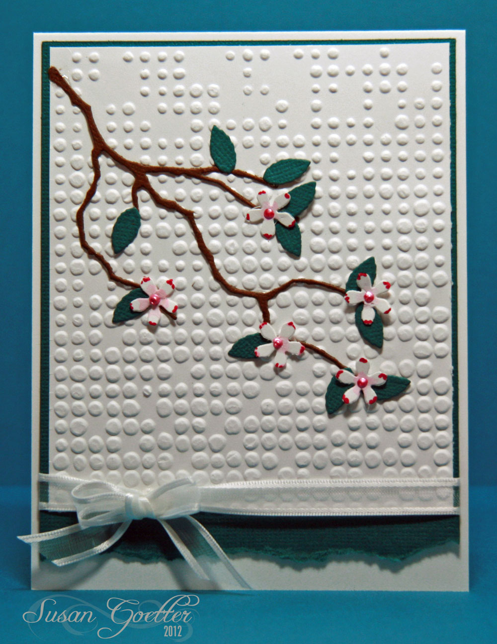
For this card, I embossed the white background, layered it on a piece of teal paper, and adhered it to the white card base. The branch was cut with a MB die, as were the leaves. The flowers were punched with a small flower punch. I painted the centers of the flowers with some distress ink and touched the edges of each petal with a red Copics marker. Tied a little bow around the piece before adhering it to the card base. No sentiment....that way I can use it for any number of occasions.
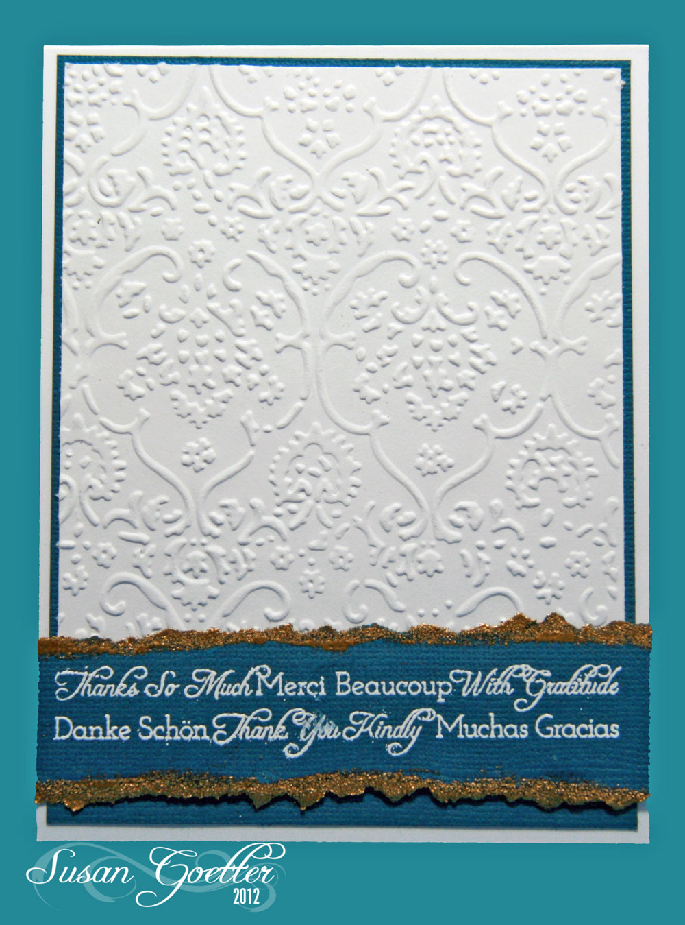
This card was super quick and so simple to make. I embossed the white background and edged it with a piece of teal card stock. I stamped the sentiment (Flourishes) with Versamark, and heat embossed with white WOW powders. Then...I tore the edges of the sentiment and inked them with Versamark and embossed with WOW gold EP. I see I smudged the white a bit...guess I need a little more practice with the heat embossing.

This last card was an after thought....I had some scraps of paper on my table from a project I finished last night, and I decided to "tear" a few blooms. I tore the centers also. The stems were cut with a QK die (part of the string for a banners set), the leaves are a MB die. Stamped the HA sentiment and cut it out with a Spellbinder die....Put the pretty (Ha!) flowers on a dotted embossed background...and it's done!
Finished a layout last week too...

These are photos of me and my grandson, Allen, when he was about 9 months old. I used Echo Park - Paradise Beach papers for this layout. The title work was cut with the Cameo (several layers stacked and glued together) The top layer of the title work was cut by adhering strips of paper to another sheet of paper and then putting it through the Cameo - giving me tri-colored letters. Then I just made that my top layer on the letters. The peachy-orange paper was punched with a EK Success "holey" punch and then I trimmed around the edges to make it kind of scalloped. The chevron strips were cut with a MFT die. The borders under the title work and under the little boy at the top were punched with a MS Victorian flowers punch. The little boy at the top is a digital image from Mo's Digital Pencil. I added quite a bit of faux stitching with a Memento pen. No journaling on this one...it's kind of self explanatory. I did have to go back and check the date on the pictures to make sure it was Allen...because it looks just like Pierce!
That's it for me right now. Thanks a million for stopping by! If you leave a comment, please know that I really appreciate it! Until next time...
Hugs!


28 comments:
A beautiful set of cards, Susan. I especially like the first one. Thank you for visiting my blog and the sweet comments. Hugs, Sue x
Gosh Susan, Your cards are amazing and your page you make them looks so easy all brilliantly done xx
You have been busy Susan, they're all fab but I love the brightly coloured 'Happy'
Margaret x
Another wonderful and varied group of cards for this challenge. I love the bright torn papers in the Hello card and the Nativity scene with minimal painting is elegant, the branch of pretty flowers is lovely and I love the simplicity of the embossing with the heat embossed thanks. I'm amazed at the torn flowers. What patience that must have taken. The pictures of you and your grandson are precious! He looks at you like you're just the best ever!
Beautiful collection. My fave is the first, so lovely. Thanks for your sweet visit and luv. Hugs
Wonderful cards Susan, espescially the first one. Hugs, Ankie
I can see you've got plenty of inspiration for the LIM challenge! Such great cards, and all of them so different! I think your Christmas card is really elegant, but I also love the card with branches and leaves - I can see the torn paper on this one! Have a nice Sunday!
You really did a great work. These cards are very beautiful. Thank you to stopping on my blog. :))
What a fab collection of cards and layout - all gr8
Kathyk
Amazing cards Susan, I love the embossing on the 4th but my fav is the Happy with the tearing underneath, genius!
Thanks very much
LIM mandi
Wow Susan - you never fail to amaze me with all your cards. They are brilliant and I'm pretty sure you didn't have to shed a tear over these!!! lol
Hugs.
Karen x
You are so prolific once you get going on a theme! Love them all, great flowers you made too.
What a cute layout, so funny you had to check the dates.
Linbyx
Love your selection of cards, all so different and beautiful.
Yvonne x
Great cards Susan - you really got into the tearing!!! Love the first card you shared - so very elegant! And I really like the cherry blossom card too! Great layout too!
Fab cards - especially the Happy-card!
You've really spoilt us with all these fabulous cards! I have to say the Nativity stamped card is my favourite too. Absolutely breathtaking.
another amazing set of cards!! i love the one you created by placing the torn paper behind the word happy... really cool! fab layout, too!
All your cards are amazing - I struggled to make one 'torn' card! My fav is the flowers but they are all fab, hugs x x
You made me laugh-"Tearing"..tee hee-i read it as TEAR..ing at first time and thought it was a fancy new craft technique !! Phew,was i relieved to find it was simply "Tearing" !I love your torm cards-especially the flower one :) x
What a teriffic bunch of cards. You really took the less is MORE to heart. MORE great cards on this post. I think my favorite is the HAPPY birthday card. I am a big fan of negative die cuts these days.
Look at ALL this gorgeousness! You were a busy busy stamper! LOVE the Happy Birthday card -- excellent colors!
I got my light box through Sky Mall. Your homemade one is working just fine! :)
your scrapbook page is beautiful, love the bucket helmet. Fav card has to be the thank you one, that touch of glitz is super.
Amazing set of cards - this is certainly dedication to the cause! My favourites have to be the Nativity and the HAPPY, the torn paper does show, and I would never have thought of that particular design. Well done. Lynn x
You've been busy again! I like the first one best too this week - it's really well balanced. I think you really had something with the HAPPY one too, perhaps just a ocuple of colours torn behind would have stood out more in the small gaps?
Great layout again too.
Tara
x
Hi Susan,
Love your cards and layout. Beautiful colors and ideas. Thanks for stopping by. To answer your question. I use natural stone and Staz On. Hope that helps.~Hugs Deanna
What a beautiful range of cards! I love them all but my favorite is the one with Christ. The colors are fabulous!
Thank you very much for visiting my blog and for the kind words.
Daen'Ys
I'm so sorry that I'm late in visiting this week, but I have been on a wonderful cruise to Norway where I didn't have very good Internet coverage!
Thanks so much for your lovely contributions!
Chrissie
"Less is More"
You really make beautiful cards. I really need to get into it more. Seems like there's always a birthday at work that I'm making a card for. I need a reserve (which I'm sure you do!). Anyways, wanted to mention how much I like the torn flower card. So fun and happy. Definitely going to steal that idea. :)
Post a Comment