
ATTENTION!
You still have time to leave a comment for the drawing on the 31st.....Did you take a moment to leave me a comment on this post? I'm going to be giving away a nice gift card to one lucky person in celebration of my 4 year anniversary as a blogger. Couldn't YOU use a gift card for craft goodies??
You still have time to leave a comment for the drawing on the 31st.....Did you take a moment to leave me a comment on this post? I'm going to be giving away a nice gift card to one lucky person in celebration of my 4 year anniversary as a blogger. Couldn't YOU use a gift card for craft goodies??
I can't believe it's only Saturday and I already have my card(s) for the Less is More challenge from Chrissie and Mandi. Of course, like many other LIMettes, I usually check first thing on Saturday morning to find out what our weekly challenge will be. I had to think hard about this one. As usual, I didn't peek at the early entries...that just makes the challenge more difficult for me! So, after a fun filled day in my craft room, I've made three cards that I'd like to share with you.

 I cut one more label out in red and trimmed the center out of it also. Then I ran all but one white label through my label maker (xryon). Very carefully, stack all the layers with the red layer on the top. This makes a very nice faux chipboard piece. I carefully aligned the label over the hole in the front of the card, then added a couple of pearls to dress it up. Very simple looking, but it did take a while to get all the layers trimmed and lined up.


So...which card is your favorite? Is there anything anyone would like for me to do a little tutorial on?


I'm not sure why, but I had a very difficult time photographing these cards. This first one looks like it's just a label on the card, but trust me...it's a big rectangle hole in the middle of the card. The happy birthday is printed on the inside of the card. After I cut the hole in the front, I printed the sentiment on the computer. Now that was a trick getting it in the right place! LOL!
Here's a close up of the front..hopefully you can see the aperture better here. The label I used was a Spellbinder die. I cut out 5 white labels and cut the centers out of each. I drew around the inside of the die cut to get an even border for each of the labels.
Here's a close up of the front..hopefully you can see the aperture better here. The label I used was a Spellbinder die. I cut out 5 white labels and cut the centers out of each. I drew around the inside of the die cut to get an even border for each of the labels.

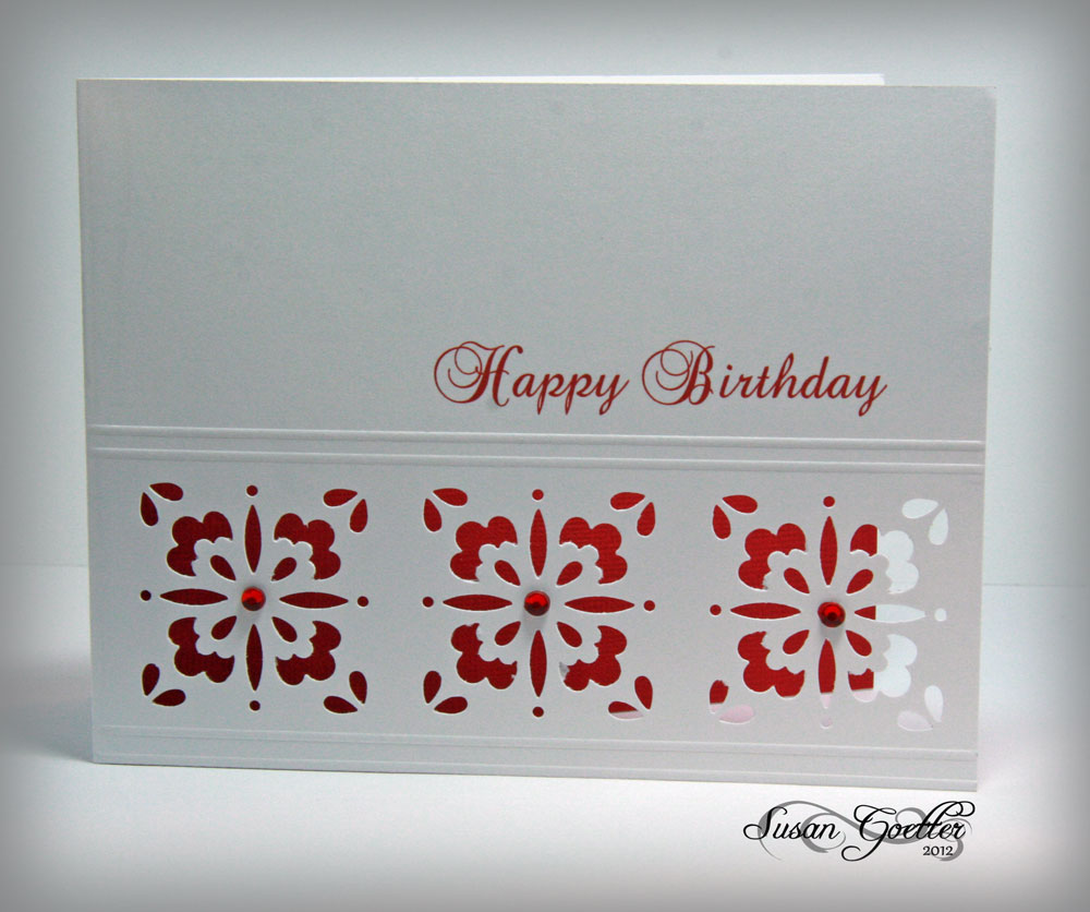
I hope this second card counts as an aperture. I used a Martha Stewart "anywhere" punch and punched it three times down the side of the card. Then I scored a couple of lines on either side of the punches. Now comes the tricky part....THEN I put it through my printer to get the sentiment on it! Am I crazy or what! By the way, there is a trick to getting these punches lined up. Look closely at the etchings on the metal part of the punch.

This last card took a while to come together. I cut the oval with my Spellbinder. Then I made a frame using the two larges dies, and embossed them. The blooms are Flourishes cone flowers. I colored them with Copics and then did a little fussy cutting. I pop dotted the edges that sit on the card front so that the bloom would be level with the part hanging over the opening. The sentiment is also Flourishes, and is stamped on white, and cut out with a Spellbinder banner tag. I inserted the tag between the frame and the card and then adhered it on the right with a glue dot. The card looked really plain, so I used the negative image from cutting the frame as a mask and sponged an oval inside the card behind the flower...leaving the center of the oval a little paler.
I finished a layout this weekend too...
I finished a layout this weekend too...

These are some photos I took of my darling granddaughter, Katie, on New Years Eve (2011). I wanted to practice with the new lens I got for my birthday, and Katie was happy to model for me! I used Echo Park's Life is Good collection for this layout. The butterfly is a Memory Box die (and it's a very delicate butterfly). Circles were cut from ppr with my circle cutter and several different size circle punches. The scroll border is a Sizzix die, and the pink border was punched with a MS punch. The title work is some faux chipboard letters I made. To make the faux letters, just cut out the top letter in the paper you chose and then cut 5-6 more of each letter from plain white card stock. I cut "almost" with my Cameo, so it was kind of quick. The "13" was cut with Papertrey Ink number dies and I had to run it through my Cuttlebug a few times to get all the numbers cut. Then I ran all but one of each letter/number through my sticker maker to make the backs sticky. Almost done....then layer them one on top of the other and you'll end up with a nice thick letter. Really looks cool IRL. Blooms were from my stash. The leaves behind the flowers were cut with a Memory Box die. Flower centers were made with liquid pearls. I inked the edges of most all the pieces and added quite a bit faux stitching with both a black and a white pen. Journaling was printed on the computer and cut into strips and adhered across the bottom. Journaling reads:
Katie, it’s hard to believe that in just a few short months you will be 13…a teenager! In the blink of an eye, you’ve lost your little girl look and have become a beautiful young lady.
So...which card is your favorite? Is there anything anyone would like for me to do a little tutorial on?
Thanks so much for popping in! I appreciate your visit and your wonderful comments! Until next time...
Hugs!


38 comments:
Susan these are all gorgeous! Your flowers are beautiful, I think the middle one is my favourite, I like the red/white it's a favourite combi for me.
Anne
x
Fabulous cards, Susan. I especially like the last one. The touch of blue behind the aperture was a lovely touch. I LOVE the red on the inside of the second card, too. I've never made a card with an aperture, so this challenge will be a real challenge for me. :) Ann
Not one, but three amazing cards from you Susan. I like them all but my favourite has to be the third, but then I'm a flower type of girl! Your colouring on this is superb. I love it!
Love Sheila x
Oh my!
You;ve really excelled yourself this time Susan. These are all wonderful. I love the punched second one and as for adding the sentiment after punching... well I'm in awe!
Your third one is beautiful, the composition is lovely and the touch of blue visible through the aperture is so subtle yet extremely effective.
Beautiful cards.
Thanks so much
Chrissie
"Less is More"
I oo-ed and arr-ed as I scrolled down your psot Susan, fabulous cards! As i got to the last with the 'cone flowers'? I gasped
Awesome!
Thanks so much
mandi
"Less is More"
You're on a roll! A super set of cards - I think my favourite is the middle one with the lovely border of ornate squares.
And your layout of Katie is just gorgeous - she's a beautiful young lady!
what a beautiful selection of cards for the LIM challenge - admit to loving the middle one,very striking.
Hi Susan , what a talented lady you are, such stunning work , fabulous fabulous designs layouts colouring stamping cutting what a talented lady you are.
Marie
Love the layout too your granddaughter is so pretty.
wow, all of your cards are faboulous!!! Great work
hugs from Germany
Cathi
Hi Susan, your cards are amazing. I love them all. If I had to choose a favourite I think it would be the middle one. Luckily I don't have to!
Beryl x
These are each so special! I love how you have framed your apertures. Simply using an oval nestie on the third one gives it such dimension.
Susan these are fabulous, I started scrolling down and each card, for me, got more amazing! I love them all the 2nd one with the punch I love but my all time favourite are the cone flowers, absolutely stunning!!!!
Beautiful LO and such a pretty granddaughter:)
Val x
Hola Susan at last i post in your blog:D:D after my tryp to London for to visit my husband(is working there)i has been "out".
Happy new year Susan.
Fantastic cards Susan, perfection is the word, i love all your cards, well done as always.
Your granddaughter is a really beautiful teenager!!!i think the childs grow up to much quickly .
A warm hug from Palma
LOL, Susan, you do like to live dangerously don't you! All that pretty punching then put it through the printer? I'm so glad it didn't get hung up because it's beautiful! Love the fussy cutting with the cutout oval too. Amazing!
Hi Susan, Again they are stunning and your layout is amazing such lovely pictures of your grand daughter she is sitting there so pretty:) Sandra H
Don't know how you come up with several designs every week Susan, I have problems with one! Finding it hard this week but you have risen to the challenge beautifully as usual. My fave is No.2 also but they are all brilliant, well done.
GORGEOUS cards and GORGEOUS granddaughter! !! Love that lo!!
My favorite card would have to be the middle one as well- it just looks so crisp!
Question about your Xyron- do you find that when you make stickers out of things that have lots of holes, does the sticky part sort of stretch across the openings and make "webs"? Lately, my sticker making has been dismal- the adhesive gets all over the edges and holes of my letters and it is very hard to rub off or peel away.
Great scrapbook page- I always enjoy your LOs.
wow! You have been busy! My fave is the oval and flower card.
I agree all of the cards are lovely each in their own way - my favourite is the one with the flower - but thats because I love flowers lol!
Fabulous cards! My favorite is the one with the Martha Stewart punch. I haven't been compelled to want those until now...
Fabulous projects - LIM ROCKS!!! Your scrap layout is fab too
Kathyk
Fabulous cards Susan, think the second one is my favourite - goodness knows how you manage to print the sentiments in the right place! beautiful layout too, your granddaughter looks very similar to my daughter who turns 13 in March. xx
These cards are amazing Susan, my favourite? I think is the flower.
These are gorgeous cards Susan...I love the faux chipboard frame _ I know it takes a while to do but the effect is great isn't it.
The last is my fave, super border to the oval and love the flowers with the pale blue shading in the aperture. Super LO, such a pretty young lady :)
Jenny x
i knew you would have more than one fantastic card to share, susan!! all are so pretty, but i really like the last one the best. and the layout??? gorgeous!!
More gorgeous cards, I love the oval cut out with the flower.
Yvonne
These are all just so gorgeous! I love them all but the second one is the one I want to have a go at! What wonderful photos of your granddaughter too Susan and a gorgeous layout.
OK, Susan, the more I read the more I "oohed" and "ahhed" because each card is fabulous and amazing (and so is your lovely scrapbook layout)! I think my favorite is #3...the blue sponged inside oval is the perfect touch against the pretty frame and coneflowers. Wow!
Each card was a delight to come to and I read your pst avidly as you explained the process. I'm in awe of your cutting and PC skills! All lovely cards and a stunning scrapbook page. x
Wow, wow and wow again! I love them all. The fussy cutting on the cone flower is amazing and I love the look of that one, do like the middle one too - very Moroccan in style. I haven't even mastered printing on a blank! Love the layout too.
I'm going to go and sit in the corner now and do something better than the pathetic cricut quickie I managed so far!
Tara x
They're all gorgeous,especially the second.Brilliant layout too!
Ooh I love them all Susan...again.
I particularly like the second card. Reminds me of a laser cut.
Lynne xxx
Gorgeous cards Susan, my fave is the second one - so pretty and ornate x
Gosh you've been busy. Loving all your LIM cards but the third is my favourite, just love those flowers.
What a beautiful young lady your grand daughter is and you've done a fab layout - may have to scrap lift some ideas here if that's okay :)
Carol x
Wowwwwww....Susan...soooooo pretty!! I think they are all lovely, but as I continued to scroll...the love kept getting stronger...the second and third...WOWZER!! Katie is beautiful:)!!
As usual Susan, your creations are wonderful. I especially love the last one - tat coneflower is gorgeous and I love the way you inked the oval inside the card and the way you attached the sentiment.
xo
Your cards are beautiful! I have a question about the Martha S punch - do you ever have trouble getting it to release? I have that same punch and just finished a rousing round of "let the paper go!" with it. I was just punching regular weight cardstock, nothing really heavy. Annoying!
Post a Comment