Sunday, February 26, 2012

LIM56 - Using those Scraps

It's time once again for the Less is More challenge hosted by Chrissie and Mandi. This week we've been challenged to "use some of those left over bits and pieces we all tend to keep."  For the record, if I made cards with just my "scraps", I could be making cards for several years to come!  Here's a peek at my accumulation of  scraps.  Since I also scrapbook, my scrap pile is ridiculously huge!


This little tower is a stacking set of 12 x 12 inch drawers - three drawers to each stack.  They're great -- each unit stacks nicely on top of another unit.  I have divided my scraps up by color...two or three colors to each drawer. The six drawers fit under one corner of my crafting table, with a little space on top to store my acrylic blocks, adhesives, and other little necessities.  I think it must be time to clear out my scrap bin since all the drawers are so full I can barely close them! LOL!


For this card, I used a white card base, then adhered a dark brown strip across it horizontally, slightly higher than center.  The image is a digi from the Wax Fruit Company that I printed out three times on a scrap of white card stock.  I heat set the ink from the ink jet printer, then colored the image with Copic markers.  I cut out the two star fish from the other two images I printed, and popped them over the original photo.  The kraft border was cut, then I cut out the center and used it as a frame for the image, so that the starfish would hang slightly over the edge.  The sentiment is from PTI and is stamped in brown.


My second card is also made using a digi image from the Wax Fruit Company.   I printed the image on a scrap of white card stock, then printed it on the striped paper and the solid teal paper.  I heat set the ink from the ink jet printer, then colored the image with Copics.  I used a white pen to add highlights to the water.  I cut each of the umbrellas out and then layered them on the original image.  I found a piece of embossed paper that I had stuck aside from a previous project and used a portion of it as the background for the image, popping the image with pop dots. The teal background paper is scraps from a recent layout I did.  I cut it slightly smaller than the card base, and inked the edges slightly.  The sentiment is from Hero Arts.


This last card sounded much better in my head! LOL!  I used some scrap pieces to cut banner tags, inked the edges, and added a touch of faux stitching.  The white background was a scrap piece of white that I ran through my cuttlebug with a SU impression template called "distressed".  It's a black template, and I've had it forever.  I had to fiddle around with different stacks to get it to work with my cuttlebug.  The sentiment is from PTI.  I added a small green border (the same green as the middle banner).  Did a little faux stitching around the edges of the white with a pink pen, and added three brads to the banners.  Not thrilled with it, but it's okay.

Thought I'd share a recent layout with you too.  This is photos of my son, and my grandson that I took last summer.  On the February 24, my son turned 33....WOW!  How did he get so old so fast?!


I used My Mind's Eye papers (Hattie collection). I used a EK success punch for the border under the photo. I made several ribbon banners and layered them under the punched border. The stars were cut with a QK die. Title work was cut from card stock with the Cameo. I punched several circles to layer around the layout. Lots of faux stitching on most layers. I inked all layers with some amber colored ink. The dots in the corners are liquid pearls and I added one piece of bling on the blue star. Journaling is tucked behind the top gold mat with the pull made from the same border punch. Journaling reads: 

Allen, from the time you were old enough to walk, you would follow your Daddy anywhere. You two are like two peas in a pod! You're a very lucky little boy to have a Daddy who love you so much and doesn't hesitate to give you hugs and kisses! 

Thanks so much for stopping by! I appreciate each and every one of your comments! They make me happy!  Until next time...

Hugs!

Photobucket


Pin It!

One Layer Wednesday #80 - Two Colors

In the words of our host, Susan.... "This week's One-Layer Wednesday (a.k.a. OLW) Challenge is to use two colors, two images, and masking. Sentiments are optional but must be in one of the two colors, just to make the whole thing more diabolical, um, challenging."

I do believe diabolical would be the better choice of words!  I definitely struggled with this challenge.   First of all, I rarely stamp in colors.  I use a lot of color, but normally the color is added with my Copics or Prisma pencils.  Stamping color never looks right to me when I do it!  But, always willing to give each challenge a try...here's my efforts! 


This card was my first try, and I totally  didn't like it, but thought I'd post it anyway.  The butterfly isn't bright enough, and the "trail" is too dark...hmmmm...on to the next try.


I think my biggest problem was the fact that the stamping had to include masking.  I tried to think of something I had that would work with masking and stamping...and I was at a total loss.  Then I decided to give these Technique Tuesday images a try...still not happy!


I decided this would be my last effort to make something that I liked.  I used PTI stamps for this card.  Stamped in Memento cottage ivy and cantaloupe, then added three scored lines to ground the image.  Although I wasn't totally satisfied with any of these three, this third card comes the closest to making me happy.

These last two weeks of OLW challenges have really been challenging! (guess that's why it's called a challenge, huh?!)

Thanks so much for stopping by!! Appreciate all your comments!! Until next time...

Hugs!
PhotobucketPublish Post


Pin It!

Thursday, February 23, 2012

Simple Steps to Turn OFF Word Verification and Moderate Comments

I participate in several online challenges each week and have for several years.  I'm sure I'm like most of you and my Internet time is limited,  so I want to make the most of what time I have to be able to visit your blogs and leave you a comment or two.  With the changes to blogger, it has become increasingly more difficult to leave comments on quite a few blogs because of the double word verification that blogger has put in place.  I personally find the two words difficult to read sometimes, and if I input it incorrectly, I have to keep trying to get the right letters before my comment will be accepted.  

So, with all of this being said...I have a favor to ask.  It would be so nice if word verification was turned off and we all just used comment moderation.  

What knowledge I have about blogger, I've learned through trial and error, but I have discovered how to turn OFF word verification and set my blog to comment moderation.  So, for those of you who use blogger, I thought I'd share the steps with you, in case you don't know how to do this.

Go to the design area (where you see the layout of your blog), select the settings tab…then comments.  This is the screen you’ll see: 


Then scroll down the page to the comment moderation section and click the always button…this turns on comment moderation.  Under the Show word Verification for comments…. Check the no button.  This turns off word verification but leaves comment moderation ON and makes it SO much easier for people to leave a comment on your blog.


I know I enjoy getting feedback and blog luv from my followers, so I wanted to make it as easy as possible for everyone to leave me a comment.  I know this looks like a lot of stuff, but it’s super simple and I've found that I get more comments now that I have my verification turned off.  

If you have any questions about how to do this, don't hesitate to shoot me an email (just click on the envelope that says contact me) and I'll do the best I can to help out. 

Thanks for stopping by!  Until next time...

Hugs!
Photobucket


Pin It!

Wednesday, February 22, 2012

Challenge 59 - Mardi Gras

This week the challenge from Laura at I am the Diva  is to create a tile or ZIA using the prompt: Mardi Gras.  Here in the panhandle of Florida, Mardi Gras is a big deal to lots of folks; however, it's not a celebration that I usually pay much attention to.  When my children were small, my hubby would often take them to the Mardi Gras parades and they would always come home with tons of beads!  So...with that as my inspiration...here's my take on the challenge.
I drew this in my sketchbook and it's about 5 x 5 inches. The beads my kids would collect at the Mardi Gras parades would end up in piles all over the house....and slowly but surely they'd end up with the strands broken and bits and pieces would be everywhere....and at that point they'd be headed for the trash. I think I'll keep these beads though...even though they do look like the strand is broken! LOL!

I've got a couple of other little pieces to share today, too.  Just some things I did while vegging in front of the television...
This was drawn on a 4 x 4 inch tile....simple and just plain fun! The pattern down the center is one that I designed, although I'm told it resembles Oof, it really isn't drawn the same way at all.  I think I'll call it Eleganze.
 This one my hubby thinks looks like snakes.  I think I'll call it "what lies beneath"....LOL!

That it for right now....I might be back later with a new card.  Thanks so much for popping in!  Until next time...

Hugs!
Photobucket


Pin It!

Sunday, February 19, 2012

LIM55 - Punches or Die Cuts

The Less is More challenge this week is to make a card(s) using punches or die cuts.  Wow...how simple is that!  After last weeks efforts to make a card with stripes, this one should be so simple!  I have tons of punches...and dies...what to do...what to do??!

To go off on a side note for a minute...  Usually, when I make cards for a challenge, I attempt to make a card that I know I will use soon or at least in the near future.  Somehow, I've managed to accumulate quite a stash of cards and I'm fairly certain that I'll never use all of them...and I keep making them too!  So, I asked my daughter-in-law who works as a social worker at a nursing home, if the people at the nursing home would be able to use some of these cards.  She was so excited to get them and assured me that everyone would be thrilled to have some cards to send out!  My cleaning up of my craft room accomplished two things...I got my room clean and thinned down the number of cards I have on hand...and I provided some cards to people who don't have the ability to go to the store to buy cards!  Makes me happy!


I made this first card using a white card base.  I embossed a white piece to pop over the front of the card.  The tag is a Spellbinder die that I also pop dotted on top of the embossed piece.  The flowers are punches and I added a liquid pearl center to each flower as well as a little white doodling.  The sentiment is from a very old stamp I had in my stash (I think it is SU).  Made this card for a friend who had open heart surgery this week.  Very simple...with just a pop of color...and I used a die and a punch!


This next card was made using a heart die from Memory Box.  When I ordered the die, I had no idea it was so large.  I don't know if it's just my cuttlebug, but I have a lot of trouble getting the Memory Box dies to cut all the way through.  Seems like I have to run it through my machine 4 or 5 times and use shims to get a clean cut.  I used a red card base, then cut off the front of the red and used a punch for the scalloped border.  I added a layer of white behind the red and stamped the PTI sentiment on the white in SU Real Red.  The heart is pop dotted (and that was difficult since the cuts are so thin!).  I also added a strip of white paper just above the red scalloped edge...it just needed something there!


This card was super quick and simple.  The banners are Lifestyle dies as is the line they are hanging from.  I pop-dotted each of the flags and added a touch of white faux stitching to each of the banners.  The sentiment is from PTI.  

This last card is one I made just because I wanted to used the new SU pear stamp! LOVE this stamp!!  I also wanted to try to make a border with a punch, and I used a MS border punch for this border.  I simply cut a one inch strip and punched down either side of it.  I see I was slightly off...but I'll try not to stress over it! LOL! I stamped the pear with Memento cocoa brown, then cut it out with an oval Spellbinder die.  While it was still in the die, I sponged it with DIs.  I cut a scalloped oval with the same size Spellbinder die in green and used it to back the oval die cut.  The sentiment is from PTI and was stamped in the same brown.  The card base is a yellow...not nearly as gold as it looks here.

Thought I'd share a layout too...This one is a photo of my hubby and his two younger brothers...taken sometime around 1950.


I used a mix of G45 papers (A proper gentleman, Times Nouveau, Playtimes Past, and Botanicabella). I think they all blend together well. Title work was cut with QK - Fiesta and Lemonade. The diamonds were also cut with a QK die. I added lots of doodling and did quite a bit of layering. Journaling is tucked behind the photo with the domino as a pull and reads: 


The three Goetter boys…all dressed up in their choir robes, singing and posing for a photo. I don’t know for sure, but based on the stories I’ve been told…these three were definitely NOT choirboys! 

Whew...are you still hanging in there?  Thanks a million for stopping by! I truly appreciate all you comments! Until next time...

Hugs!
Photobucket


Pin It!

OLW79 - FIVE Stamps?!?!

This week's One Layer Wednesday challenge is hosted by Jennifer at Styles Ink.  This week's challenge is a doozy...at least it was for me.  Our challenge was to use at least 5 different stamps on a one layer card.  One layer cards are a challenge in their own right...now I need to make one using 5 different stamps..WOW!  I gave it some thought and this is what I came up with. Not very original or different, but the best I could think of!

This first card was made by masking off the center section and sponging on DI in peeled paint, wild honey, and broken china, then I stamped it with the four different stamps from the SU Pocket Silhouettes set, plus Flowers in Silhouette from SU. Adding the sentiment from PTI and that's a total of 6 stamps! Yay, me!!


This second card was created with the same stamps, I just used different DIs for my sponged background.  I believe I used wild honey, rusty hinge, and broken china DI for the background.  Didn't much care for how this one turned out...but it's different and I used 6 stamps!


I think this last one is my favorite from these three.  I masked off the bottom of the card and used 5 different stamps from the PTI collection Peaceful Gardens.  I stamped the plants in varying shades of green and then added touches of brown.  After stamping, I sponged a little darker green at the base of the plants, then sponged in a blue sky with tumbled glass DI.  The sentiment is also from the same PTI set.  I added a scored line under the scene and stamped the sentiment below the line.  In retrospect, I should have left the scored line off...it didn't add a thing, and I think it looked better before.


That's all for this week. This week's challenge was definitely difficult for me.  Maybe I'll do better next week!  Thanks so much for stopping by! I appreciate it when you take the time to leave me a comment!!

Hugs!

Photobucket


Pin It!

Tuesday, February 14, 2012

Challenge 58 - Diamonds

The challenge this week from I am the Diva is a challenge from CZT, Diana Hirsch.  This weekend, February 17-19, 708 college students will dance to raise money to fight pediatric cancer.


Penn State University’s Dance Marathon—lovingly called THON —(and is nonstop dancing for the weekend) is an annual event that benefits The Four Diamonds Fund at Penn State Hershey Children’s Hospital.  The Four Diamonds Fund was started by Charles and Irma Millard after their son, Christopher, lost his 3 year battle with cancer in 1972.  Symbolic of the traits Christopher felt were needed to defeat cancer, he wrote a story in which the knight Sir Millard overcomes obstacles to achieve the four diamonds of Courage, Wisdom, Honesty, and Strength


In 1973, 39 dancer couples participated in the first THON and raised $2,000.  Last year in 2011, 353 couples danced and raised $9.56 million.  In its 40 years, THON has raised over $78 million, money that has paid medical expenses for more than 2000 families and also funds innovative research. 


This week’s challenge is Diamonds.  Here's my take on the challenge:


My diamond is about 4 x 4, but drawn on a 6 x 6 sketch pad.  I tried to draw my diamond to resemble this logo for THON.


It you'd like to see even more cool tangles, pop over to Laura's blog and check them out!  Thanks so much for stopping by!  I appreciate all your comments! Until next time...

Hugs!

Photobucket


Pin It!

Saturday, February 11, 2012

LIM54 - It's all about the Stripes

I just saw today that my With Love card from the LIM52 challenge was ShoCASed!!! How exciting is that!  Thank you so much!


Now...on to this week's challenge! This week the ladies at Less is More have challenged us to create a one layer card...and it must have stripes!  I discovered that I rarely use stripes in my cards, except when I'm using designer paper....but to create the stripes on a one layer card?  Had to put my thinking cap on for this one!


For this first card, I masked off part of the card and then stamped vertical lines with Memento London Fog ink.  The grey is rather dark, so I stamped it off one time before stamping each set of two lines.  The image is Harvest Berries from Papertrey Ink. I stamped the image in Memento Bahama Blue.  The sentiment if from Flourishes.  I added a couple of scored lines below the stripes and I also added a little glitter dust to each of the leaves and berries.  Don't know if you can see the sparkle...but it looks pretty in real life.  


This card was created with Papertrey Ink stamps from the Tea for Two set.  I stamped in Memento Bahama Blue, then added some stripes to ground the teapot with the matching Memento marker.  Sentiment is also from Papertrey.  You can't see it here, but I also added a bit of sparkle with the Sakura clear star pen.


I think this one might be my favorite card.  The peaches are a Flourishes image.  The stripes are from a package of borders...and I have no idea who makes them.  I stamped the image, then masked it to stamp the stripes behind it.  The stripes are stamped in Memento Rich Cocoa.  I colored the peaches with Copic markers (using reds, yellows, oranges, pinks...and of course, greens for the leaves).  The sentiment is from Flourishes With Gratitude set.  I also added a bit of grey shadows to give the peaches some depth.  To make the stripes uneven, I used a torn piece of paper to mask off the bottom of the card.


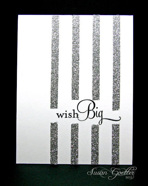
This one was just a last minute thought.  Super simple and quick.  I stamped the PTI sentiment on the card, then added stripes of double sided tape (I used 1/4 inch Sookwang double sided tape).  I actually did two of these cards, but I didn't get the stripes straight on the first on and I used gold glitter and a red sentiment.  I like this one better.  Before I added my tape to this card, I drew some light pencil lines so that my tape would be straight.  Worked much better!  Then...I peeled off the top of the tape (on all the stripes) and sprinkled silver glitter all over the tape.  Worked beautifully!   

Thought I'd also share a little something that I made for the grand kids for Valentine's Day.  It's just a super simple little box.  It makes about a 2 inch cube and the tabs on the top slid together to make a heart.  So cute!  I filled each of the little boxes with conversation hearts candy...and they're all ready to go!
Here's the link to the image if you'd like to make a few for Valentine's Day.  Just print it out, cut it out, and glue it together!  Super easy! Here's the link:  HP Explore and Create

That's all for today! Thanks for hanging in there.  Hope you find something that inspires you! Thanks for stopping in...and thank you for leaving a comment! Until next time....

Hugs!
Photobucket


Pin It!

OLW78 - Let's See Some Circles

This week's OLW challenge is to create a card using more than 5 circles.  Normally, this wouldn't be a problem...unless, of course, I have to create with circles! LOL!  Here's my take on this weeks challenge

I love how this first card turned out...I guess it's not really totally CAS...but it is one layer.  The little girl is a digital image (can't remember where I got it) and the flowers are from one of the PTI jar filler sets...I just stamped a set of flowers on each side of the little girl. 

Since the little girl was a digi image, I printed her on the card front with my ink jet printer, then heat set the ink so that when I colored her with my Copics there wouldn't be any smearing.  I'm learning...slowly but surely!  The flowers were stamped with Memento black and colored with Copics.  Now...the circles...six circles on the flowers...and then there are polka dots on her shirt.  I masked off the little girl and the flowers before sponging the ground with brown ink. 

This card has lots of circles...teeny, tiny circles!  I used my dot background from PTI (and it looks like I need to add a dot right in the middle of the border...huh!  The sentiment is also from PTI.  Everything was stamped in Tempting Turquoise.  I added three pretty pieces of bling to finish it off!

Thanks so much for stopping by! Your comments are always welcomed and appreciated!! Until next time....

Hugs!
Photobucket


Pin It!

Friday, February 10, 2012

Bloomin' Tangles!

Here's a couple of new tangles for me.

 This first tile is about 6 x 6 inches.  I didn't use a string for this one, I just started drawing...and let the pen do the thinking for me! LOL!  I kind of like how this turned out.  I had started this on Wednesday evening, and then got sidetracked, but came back to it last night and finished it up.


This second one I started and finished last night.  This tile is approximately 6 x 6 also.  Actually, neither of these drawings are on an actual tile...I'm working in my sketch book which is a spiral bound book.  I love the way this one ended up.  Looks like a large Zinnia bloom....and all I did was build off the main flower...too cool!!

Thanks a bunch for stopping by! As always, I truly appreciate your wonderful comments! Until next time....

Hugs!

Photobucket


Pin It!

Monday, February 6, 2012

Challenge 57 - Sanibelle

Pin It


The challenge this week from Laura at I am the Diva is to create a tile using the tangle Sanibelle designed by .  It just so happens that this is one of the first tangles I tried...and I still love it!

Here's my take on the challenge.

This was done on a 4x4 tile.  Love how this turned out!  Thought I'd share a few more of my recent tangles with you too.


This first one was just me doodling around and playing with lines...I actually love the flow-y look this has.


Trying out repeat pattern stacking...so much fun!

 Here's one I did for my hubby for Valentine's Day...if you don't know what mwah is....it's the sound of me sending him a big kiss! LOL!

Thanks so much for popping in! Your comments are welcomed and much appreciated! Until next time...

Hugs!
Photobucket


Pin It!

Saturday, February 4, 2012

LIM53 - Aqua it is!

Hello Saturday! And welcome to another week of the Less is More challenge! Since this is the first week of the month, our challenge this week is a color challenge.  We've been challenged to create cards using the color Aqua.  Such a pretty color..don't you think?

I've made three cards today for the challenge...so without further ado...here they are:
This first card is fairly simply.  The butterfly was cut with a Memory Box die. I added a few pearls to the body and some glitter on the wings and popped it off the card.  The layer behind the butterfly was embossed with a paisley embossing folder and layered on aqua paper.  The sentiment is from PTI and the tag was hand cut and then layered on the same aqua paper.  I added three aqua pearls to the tag.

This second card was made using the Cameo.  I cut the front panel out (the aqua with the flowers on the end) then layered it over a piece of embossed card stock.  I believe that's a SU embossing folder.  The sentiment is from Papertrey Ink and was stamped in white then heat embossed with white.


I'm not sure what happened to my colors, they look kind of blue...but they are aqua.  This is another simple card.  I cut off part of the front of the card then punched a decorative edge.  I added the aqua behind the punched edge and added a couple of score lines on the aqua.  I tied a ribbon around the card...stamped the sentiment from Papertrey Ink (in aqua ink) and added a couple of robin's egg half pearls.

That's all the cards for me this time.  Not sure why my camera wants the cards to be blue.  I tried several times to get a true color...but this wasn't my lucky week! LOL!

I also finished a layout today that I thought I'd share with you.


This is my cutie pie little grandson, Jacob. I used Echo Park papers for this layout. All the embellishments were printed on my ink jet printer then cut with the Cameo.  I have to tell you I'm really loving my Cameo.  I discover new things every time I use it!! The title work was cut with PTI dies.  Journaling was done on the computer, then cut into strips and adhered to the layout.  Lots of faux stitching and most of the embellishments are pop dotted. Love this collection...so perfect for water/beach layouts!  Journaling reads:

Jacob, you’re like a little fish!  These photos were taken in April 2011, and you were already playing in the water at the beach.  I probably wouldn’t even get my toes wet in April…it’s just too cold for me...but not for you!  That cold water never even slowed you down.    

Thanks so much for stopping by! I appreciate you taking the time to leave a comment! Come back again soon!  Until next time...

Hugs!
Photobucket


Pin It!

LinkWithin

Related Posts with Thumbnails