Showing posts with label Color Throwdown Challenge. Show all posts

Friday, July 9, 2010

Color Throwdown #100

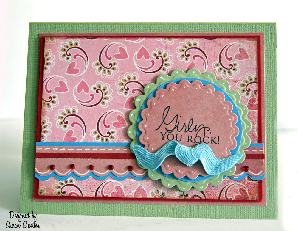
These are the colors for the Color Throwdown #100. When I first saw the colors, I wasn't sure I could actually do anything with them....but WHOA!!! These colors are fantastic together!

I pulled cardstock, patterned paper, and ribbons just trying to find the perfect combination for this challenge. This is what I finally came up with. The pink heart paper is Basic Grey, then I added the green, blue, pink and red cardstock. I cut the scalloped circles with Spellbinder dies, and then added a blue circle between the two. The large mat is pop dotted on the green background. I punched two scalloped borders with the pink and blue, layered them and then added the tiny red strip. I also added a little doodling with a white Signo pen. At the peak of each scallop, I added a tiny red bling. The Sentiment is from PTI. I tied a little bow with some large blue rick-rack, and then pop dotted the circles on top of the scalloped strips.

I'm not sure why the blue looks so bright, but it's really a much softer blue IRL.

It's a girly card....but I'm sure I can find a sweet girl to send it to! Thanks so much for stopping by....Until next time....

Hugs!


Pin It!

Wednesday, June 23, 2010

A Color Throwdown Challenge and Trying Something New

These are the colors for the Color Throwdown #98. The colors were chosen from Basic Grey's Cappella Collection, which I just happen to have...since I just completed a layout for Basic Grey's newsletter. I really love the colors in these papers, so this challenge was perfect for me.

Here's the card I created. I used a soft pink cardstock base. The sentiment is stamped on a Nestabilities Labels 11 die cut. I inked the edges of the patterned paper with a soft brown. The scalloped edge is a Martha Stewart punch. I added a piece of lace, a few pearls, and a pink and brown flower layered with a pearl center. I love the finished card! I think it turned out a bit feminine, so I'll have to think of someone special to send it to.

This second card is something new I was trying. I found a great tutorial at Splitcoast Stampers and it was super easy to follow. The first photo is with the card closed...and the second photo is with the card opened.

I made this card for our grandson who will soon graduate from basic training at Lackland AFB.

I used a combination of papers...some Cosmo Cricket - Mr. Campy, the red is My Mind's Eye, and then added some gold cardstock. The image is from PTI, stamped on white cardstock, and colored with Copic markers. You can't really see it here, but I covered the vase with some glossy accents. It gives it a nice finish.

Thanks a bunch for stopping by. Leave a comment and let me know what you think of these cards.

Until next time....

Hugs!


Pin It!

LinkWithin

Related Posts with Thumbnails