Showing posts with label Less is More. Show all posts

Thursday, October 8, 2015

LIM 244 - Jewel Tones

I'm really running behind this week! I've had my cards made since Sunday, and just got around to taking pics today! Whew!

This week the challenge at Less is More is to create a card using jewel tones.  Here's my take on the challenge.


I think this first card is my favorite of the three cards I made.  I love these edge dies from Spellbinder.  I cut the front white panel with the Spellbinder dies twice.  The curved edge with the tiny holes is one die, and the lacy cut is another die...they work together beautifully.  I popped up the lacy cuts over some rich blue/teal card stock and added the blue panel to a white card base.  The sentiment is from SSS.


This second card is actually the first card I made. I cut the lacy star using a Spellbinder die that I've had forever and never used! Guess that makes it a NBUS die!  The "best" is a die from SSS that I've used several times lately and the "wishes" is part of a stamp set from SSS also.  I cut the lacy star from the white panel and then again from the teal card stock.  Because of the open work in the die, I adhered a piece of acetate behind the die so that I could inset it into the white panel.  The "wishes" part of the sentiment was stamped with Versamark and heat embossed with white and popped over the bottom of the "best" die cut.  I edged the white panel with some of the same teal card stock, then popped it all over a white card base.


This last card was super quick and easy!  I cut strips from several different jewel tone card stock, then adhered the strips along the top and bottom of a white panel (4 x 5.25).  I cut the "sending" from the white panel and then cut it again from some of the deep purple card stock and inset the purple die cut back into the white panel.  The sentiment is from SSS.  I also punched a decorative edge to add to the top strips with a punch from EK Success. I finished off the card by added several pieces of deep purple bling and popping the panel on a white card base.

Thanks so much for taking the time to stop by for a visit!  Hope you'll come back soon!  Your comments are greatly appreciated! Until next time...
Photobucket


Pin It!

Saturday, July 25, 2015

LIM 234 and ATSAM

I've got several cards and a couple of layouts to share with you today.  I believe all 4 of these cards will fit the current challenge over at Less is More  and Addicted to Stamps and More.  The challenge at LIM is in honor of Chrissie's birthday!  Happy Birthday, Chrissie!!

I've had a busy couple of days, but I did manage to make these 4 cards.

  
For this first card, I inked the card base with just a very light touch of blue distress ink for the background.  The honeycomb piece is from my scraps (it was left over from another card).  The butterfly was cut from a snippet of white paper, then colored with some Copics.  I added some clear Wink of Stella to the butterfly for a little sparkle.  The sentiment is from PTI and is heat embossed in blue.

Any time I use the hexagon cover plate from PTI, I always save the "centers" of the honeycomb to used on something else.  This time, I took some of the pieces and colored them with Copics, then using another "honeycomb" piece from my scraps, I placed the colored hexagons back into the honeycomb to find an arrangement that I liked.  I added dimensional tape to the back of each of the hexagons, and placed them back in the "frames".  After adhering all of the hexagons, I removed the honeycomb frame piece.  The sentiment is from PTI.  I also added a touch of clear Wink of Stella to each of the hexagons.


I used the Penny Black Bashful Flower die for this card.  Each of the different colors in the flower were cut from snippets from my scrap bin.  I embossed the white panel with a PTI embossing plate, then inserted the different pieces of the flower back into the white panel.  To get it to stay in the white panel, I added some wide score tape to the backside of the panel.  The panel is popped up with a piece of fun foam that is slightly smaller than the card panel.  Then sentiment is from Technique Tuesday and is stamped in Versafine Black.  I also added a little Copic coloring to the yellow bloom to give it a little dimension, and then I dotted the flower center using a white signo pen.


For this last card (which is probably my favorite), I was inspired by this card.  The front panel on this card is popped up with fun foam.  I cut the circle from the front panel with a SSS stitched circle die. The bloom is a die from Penny Black (Field of Dreams).  I cut the flowers from a snippet of white from my scrap bin (and WHY do I have some many little "pieces" of white!) I colored the flowers with Copics and adhered them to the card front panel.  For the top bloom, I put a piece of the leftover fun foam behind it so that it would be level with the top panel.  The sentiment is from PTI and was heat embossed in liquid platinum.  I also sponged a bit of red and green distress inks on the card base directly behind where the top bloom would sit.


I wanted to share another layout with you too.  This is a photo of my mother (when she was a baby) sitting on her mothers lap.  I used a lot of old papers for this layout as well as lots of old flowers.  I cut some flowers and leaves from gold vellum to add to the brown blooms.  The two lacy pieces are actually old, old stickers from my stash.  I do believe I could scrapbook/make cards for years without purchasing anything but adhesive!  The metal circles and the bling were also from my stash.  The doily was cut with a Prima die and then cut in half and added to the layout.  I scattered a bit of bling around and added a touch of faux stitching with a black pen.  The title work was created in the Silhouette program and cut out with the Cameo.  I used a clear transparency behind the photo which is also one of those things that has been in my stash forever!

Thanks so much for taking the time to stop by for a visit!  Hope you'll come back soon!  Your comments are greatly appreciated! Until next time...
Photobucket


Pin It!

Saturday, April 11, 2015

LIM 219 - One Layer with Splatters

The challenge this week at Less is More, is to create a one layer card and to include splatters on it. Tough one this week.  I have a LOT of trouble making a card with splatters on it...you see, that's random...as in...not planned.  So...here goes....


I think this first one might be my favorite of the three cards.  I sponged some distress ink on the bottom half of the card and up the right side, blending as I inked.  The splatters are also distress ink.  I put some walnut ink on my craft mat, spritzed it with water then flicked it across the card with a paint brush. The sentiment is from PTI and was stamped in Versamark and heat embossed with Liquid Platinum embossing powder.  In retrospect, I should have heat embossed the sentiment before I did the blending of the distress ink and added the splatters....oh well....lesson learned!  I also wanted to add a little more of the embossing, so I masked off the card leaving a small strip on the right hand side, then inked it up with Versamark, peeled off the mask, and heat embossed some liquid platinum embossing powder.


I liked this second card okay, but it's kind of blah. I stamped the Simon Says Stamp sentiment in the middle of the card front in Versamark ink and heat embossed it in white. I masked off a circle in the middle of the card base, inked it up with a couple of colors of distress ink (tumbled glass and peacock feathers).  I then added some darker ink to my craft mat, spritzed it with water and then flicked a few splatters on the circle.  I also added some white splatters with watered down white Copic ink. I peeled off the mask and added a little gray Copics around the edges for a bit of dimension.


This last card was actually the first card I made...then after I added the splatters, and really looked at the card...well...it kind of looks like the little bird is pooping!  The bird is from Tim Holtz.  I stamped him in Memento black and colored him with Copics.  The sentiment was computer generated after I colored the little guy...I know...very risky!  But luckily it worked out this time!  The ground was spritzed on with my TH spritzer and a green Copic marker.  (Thanks Chrissie for mentioning that the barrel comes apart - I had forgotten that!).  Anyway....not sure it the spritzed green "ground" would count as my splatters, that's when I added the brown splatters!  Trust me...it was much better before the brown splatters!  I can't imagine sending this to anyone!

So...which card is your favorite?  

Thanks so much for taking the time to stop by for a visit!  Hope you'll come back soon!  Your comments are greatly appreciated! Until next time...
Photobucket


Pin It!

Monday, April 6, 2015

LIM 218 - Mostly Black

It's been a few weeks since I've played along with the challenge at Less is More, and this week's challenge seemed to spark my mojo!  I've gone overboard again, and made 5 cards for this challenge! Here's my cards for this week's challenge:


This first card is on a black card base, with a tiny white border on the embossed card panel.  I heat embossed the poppy stamp from SU with a detail white embossing powder.  I heat embossed the sentiment from Hero Arts on a strip of vellum and adhered it over the black panel, then adhered the black panel to the white background before popping it up on the black card base.


When I started this card, I had NO idea how it would end up.  This is actually a top folding card, although it looks like a side folding card.  The recipient will probably really be confused when trying to open it! LOL!  I stamped the PTI sentiment on the center of the white panel.  The flowers are from Sweet and Sassy, and were stamped in black ink then cut out with a matching die.  I added some black gloss to the center of each of the blooms.  I also popped up the two middle sized blooms, rounded the right corners and adhered the panel to a black card base.


This card was SO super quick and easy!  I printed out the silhouette children and the sentiment...cut it out, adhered it to a black panel, then popped it on a white card base....SUPER quick and easy!


This card and the next card are both cards that I did a little Zentangle inspired art on.  When I think black and white, I often think of added a few of my doodles.  The sentiment on the above card is from PTI, stamped in black.  I cut the panel using a stitched edge rectangle from Simon Says.  I popped the white layer on a black card base.


This card is also some of my ZIA...I used the same die for cutting the white panel and the sentiment is also from PTI.

Whew! That was a lot to drop on you today! Thanks so much for taking the time to stop by for a visit!  Hope you'll come back soon!  Your comments are greatly appreciated! Until next time...
Photobucket


Pin It!

Sunday, July 27, 2014

LIM 182 - Anything Goes

It's been quite a while since I've played along with the Less is More challenge. Oh, I've made some cards for the challenge quite a few times....just never got them posted!  The challenge this week is Anything Goes in honor of Chrissie's birthday.  Happy, Happy birthday, Chrissie!

There's a few cards I've finished recently that will work perfectly for this challenge.


This first card I was practicing with doing inset words in a card.  My choice of die for this first card was probably not that good...it was a little difficult to piece back together.  Once I finished it though, I was pleased with how it turned out.  I added the "birthday" with heat embossing in black.  The stars were from a set from Clearly Besotted and were stamped in blue, then coated with some glitter from a Wink of Stella pen.  The word "happy" is also in blue...even though it looks black on here! I adhered the pieced panel to a piece of dark blue card stock and popped it on a card base.


This second card was basically the same procedures, except the letters for this "happy" are individual letters and I ended up not getting the letters completely straight...but it works!  I cut the letters from the card base and then cut them again from a piece of shiny card stock from an old tissue box.  The "birthday" was stamped in black.  The stars were outline stars that I stamped in black, and then put some gold Wink of Stella inside the stars.  Rounded the corners with a corner chomper.  Since there wasn't a front panel for the die cut, I simple put a single piece of card stock inside the front cover to cover up the cut out word.


I think this card is my favorite of the three.  I love these poppy stamps from Penny Black (they also have a matching die).  I found it very difficult to stamp and then cut out...missed the lines completely! Then I tried cutting the image with the die first before stamping...then I couldn't get it on the die straight!  I finally got close enough to make me happy!  Is there a trick to this that I don't know about? A thinking of you cards works for a birthday too...don't you think?

That's it for me today...see you soon (I hope!)

Thanks so much for stopping by! Your comments and your visits are always appreciated!! Until next time...
Photobucket


Pin It!

Tuesday, April 29, 2014

LIM 169 and a little scrapbooking...

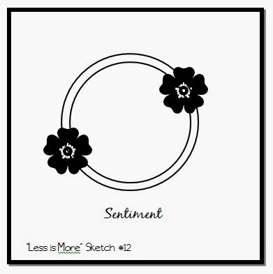
This week's challenge at Less is More is to create a card using the following sketch:


I didn't use a circle....but I think you can see the sketch in my card...


I used a linen card stock for my card.  I cut a square from a 4 x 5.25 panel and embossed the frame using a Spellbinder die.  The flowers are a die from Simon Says.  I cut the flowers from white card stock, then colored them with Copics.  For the background, I sponged a piece of the linen card stock with DI - salty ocean and mowed grass.  I adhered the flowers to the back of the front panel and then pop dotted the panel over the sponged background.  As a finishing touch, I punched the butterfly with a MS punch, colored it with Copics to match the blooms...added a few small pearls for the body and adhered it to the card front. The sentiment is stamped with HA Orange Soda using a stamp from HA.

I haven't shared any of my scrapbooking in a while, so I thought I'd start sharing a few layouts at the time.  I did this layout quite a while back, so I don't really remember much about the papers I used.


The little happy face people were cut using a Silhouette file.  I added color to them in the Silhouette program then used the print and cut feature of the program to cut them out.  The title work was made in the Silhouette program also.  I cut out 4 layers of the words, then glued them all together for a chipboard effect.  The little dragonfly was also a Silhouette cut file.  These are old photos of my children when they were quite young.  I believe my oldest was about 4 1/2 years old, my middle daughter was about 2 1/2 years old, and my son was about 6 months old.  Time has FLOWN by!!! They're all in their 30's now!!

Thanks so much for stopping by! Your comments and your visits are always appreciated!! Until next time...

Photobucket


Pin It!

Monday, April 21, 2014

Box Card & LIM 168

I've noticed quite a few "box" cards recently and I was intrigued, so I thought I'd give it a try.  I made one the other day for one of my granddaughters, and forgot to take a photo.  I have another granddaughter with a birthday on Sunday, so I made this one for her.


I used some American Crafts papers to decorate the pink box.  The fifteen was cut with some Quikutz dies. I cut the little 3-D bow with the Cameo.  The balloons were all stamped with a Simon Says stamp and cut out by hand...(I think I should have ordered the die that goes with these dies!)  I attached the balloons to thin strips of acetate and adhered them to the inside of the box.  Each of the balloons were painted with my wink of Stella clear glitter pen.  The "happy birthday" tag in the back was stamped then hand cut and adhered to the back of the box.  The back flap of the box does not fold down and I added a piece of plain white card stock to the back of that panel to stamp a sentiment...and I also included a little pocket on the bottom of that panel to slip a little money into.


Here's another view that you can see the shimmer on the balloons a little better.  I think this makes a really cute card and I'll probably make another one soon! If you're looking for a tutorial to make this box there's a really good one at Splitcoaststampers.

I made another card that works for the Less is More challenge this week   The theme this week is Makes me smile! It's simply that... something that makes you smile.  Well, no matter how often I use this adorable Penny Black stamp...it never fails to make me smile.  


I used a piece of sunny yellow for the card base.  I die cut an oval and adhered a white panel behind the oval.  I stamped the frog in the center of the oval, and colored him with Copics.  It's difficult to see here, but I also added some glitter with the wink of Stella clear glitter brush.  The sentiment was computer generated...and it's slightly off-center...but it's done now!  I used the font - problem secretary...which is also a bit of a "wobbly" font.  I cut an oval frame slightly larger than the oval center and adhered it to the top of the oval.  I also added glitter brush to the frame.  I rounded the bottom corners with a 3/8 inch corner rounder.

Thanks so much for stopping by! Your comments and your visits are always appreciated!! Until next time...
Photobucket


Pin It!

Thursday, October 10, 2013

It's Been a While....

I know it's been a while since I last posted.  Thank you for all your visits and the sweet comments you have left for me.  I'm crafting a little more now, but I still struggle with my crafting.  I haven't participated in the Less is More challenge in quite a while, but the theme of this week's challenge caught my eye, so I thought I'd give it a try.  

This is the first card I made for the challenge:  


I designed the "peace" frame in my Silhouette program and then cut it out with my Cameo.  I used a Memory Box die for the house and trees on the hill and then cut a reverse hill with an xacto knife.  I coated both "hills" with glamour dust for a lot of sparkle.  The background was embossed with the "snow" embossing folder.  I don't think it's available anymore.  The star is a Memory Box die that I cut out 4 times and glued together for added dimension.  The frame and the "hills" are on pop dots to give it a little dimension.  After I finished it, I thought perhaps it might not be CAS enough, so I made one more.


For this second card I used my Cameo to cut out two of the ornaments in white card stock, then glued the two layers together over a piece of fishing line to suspend it in the frame.  The background is again the snow embossing folder.  I cut the frame with the Cameo and put it on pop dots so that the ornament is suspended over the snow background.  The sentiment is from PTI and was stamped in silver.  I just cut a notch in each end of the sentiment strip and added it to the card with pop dots.  I coated the ornament with stickles and glamour dust.  It's really "sparkly" in real life!

Thanks so much for stopping by! Your comments and your visits are always appreciated!! Until next time...
Photobucket


Pin It!

Tuesday, July 16, 2013

LIM128 - Anything but a Square or Rectangle

It's been quite a while since I've posted.  I'm working on getting my life back on track right now so I haven't crafted in a while.  I wanted to get back to "normal"...whatever that is...and so I've made a card for the Less is More challenge this week.  If I don't make it to your blog to leave you a comment, please forgive me...I'm just not there yet.

Here's my card:


I made the card on my Cameo by welding the one and the eight together, making a mirror image and welding that together before cutting out the file. I stamped with a HA stamp in HA pale pink. Sentiment is from PTI and is heat embossed with black embossing powder.

I'd like to say thank you to all of you who have sent me cards and emails.  I appreciate each and every one of them.  I'm still working through some things, and I appreciate your continued thoughts and prayers.

Thanks so much for stopping by! Your comments and your visits are always appreciated!! Until next time...
Photobucket


Pin It!

Sunday, May 19, 2013

LIM120 - Our Favorite Pets & Freshly Made Sketches

Another Saturday's rolled around and it's time for my weekly challenge from Less is More.  This week is particularly difficult for me as I don't have stamps with animals on them!  So this week, I had to resort to digital stamps.  

At this point in our lives we don't have pets.  I've had pets off and on during my life, but after losing our last dog, Muffin, I just don't have the heart to get another pet.  Muffin lived to be 15 years old, which is quite old for a Pomeranian.  She was the cutest little ball of fur you've ever seen...all 4.5 pounds of her!  I've never had a cat as a pet except when I was a child.  We always had a cat or two around the house...and usually 3-4 dogs!  Anyway...on to my cards for this week's challenge.


This first card is probably one of my favorite digital stamps.  The image is from Mo's Digital Pencil.  I remember holding a cat like that when I was a child...and obviously the cat is less than thrilled! I printed the image on white card stock and cut out a panel with a Spellbinder die.  I colored the image with Copics, and popped it on a dark blue card base.  The sentiment is from Simon Says and is heat embossed in white. The bottom corners of the card base were rounded with the corner chomper.


This next card was a coloring page that I re-sized to fit my card.  I printed the image on white card stock and only colored portions of it with Copics.  I know the focus is on pets this week, so I only wanted to highlight the puppy.  Actually, I think it turned out kind of cool with only parts of it colored. I pop dotted the image on a piece of red and then adhered the red piece to a white panel .  I stamped the sentiment from Simon Says and added a couple of scored lines below the sentiment and above the red panel and used a ticket punch for the corners of the white panel and the image panel.  I used a Simon Say die to cut the small heart, then added it with a pop dot and coated it with glossy accents.


This card also fits the challenge at Freshly Made Sketches this week. Here's the sketch for the challenge.  I'm not sure where this image is from, I believe it is a coloring page that I re-sized to fit my card.  I made my card base from kraft card stock.  I printed the image on white card stock, and colored it with Copics.  I backed the image with a darker brown paper, and adhered a brown ribbon around the panel.  The sentiment is from Flourishes and is stamped in Memento black.  The bottom corners were rounded with a corner chomper.


Thanks so much for stopping by! Your comments and your visits are always appreciated!! Until next time...
Photobucket


Pin It!

Saturday, May 11, 2013

Less is More 119...one layer week

And just like that another week has rolled around and it's Saturday again!  This week is one layer card week at Less is More.  Chrissie and Jen have challenged us to make a one layer card (i.e., one piece of card stock folded in half) and to use a colored card base (no white, ivory, black or Kraft colored card blanks).  What to do, what to do???

Here's what I've come up with for this week's challenge:


These first two cards blanks were made with a piece of navy speckled card stock that I've had in my stash forever!  At first I thought something was wrong with the card stock until I realized that the speckles were suppose to be in the paper! LOL!  

For the first card, I stamped with white pigment ink from Memories (unicorn).  It's one of the best white inks I've ever used.  You do have to make sure it dry before doing anything to it.  After I dried it with my heat gun, I colored the butterfly with Derwent Inktense pencils and lightly moved the color around with a wet paintbrush.  Since this card base isn't watercolor paper, I had to be very careful not to get too much water on the paper.  The sentiment is from PTI, stamped in white and heat embossed with clear embossing powder. I rounded the bottom corners with the 1/4 inch corner chomper.

I found a new product recently and wanted to try it out on this butterfly.  I used a ZIG Wink of Stella GLITTER CLEAR Brush Tip Marker.  It works like a water brush and the glitter goes on beautifully!  I got the brush in clear, silver, and gold...and now I see that there are glitter brushes in several colors!  Might need a little retail therapy soon! 


As mentioned above, this card was made with another piece of the navy speckled card stock.  I stamped the poke leaves from PTI in SU illuminate ink (like Versamark but with a glitter).  It could also be used for tone on tone stamping too.  Anyway...back to the card.  After stamping the leaves and berries, I applied pearl-ex powder in bright yellow...only once applied to the illuminate ink it appears to be a golden color.  The sentiment is from PTI and was also stamped in the illuminate ink and brushed with the pearl-ex powder.  I'm not sure you can tell from the photo, but the pearl-ex powder has a glimmery look...as does the ink...so the card is very glimmery IRL. The corners were rounded with a corner chomper.


For my third card, I used a double stamping technique that I saw in the recent His & Hers online card class.  I used a bright gold card stock for the card base.  The leaves and berry stamps are from Paper Smooches.  I masked off the top portion of the card and stamped the leaves in Memento peanut brittle ink, then over-stamped (a little off on purpose) with the white Memories (unicorn) pigment ink.  I added a solid line across the top of the leaves with a Memento's pen (potter's clay) after removing the mask.  The sentiment is from Hero Arts and is stamped in Memento's potter's clay.  As an afterthought, I decided to add a touch of glitter with my new glitter brush across the solid line and on the darkest part of the berries.  The corners were punched with a deco corner chomper.


Don't know if I'm really "crazy" about this card, but thought I'd add it anyway.  I used a red textured card base. I masked off the bottom of the card and stamped the flower from PTI so that half of the flower would be showing.  I stamped in Versafine onyx black.  I added a solid black line with a black distress marker, and a white dashed line with a Signo white pen.  The sentiment is also from PTI and is stamped in Versafine onyx black.  I  colored the flower with some Prisma pencils and didn't like it, so I colored over that with some watercolor pencils and touched it with a damp paintbrush to push the color around a bit.  For the center circles on the flower, I painted them with the glitter brush...then added a few white flicks of the pen around the edges and in the very center of the flower.  I rounded the corners with the 1/2 inch corner chomper.

Thanks so much for stopping by! Your comments and your visits are always appreciated!! Until next time...

Hugs!

Photobucket


Pin It!

Sunday, May 5, 2013

LIM 118 ---Wild with Color


The challenge this week at Less is More is to create a card using opposing colors on the color wheel. 


I seem to always have trouble with a color challenge...don't have any idea why..but it really is the most difficult for me, I think.  Anyway...here's what I finally came up with.....


I also used some of the techniques we learned this week in the His & Hers online card class.  For this first card, I masked off the top portion of the car and stamped the image in white on Kraft card stock.  I then masked off a small line at the top of the stamped image and inked it up with some white.  After the ink was completely dry, I colored the image with Prisma color pencils and used the opposing colors violet and yellow.   I mounted the kraft panel to a violet card base.


For this second card I used the colors yellow-green and violet-red.  It looks kind of pink on here, but this card front was made with watercolor paper.  I stamped the flowers in a light ink, then added the water colors.  After the panel dried, I outlined the stamped image with a black pen to give it a little pop.  The sentiment was stamped on vellum and embossed in white. In order to really capture the colors for the challenge, I added strips of color around the panel in yellow-green and violet-red.  I also used my paint brush to splatter drops of the two colors over the stamped image.


This is another card I made using techniques from the His and Hers class.  I colored strips of vellum with Copic markers, cut them in varying lengths and adhered them to a white card panel.  I stamped "birthday" on a strip of vellum and adhered it around the card panel. The word "happy" was cut with alpha dies from Simon Says Stamps and are adhered over the vellum strips.  I used the opposing colors blue and orange for this card.


I think this last card is starting to grow on me now.  I wasn't too sure I liked it at first, but it's getting better! LOL!  I used opposing colors blue-violet and yellow-orange for this card.  I use my large Memory Box (Chloe) butterfly die to embossed a white panel (4 x 5.25 inches).  I colored the butterfly with Copics, then added a little sparkle in the "grooves" with a clear star pen (Sakura).  I wanted to add just a little more zip...so I painted over the coloring with some twinkling H20 paints. Since I wasn't using water color paper I was afraid it would not work...but laying the Copic ink down first seemed to help.  I added a light yellow-orange shadow around the butterfly. The sentiment is from Simon Says Stamps. I layered the panel on a piece of yellow-orange paper and adhered it to a white card base. Is it CAS enough??

Thanks so much for stopping by! Your comments and your visits are always appreciated!! Until next time...

Hugs!

Photobucket


Pin It!

LinkWithin

Related Posts with Thumbnails