Showing posts with label Paper Smooches. Show all posts

Thursday, December 15, 2016

Whoosh....It's Almost Christmas!

Seems as though we just got started on 2016....and here we are at Christmas 2016 already!  WHERE does the time go!  I've been SO busy since Thanksgiving!  There were presents to buy, house to decorate, food to cook, presents to wrap, company coming, baking yet to be done, birthdays galore...and more! I hosted the annual Christmas party for the widows group from my church...we had 16 in attendance.  I cooked a great meal for everyone, we played games, wrote Christmas cards to the home bound folks from church, and did a lot of talking and visiting.  After 4 hours, I was exhausted!...but a good kind of exhausted

In between all these chores (okay, some of the chores were fun), I managed to make a few Christmas cards (which I've yet to address and mail!)...Thought I'd share them with you today.  This will be a PHOTO HEAVY post for sure! To view any of the cards larger, just click on the image.


I'd list all the products used for the cards, but you'd still be trying to read through this blog post next week!  So....if you have any questions about products or techniques on any of the cards, just click on the envelope at the top of the blog that says contact me, and shoot me an email with your question and I'll get back to you as soon as I can!

If you've hung in this long...you're a real trooper!  Thanks a $Million!

As always, thanks so much for stopping in.  I appreciate your visit...and I appreciate each and every comment!
Photobucket


Pin It!

Saturday, October 8, 2016

One-Layer Simplicity Challenge #32 and The Flower Challenge #1

This is my second post for today....I have a two cards to share with you...one for the One-Layer Simplicity Challenge #32 and the other for a new challenge at The Flower Challenge #1.....So let's get started!

     OLSWe would love you to display our banner !


This was a fun card to create.  I haven't done much ink blending lately (mostly because I've been playing with my water colors!).  I masked off the rectangle in the center with some post-it tape and blended some distress inks (candy apple red, carved pumpkin, and squeezed lemonade).  I removed the post-it tape and stamped the silhouette image from Paper Smooches in versafine black.  After making sure the distress ink was completely dry, I stamped the sentiment from SSS and heat embossed it in white. I added the faux stitched border with a dark orange memento marker.  Super simple card...but I love how it turned out.

And now...here's the card for the Flower Challenge....


I absolute LOVE this flower from Penny Black!  I stamped it on Bristol paper and colored it with Zig Clean Color Markers.  Then....I fussy cut this flower!  Those tiny stems are VERY fragile!  I also used a black marker to color all of the edges of the image after I cut it out.  I cut a panel of white card stock about 4 x 5.5 inches and used an embossing folder (Tim Holtz, I think) to emboss the bricks.  I cut the center of the panel out using an oval die from Spellbinders BEFORE putting it in the embossing folder.  I used a little distress ink on the card base for the background and some splatters from the ink as well as some water splatters.  The sentiment is from Winnie and Walter...stamped in black.  I fussy cut the word hello and then cut a small rectangle for the word friend. Both words are adhered directly to the brick panel. I slipped the flower behind the oval and popped ups the blooms with some foam tape. I added a dark pink border down each sided of the card (it actually matches the blooms IRL!).

I know I'm going to love this flower challenge!  It seems that most of my cards feature a flower of some kind!

As always, thanks so much for stopping in.  I appreciate your visit...and I appreciate each and every comment!
Photobucket


Pin It!

Saturday, April 7, 2012

LIM62 - A Little Green...

It's time for a new challenge at Less is More.  This week Chrissie and Mandi have given us a color challenge, which is to use at least three different shades of green on a card.  I had a little free time this afternoon, so I got my cards finished in record time!

Last week was so hectic that I didn't get my cards posted until Thursday, so I'm really early this week!


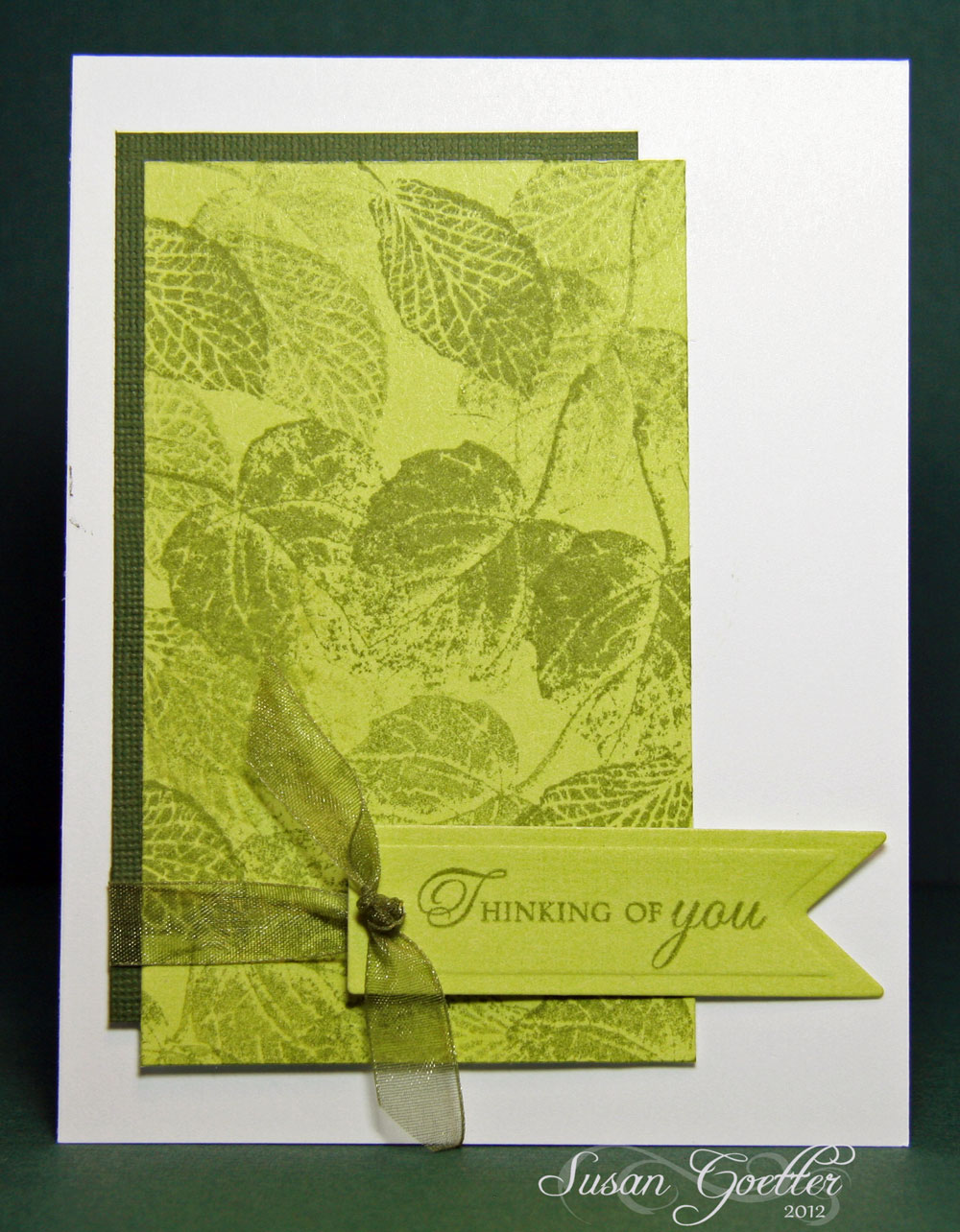
For my first card, I stamped leaves from SU French Foliage collection in two shades of green (peeled paint and shabby shutters DI) on a piece of light green card stock. Then I backed it with a dark green card stock.  The tag was stamped (on the same light green as the leaves) with a PTI sentiment in peeled paint and then cut out with a Spellbinder die.  I punched a hole in the tag and wrapped the ribbon around the two layers of green and brought both ends up through the hole and tied a knot.  I really like how this turned out.


Chrissie and Mandi, you might think that this next card is not CAS enough, but I kind of like how it turned out.  I used a MB window and window box die.  The siding is just strips of green card stock that I inked the edges and then overlapped the edges like siding on a house.  The flowers are also MB dies.  I colored the window box with Copics as well as the flowers.  The curtains were made by gathering a piece of ribbon for the top and then making some of the ribbon swag down the sides of the window.  Window box is pop dotted as is the window.  The sentiment is from Flourishes and is stamped in peeled paint.


This next card was made by masking off a section with post it notes and inking with peeled paint distress ink.  The grass is a PTI stamp as is the sentiment.  The butterfly is a Spellbinder die that is layered. The body of the butterfly is part of the MB die set.  I also added some green stickles to the butterfly.


This last card was just an afterthought, and I'm not sure I should have posted it.  I used a Paper Smooches chevron stamp to stamp in peeled paint, then used my Copics to color in the different greens.  Sentiment is from PTI.  Super quick and simple card.


I also finished a layout last night, and thought I'd share it tool


Photo of my dgc, Allen, Helen Grace, and Pierce. My son took this photo with his cell phone and I think it's a great pic of the three of them. I used Echo Park - This and That for this layout. The butterfly is a Memory Box die. The "stars" were printed and cut out with the Cameo, then I colored them with Copics and added some glitter to the edges. The banner is just strips of the patterned paper. I punched the "v" out of each end with a square punch. I made the photo corner by cutting several of the same corners and layering them for dimension. The banner on the bottom was cut in one long strip, then I folded it on each end to make it have more dimension. I did quite a bit of faux stitching with a pen, and the stitching on the banner tags was done by piercing the paper and connecting the holes with a black pen. The little diamond strip under the photo was cut from the patterned paper using a circle punch ...super simple! I added a few dots of liquid pearls. Title word is some Thickers from my stash. Journaling is tucked behind the photo and reads: 


In March 2012, your Mama had just started her new job . For the first several months of her job, she had to travel each week to a different city to complete her training. She would usually fly out on Sunday and fly home every Friday. Your Daddy spent the week working and taking care of you all (and Uncle Thomas came over sometimes during the week to help out). On Fridays, your Daddy would pick you up from daycare so that all of you could go to the airport to welcome your Mama home. One Friday, you were a little early getting to the airport, so your Daddy took you to the park to let you play for a little while. While he was there, he snapped this picture of the three of you with his cell phone, and sent me a copy of the photo. This is such a great picture of the three of you! Just look at those happy faces! 


Thanks so much for stopping by!  Maybe this week will be calmer and I can get around to visit all the other fab entries in this challenge!  I truly appreciate your comments...just what I need to brighten my day!  Until next time...

Hugs!
Photobucket


Pin It!

Thursday, March 22, 2012

OLW84 - Pink and Orange

This week's One Layer Wednesday challenge is hosted by Susan at Simplicity.  I must say the challenge this week is not a favorite of mine.  I really don't care for pink and orange together.  Susan's card is fabulous, but I can never get these two colors to go together! Of course, my other problem is that I really don't like to stamp images in color....I much prefer to stamp in black or brown and color my images.  But...it is a challenge and so I wanted to give it a chance.  Here's my take...such as it is. 

 This first card is made using a background stamp from Paper Smooches.  I can't decide if I like these stamps or not.  I can never seem to get a clean stamped image when I use them.  I stamped the image in pale pink, then filled in several of the hexagons with an orange marker and then others with a pink marker.  The sentiment is from Flourishes and was stamped in black.  I also added a touch of glossy accents to the orange hexagons...and for some reason that made them look red, but honestly, they are orange!


My second attempt isn't much better.  I used an image from PTI and stamped it in pink and orange.  I was going to just use it as a border with two lines of the image, but then decided that looked "unfinished", so I added some random stamps across the card, leaving a space to insert the sentiment. Sentiment is from Flourishes and is stamped in orange.

Like I said...not too happy with my cards this week and they may end up in the trash, but I did give it a try!

Thanks so much for stopping by!! Your comments are much appreciated!! Until next time...

Hugs! 
Photobucket


Pin It!

Wednesday, June 15, 2011

OLW58 - Yellow, Orange, and Aqua

We have a new challenge this week from Susan at Simplicity.  Our challenge this week is to make a one layer card using the colors yellow, orange, and aqua.  The only difficult thing about the challenge this week was trying to decide what I wanted to color yellow, orange, and aqua!  I finally decided to use the Inkadinkado fish stamps I got a few weeks ago. I have no idea why I wanted fish stamps, but they seem to leap in my basket without me knowing it....really! I actually made two cards, the first one I wasn't overjoyed with, so I did another one and added a little more to it.  I think I'll show you my second card first...


I used a vertical fold card base (BTW, am I the only one that makes my own card base? Do you buy your card base, and if so, where?  I really like the vertical fold better than a horizontal fold...no idea why, I just do).  Now...back to the card.  I've been practicing with my brayer...see?  I actually did it without getting the dreaded lines across my card! YAY ME!  For this card, I stamped my fish with black Memento, then colored them with twinkling H2Os.  I rarely use the h2os but, I thought I'd give it a try on these fish.  I also cut a mask from paper to cover the fish while I brayered the tempting turquoise on to the card stock.  The sentiment is from Paper Smooches, and kind of fit the fish theme.

Okay, now here's the first card I did...


I used a "water" stamp that I've had for a while and stamped the little water lines, but then decided I just didn't like it very much.  I definitely like it better with 2 fish and the brayered water.

And last but not least, I also made a card for the technique challenge at Splitcoast which was to make a patchwork card.  Since I used to quilt (many moons ago), I decided to make a quilt block with the Ohio Star pattern.  After I adhered the paper pieces to a piece of card stock, I embossed it with a SU embossing folder.  Kinda cool....huh!


Playing along in all the different challenges has really made me step out of my comfort zone...and in the process, I've learned a lot.  If you haven't played in a card challenge, you should give it a try.  I still love to scrapbook and do it often, but card making is a source of instant gratification.  A layout may take me 4-5 hours (and sometimes I piddle with it for several days!), but a card is usually finished in under an hour. Like I said, instant gratification.

Thanks so much for stopping by! I appreciate all your comments...they make my day!  Until next time....

Hugs!


Pin It!

Saturday, April 9, 2011

LIM10 - Focus on the Sentiment

It Saturday, and time once again for the Less is More Challenge.  Our challenge this week is to  make the sentiment the focal point of the card.  These challenges have really made me put my thinking cap on!  In fact, for this week's challenge, I couldn't make up my mind what to do!  I can't wait to see what everyone is posting for this challenge!  You really should pop over to Less is More and check out the challenge and all the beautiful entries!

Putting the focus on the sentiment is so different from what I would normally do.  So....off we go! I ended up making four very different cards, and I'm not sure that I'm totally thrilled with any of them.  So you can tell me if you have a favorite.

This card was the first idea that I had.  I stamped the sentiment (I think it's Hero Arts) in versamark and black and embossed it with clear embossing powder.  Then I stamped the butterfly image (no idea who makes it!) with versamark, then with a paintbrush, I lightly brushed on some Pearl-ex in a teal-blue.  I thought it would be a lighter shade of teal, but I was wrong.  So...not completely satisfied, I moved on to the next one...

I found another stamp (the flowers - no idea who makes it) and decided to stamp it with versamark and brush lightly with a soft green Pearl-Ex powder.  I also added the butterfly stamped with versamark and brushed with the Pearl-Ex powder.  The trail of the butterfly was done with a versamark pen.  I was trying to get it to look more like a watermark than a stamped image.  Then I stamped the same sentiment as in the first card with Memento's black.

I'm kind of leaning toward this card as the one I like the best.  Remember the old brass stencils that you had to use a light box to emboss with?  Well, the border around this card was hand embossed with a stylus and one of those little brass stencils.  I had to keep moving the card around on the stencil to be able to do all the edges as the stencil is a rectangle of about 2 inches by 3 inches.  The sentiment is also from the same set as the first two cards.  When I finished stamping the sentiment, I decided that the card just need a little something else...so using a glue pen, I added glue and white glitter dust to all the leaves...I think it did add a little pizazz to the card. 

For my last effort, I made a cutesy card.  The sentiment stamp is from Paper Smooches and the cupcake is from Hero Arts.  I stamped the sentiment in SUs Tempting Turquoise. I stamped the cupcake in Memento black. I colored the cherry with a red Copics and the cupcake paper with a tan Copics marker.  Still a little blah....so I used my glue pen and traced the word celebrate and added some Martha Stewart teal glitter. I also added a little teal glitter as sprinkles on the cupcake. Then to bring it all together, I added a border about 1/2 inch from the edge of the card.

As you can see, I was jumping from one thing to the next, but I just couldn't make up my mind.  Therefore, you get to see all my trials! LOL! 

Oh! Sharing some happy news!  This past Monday, I was a featured designer on the Bo Bunny blog.  They featured a little bio on me and two of my layouts! 

Thanks so much for stopping by! Your comments are much appreciated!  Until next time....

Hugs!


Pin It!

Saturday, February 26, 2011

Less is More - A Recipe for 3 Squares

Happy Saturday and welcome to my blog! I've been playing in my craft room most of the day and enjoying every minute of it!  I've been working on my card(s) for the Less is More challenge, hosted by Mandi and Chrissie.  Our challenge this week was to make a card using 3 squares.  I've probably made about 7 cards, but these two are the only two I kept.  I know...I'm my own worse critic.  This first card is just a fun card I made for one of my grandsons who will be turning 7 years old in just a couple of weeks.

The fish stamp and the sentiment on this card is from Paper Smooches.  Now, I don't usually do cutesy cards, but these cute stamps really spoke to me.  I cut three 1 1/2 squares from white card stock.  I stamped the fish in black Memento ink, then colored the fishes with my Copics.  Then I used a sponge and inked up the backgrounds of each square.  I also added a "googly eye" to each of the fish. With two different size hole punches, I punched a couple of holes above each fish and then carried the "bubbles" on up above the squares by drawing little circles and highlighting them with a light grey Copic marker. The three squares are pop-dotted off the card. 

For my second card, I found a really old (and now I know that it's dull) punch in my stash and punched three shapes down the side of the card. Then, using my scalloped edge punch, I punched the right, front edge of the card. I backed the punched out areas with a bright pink (and for whatever reason it looks red on here) that was also punched with the scallop punch.  I used a Papertrey Ink sentiment and offset it between two of the punched out shapes.  A small piece of bling to the center of each shape...and I'm done!

Now I'm off to check out the other challenge entries.  Everyone has such beautiful work...can't wait to see what everyone has been up to!

Thanks so much for stopping by! Thanks SO much for all the wonderful comments! Until next time....

Hugs!


Pin It!

LinkWithin

Related Posts with Thumbnails