Showing posts with label Flourishes stamps. Show all posts

Saturday, August 20, 2016

Practicing Watercolor and More

I've been working on trying to improve my water coloring capabilities. I think I might be getting just a "little" better!  


Using Altenew Peony Bouquet stamp set.  I stamped the bloom in a light distress ink, masked that bloom and stamped another bloom right beside it.  I masked off the blooms to added the leaves, which were stamped in light green distress ink.  I think I try to work the water colors (in this case distress ink) too much.  I cut the panel down, added some splatters, and popped it over a card base with on side covered in a green card stock. The sentiment is from SSS Uplifting Thoughts, stamped with versamark and heat embossed with liquid platinum embossing powder. (and would you look at that!  I adhered it crooked!!!  Maybe no one will notice! LOL!)


So...I thought I'd try the same bloom again.  This time I used distress inks again, but I used a lighter hand with the water.  I think it might be just a bit better blended than the first one. I like the leaves on this one better too.  Used the same stamp set.  I used some Nuvo pearl drops and a few spots of Irresistible in silver.  Popped it on a card base with craft foam. 


This was my third attempt at water coloring.  I used the Altenew Beautiful Day stamp set (LOVE this set!)  I stamped the blooms (using masking) with distress ink (Peacock Feathers), then worked on my blending again.  "Maybe" a little better? Didn't do a great job with the leaves...but I think I'm getting there!  Sentiment is from SSS Flower Friends.  Popped on a card base with a teal strip on one side.

Thought I'd add in a couple of cards that I actually made for challenges, but never got around to posting them.  I'm slow like that sometimes! :)


Super quick and easy card...I think I actually made this card for CASology "dizzy" challenge.  You know....when you're dizzy, you sometimes see spots?  Right?  Anyway, I just stamped random dots with several colors of ink from MFT, then added some white dots on the top of that.  Added a few drops of different colors of  Nuvo.  I really love this stuff!  Makes perfect drops....every time!  Simon Says has lots of different colors!  I wanted them all, but I restrained myself...you know, it's that whole fixed income thing!  I'm sure many of you can relate!


I really can't remember which challenge I made this one for...but it was a perfect fit...I do remember that!  I cut a card stock panel to 4.25 x 5.5 inches and cut a stitched circle from the center of the panel.  This particular die from Simon Says cuts stitching on both the inside circle and the outside circle.  The image is from a very old Flourishes stamp.  I colored the image with Copics and then sprayed a light mist of Shimmer Mist over the entire card.  There really is a pretty sparkle on the card...even though I can't seem to get it to photograph!  The sentiment is from the same Flourishes stamp set.  I popped the big panel on craft foam and then pushed the circle down into the opening.

That's it for me today.  Hope you'll leave a comment...If you regularly follow my blog do you think my water coloring is improving?

Thanks so much for stopping in.  I appreciate your visit...and I appreciate each and every comment!
Photobucket


Pin It!

Sunday, January 20, 2013

LIM 103 - Friends (and Addicted to CAS)

It's time again for this week's challenge at Less is More.  This week is theme week and we've been challenged to create a card(s) using the theme "friends".

I had a couple of hours to play in my craft room today...and here's my cards for the challenge:


All the images I used this week are digi images!  I don't think I've done that before.  I really like the way this first card turned out.  The image is from Mo's. I printed it on white card stock, then cut it out with a Spellbinder die.  I used the largest die in this set to emboss a large frame on the card base, then popped the smaller die cut on top of the card.  Image was colored with Copics.  Sentiment is from Hero Arts.

Edited to add:  It's be brought to my attention that this first card also fits the Addicted to CAS challenge this week, which is embossing...so I think I'l throw my hat in the ring for this challenge too!


Hope this card has enough white space.  I have no idea where I got this image, and I've never used it.  It's seemed perfect for this challenge.  Printed the image on white card stock, colored it with Copics, then trimmed it down to about 2.5 x 3.5" and mounted it on a piece of green textured card stock.  The sentiment is from Hero Arts.  I adhered a piece of green ribbon under the image and added the "hello friend" tag and attached a small bow.  The inside of the card reads:  "A friend is someone who knows the song in your heart and can sing it back to you when you have forgotten the words."


This last card might not be quite CAS enough.  I printed the image (again no idea where it came from) on white card stock, then cut it out using a circle die.  I used a large Spellbinder scallop die to cut a background, then made a round card base.  The image was colored with Copics and I added a ribbon for the "ground".  Then sentiment is from Flourishes.  I popped the image panel on top of the scalloped die cut.

I had terrible time with my photography today....after I finished taking all my photos (and cleaning them up a bit) I realized that I'd been using "manual" mode! Duh!  That's great for outside shots when the weather's beautiful...but doesn't work well for me indoors when it's dark outside!

Thanks so much for stopping by! As always, I truly appreciate you taking the time to stop by for a visit and I really appreciate your comments!  Until next time....

Hugs!
Photobucket


Pin It!

Sunday, November 11, 2012

LIM93 - Houses....and more Houses

Since Mandi is still working hard at her new business, we have a new face hosting the Less is More challenge this week along with our very own, Chrissie.  Welcome, Jen.  Be sure to go by Jen's blog to check out all of her beautiful work! (Make sure you visit Chrissie's blog too...as she usually has another card or two there that are definitely worth taking a peek at!  This week's challenge at Less is More is to create a one layer card with the theme of houses.  I quickly dug through all my stamps and found as many houses as I could...sadly..not too many, so I had to put my thinking cap on.  Here's what I finally came up with...


I can't decide if I have a favorite this week, although I did like the way this first one turned out.  The little houses are from a Maya Road stamp set that I've had for years, and probably haven't inked up!  I stamped each house in black, then drew a line to ground them.  I left spaces between some of the houses so that I could add some trees.  I drew the tress with a black marker, then added leaves by dotting with my DI markers.  I even added a few leaves on the ground.  I tried to use my water brush to blend the leaf colors a bit, but I think it would probably work better if I'd been using watercolor paper.  The sentiment was just handwritten with a black pen.  Oh...I decided not to color the houses...just some lighting in the windows and a couple of red doors.


I seem to have several light house stamps, so I used a couple of them on these next two cards.  This image is from Flourishes. I stamped it in black and colored with Copics.  Sentiment is from PTI.


This image is from GinaK Designs and I don't believe I'd inked up the light house previously, although I have used the birds before.  Sentiment is from PTI.  Super quick and simple one layer card. Colored with Copics.


After I'd already taken photos of the first three cards, I decided at the last minute to make another card with this "cutesy" stamp set.  I had to have this stamp set from Lawn Fawn, although I don't know why now...but each of the images on this card is a separate stamp, so I had to do a lot of masking.  I used bright happy colors of Copics to color the images.  You can't really see it too well on here, but I also added some sparkle with the Sakura clear star pen.

Thanks so much for stopping by!  I apologize for not getting around to everyone last week to peek at your beautiful cards, but I felt so bad it took all I could do to get my cards posted.  I do appreciate the well wishes from those of you who left me comments last week.  I'm feeling somewhat better now, although I still don't think I'm completely over the bronchitis yet...still got a few more days on the antibiotics.  Again...thanks for all your wonderful comments....until next time...

Hugs!
Photobucket


Pin It!

Monday, October 15, 2012

LIM89 - Winged Creatures

As always, a new diabolical exciting challenge was posted on Saturday by our great hosts, Chrissie and Mandi of Less is More fame.  This week is the dreaded (maybe not so much anymore) one layer challenge and we've been challenged to create a one layer card with a theme of "things with wings".  While there are many "winged" things, I stayed with the usual - butterflies and birds....I know, I took the easy way out! LOL!

Here are my humble offerings for this week's challenge.  Listed below are my cards in the order of my favorites for this week:


The butterfly is from HA and was stamped in black Memento and colored with Copic markers.  The sentiment is from PTI.  Simple...and very quick, but I do love how it turned out.


This one was a little more difficult because of the partial embossing, but after two tries I finally got it right!.  The image is from Flourishes and is colored with Copics.  The sentiment is from PTI.  I dotted each of the berries with some crystal lacquer and touched up the branches with a little of the white Copic paint.  I used the dotted embossing folder and to do the partial embossing, I used a technique that I've described here.


This was another simple card.   I used a SU image that I've had for a while but had never inked up.  I colored the stamp with markers so I could have red birds.  I embossed an oval with a Spellbinder die and stamped the image inside the oval.  The sentiment is from PTI.  After stamping, I used a mask and lightly dusted the background with a bit of blue for the winter sky.  You can't really see it on here, but I used a clear star glitter pen on the branches...looks cool in real life.


I made this card a 4 x 4 card.  The image and sentiments are both from Flourishes.  I stamped in black Memento and colored with Copic markers. Very quick and easy card (except for the inky fingers I seem to be plagued with!).  I think I made this card two times, also! LOL!


I'm thrown these next two cards in just for fun (are these penguins considered "winged"?)...just more Christmas cards for my stash.  This first on is from an old SU wheel.  I took the stamp off the wheel and added tacky to the back of it so that I could use it on an acrylic block.  Never could get those wheels to stamp straight!  The sentiment is from PTI and I colored the penguins with Copics.


This cute little guy is a little fuzzy for some reason.  He's from a Collections set (I believe that's a Michael's brand stamp).  Sentiment is from PTI.  I drew some lines with a silver pen (for the ice ... cool huh?)  Then I added just a few stickles, which you can't really see from this card...looks kinda cute though.

Bet you thought I'd never finish! HA!  Well, that's all for me today...I got kind of carried away with my winged friends!  Thanks a million for stopping by!  Your comments are always welcomed and appreciated!! Until next time....

Hugs!
Photobucket


Pin It!

Saturday, September 29, 2012

CASology - Cue Word - Shoe

The cue word at CASology this week is SHOE.  


Boy, that's a tough one for me!  I searched and searched through my stamps trying to find something that would work for this challenge. Unfortunately, the only stamps I have are stamps that I've used often, and they just didn't inspire me like I thought they would....but I gave it my best shot anyway! LOL!


I've used these baby booties on numerous cards, so I turned once again to this image.  I embossed a white panel with the dotted folder, cut a Spellbinder floral oval, then a smaller oval in blue.  The shoes were stamped and cut out and lightly colored with Copics.  Sentiment was made on the computer, then printed and cut out.  I added two small pieces of bling to the tag.  I also added a teeny little blue border behind the white dotted panel.  The oval and booties are pop dotted for dimension.


Then I found this rain boot stamp (Flourishes).  Stamped the boots, colored them and cut them out.  I made the floor by embossing a piece of brown card stock, then cutting it into strips and inking the edges. Then I just paper pieced the "boards" and added a few brown dots to look like nails.  I popped the boots on top of the floor and added a little grey coloring around the boots and on the floor to resemble water puddles.  Then I really messed up and decided to add some "rain" with another stamp in the collection.  I stamped it numerous times as one stamp was so small of a "rain shower", but now I'm not so sure I like it.  Sentiment is also from Flourishes.

 I also found this witches boot from another Flourishes set.  There was only the boot on the right, so I had to stamp it off on a piece of acrylic and the mirror image it.  After I got it stamped twice, I managed to get ink smudged on the edge of the card.  The reason I didn't make a card with these boots is that I couldn't think of a single sentiment that I could use.  I don't really get into Halloween...not my favorite holiday.  The extent of my "Halloween" is usually pumpkins on the front porch and handing out candy to the grand kids and some of the neighborhood kids.  I thought about making a wedding card with these boots with a sentiment like...."love you so much (outside)....it makes my toes curl" (inside of card).  Finally, I just decided to quit on this idea! LOL!


Not being totally satisfied I went in search of something different.  I found this old .pdf file on my computer with a shoe on it.  I piddled around with it until I managed to get it into my Silhouette program.  Then I made a mirror image of the shoe and welded the back of the heel together to make a folding card.  Then I simply cut out the pieces for the shoe and paper pieced them over the top of the card base...yes, it took a while, but once I got the image all set up in the Silhouette program, the rest was a snap!  The sentiment is from PTI and the bling added to the top of the shoe is from Prima.  I also added a bit of white doodling.

I'm not sure which is my favorite...what about you?

Thanks a million for stopping by!  I truly appreciate all your wonderful comments! Until next time...

Hugs!
Photobucket


Pin It!

Sunday, September 23, 2012

LIM86 - Let's get Cooking!

The weekly challenge this week at Less is More is one of my favorites.  This week is "recipe" week, and we get to create cards using any of the requirements from any of the 85 previous challenges!  How fun is that! I'm finally getting back a bit of my mojo that seemed to have been on vacation for the past few weeks...so here we go...


This week's challenge was a great opportunity to get started on some of my Christmas cards. For this first card, I used my new Flourishes stamp (you can also get the Silhouette cut file to go with it). I cut the shape on the cameo, colored with Copics, then added a touch of sparkle with some glamour dust. The sentiment is from the same Flourishes collection and is stamped in versamark and embossed in gold.  This card fits:  Challenge 55 - Die Cuts, Challenge 47 - Just one word, and Challenge 15 - embossing.


This was actually the last card I made, but I really like how it turned out.  The ornament is cut with a Spellbinder die. I doodled the design on the ornament, then ran it through my sticker machine with the doodled side down, then dipped it in glamour dust for a glittery look.  The white panel behind it was embossed with the PTI texture embossing plate.  The sentiment is from SU and is stamped on a Spellbinder die cut that actually only has one "cut" end...I just cut out half the die shape, turned the die around and cut out the other end and embossed it with basically the same steps.  I also added tiny strips of gold around the sentiment tag and the embossed textured background.  This card fits:  Challenge 55 - Die Cuts, Challenge 63 - doodling, Challenge 9 - touch of red, and Challenge 15 - embossing.


I wasn't too happy with the way this card turned out, but it's usable.  The silhouette images were cut with the Cameo.  I cut an oval with a Spellbinder die, masked the center with the negative paper, and sponged in some blue inks.  The star is a MB die and is coated with glamour dust and glossy accents.  I managed to get ink on the edges of the card, so I just sponged all the edges lightly with some of the blue ink.  This card fits:  Challenge 55 - Die Cuts, Challenge 85 - ovals, Challenge 59, masking, and Challenge 28 - inking.


Love how bright and cheerful this card turned out.  I cut the word JOY with the Cameo, the greenery was also cut with the Cameo, then stamped with and image from the new Flourishes Christmas stamp collection and colored with Copics.  The word "joy" is popped off the card as is the greenery.  This card fits:  Challenge 55 - Die Cuts, Challenge 47 - Just one word, and Challenge 56 - using scraps.


This last card was made with something I pulled out of my "later" box.  The strip across the card was originally on a one layer card that I managed to muck up with inky fingers, so I had cut this strip off the old card and put it in my "later" box.  This card was super simple.  I adhered the strip with the butterflies (from my "later" box) to a white card base, scored a line above the panel and below the panel, then stamped the sentiment in black.  The sentiment is from Sweet n Sassy stamps. This card fits:  Challenge 55 - embossing, Challenge 56 - scraps, Challenge 29 - things that move, Challenge 58 - script, and Challenge 28 - use ink. 

That's my take on this week's challenge.  Thanks so much for stopping by! Your comments are always welcomed and appreciated!  Until next time...

Hugs!
Photobucket


Pin It!

Sunday, September 16, 2012

LIM85 - Ovals

This week's theme at Less is More is to create a clean and simple card and to incorporate an oval on the card.  As challenges go, this week Chrissie and Mandi are taking it easy on us...~wink~...come on join in the fun and get your "oval" on!

I've only completed 4 cards for this week's challenge...I think I'm slipping! LOL!  And now...let's start off with my favorite card.


Super simple...cut an oval using a Spellbinder die and sponged it with DI (tumbled glass) while it was still in the die.  The branch, leaves, and bird are dies from Memory Box.  The sentiment is from Papertrey Ink and is stamped in Memento black.  Like I said...super simple...but I really loved how this one turned out!


This second card was cut in an oval shape (to fit in a standard 4.25 x 5.5 envelope) with the Cameo.  I also cut out the oval on the front, then cut a liner to fit inside the front of the card so that the cut out oval was slightly smaller than the one on the front of the card.  That's how I got the nice green frame.  Then I put the white oval that I'd cut out of the front of the card back in place and stamped the cherry blossoms from a Flourishes collection around the oval.  I removed the cut out oval and had a nice border of flowers around the frame.  The sentiment is stamped inside the card and is from Papertrey Ink.  One note...these oval cards are a bit tricky to photograph...they like to rock!


This card was made using my largest lacy edge oval die from Spellbinders.  I measured the inside of the card (inside the dotted line) and then cut a card base with the Cameo and adhered the Spellbinder piece on top of the card base.  The flowers were cut twice...once in pink and once in green, then paper pieced and I also added a touch of pink Copics to the blooms.  The sentiment is from Papertrey Ink.  This card really turned out pretty...but it just doesn't want to "stand"! I fixed that....I just trimmed off the smallest edge off the bottom of the oval card base...and it sits perfectly!


And last but not least.....another Flourishes card.  This time I used a Butterflies and Blossoms collection.  I stamped the image on white card stock, colored it with Copics, cut it out with a Spellbinder oval, and then layered it on a piece of shiny, textured, red card stock.  The butterfly was hanging slightly off the edge of the oval, so I just stamped him again and popped him on top of the image.  The sentiment is from Papertrey Ink and is stamped on white and also has the red borders.  I clipped each end to make a banner of it and rounded the bottom corners of the card base.

Whew! Bet you thought I'd never hush!  Thanks a million for stopping in.  I appreciate your visit and if you leave a comment, please know that I truly appreciate it!! Until next time.....

Hugs!
Photobucket


Pin It!

Wednesday, August 22, 2012

OLW102 - School and such....

This week's challenge at One Layer Wednesday is hosted by the talented, Ardyth at MASKerade.  Ardyth does a fabulous job with CAS cards...and I love all the bright colors she uses!  Once again, another challenge looking for "school related" cards!  I really have no need for a school related card, but since Ardyth has told us that the theme for our card should not only be school...but include our favorite subject....YAY!  I can make a card for this!


Okay...first of all....can you guess what MY favorite subject was?  LOL!! Why...RECESS of course! That was my favorite time of the day.  I don't think kids have "recess" per se anymore, but when I was a kid (many, many) moons ago, we were allowed to go outside to play for 30 minutes each morning and 30 minutes each afternoon (and sometimes a full hour in the afternoon!).  Of course we were in school from 8:00 am until 3:00 pm...so it was a long day!  Some of the friends I made during my early school years are still my friends today.  Recess was an important part of growing up when I was a kid...you learned about winning and losing, playing fair, letting everyone have a turn, including everyone in whatever game we were playing, but most of all we learned how to play.   Sometimes I think that the children of today have lost the art of "playing" unless it's connected to an electronic game!

But I digress....oh, yeah...my favorite class...RECESS!

The image and sentiment are from Flourishes.  I stamped the image in black archival ink and heat embossed with clear embossing powder.  Then I sponged in a little sky and ground with DI.  I cut this card down a bit...the finished size is 4.25 x 4.25 inches.

Thanks so much for stopping by!  Your comments are greatly appreciated!! Until next time....

Hugs!
Photobucket


Pin It!

Saturday, August 11, 2012

LIM80 - Fur or Feathers

WHEW!  I've just finished my third post...in a row!  I think I should get a little more organized and get things posted in a timely manner! LOL!  

It's time again for the Less is More weekly challenge from Chrissie and Mandi. This being the second week of the month, our challenge this week is a one layer card challenge...and it should be a card with either fur or feathers...hmmmm....

After digging through my stamps for a while, I finally realized that I have relatively few stamps that would qualify for this challenge.  So...what to do?  Why digi stamps, of course!


This card was made with a digi image from Mo's Digital Pencil.  I got it last year when I was inspired by a card that someone had done for the LIM challenge and just had to have this image!  Well, I finally got to use it! Colored it with Copics and added a touch of glitter to the bands and ball on the Santa hats...then stamped a sentiment from PTI.


I believe this image is also from Mo's.  I added a sentiment below the image before printing it on my card base.  I colored it with Copics...and that's about it....


This card was actually the first card I made...and it's the only one that I used a "real" stamp on.  The image and sentiment are both from Flourishes, stamped in black Mementos ink and colored with Copics.


This is another digi image I found in my file.  I have no idea where I got this image...but it's kinda cute.  I colored it with Prisma color pencils and added a touch of stickles.  Sentiment is from HA.


This last card is a just for fun card.  Our youngest son finished his last final and has graduated with a bachelor's degree (in some kind of interdisciplinary computer science).  It's taken him a few years, but he will graduate with high honors...and while getting this education, he's been full-time employed, done a little part-time work for someone else, and taken care of 3 children while his wife has been working some crazy hours!  That's dedication...and I'm so proud of him!

I found this image (again, no idea where it came from) and I decided to make a fun card to give to him for achieving this goal. Sentiment was added on the computer and the image was colored with Copics.

What?!...you thought I was finished?  LOL!...just wanted to share another layout I finished last week.  


This photo is my hubby when he was about 8 or 9 years old.  I have no idea where it was taken.  Papers are from Echo Park Sunshine collection.  The truck on the bottom right is a SU image that was colored with Copics, cut out with a Spellbinder die, and matted on green card stock.  The ferns are cut with a MB die.  The title work was cut with the Cameo and 4 layers were put together to form a chipboard like letter.  I made the little tags with descriptive words using an old typewriter font on the computer, then cut out the flags and backed with paper.  The "flagpole" was cut from gold paper and I added a pearl to the top of the pole. The "memories" sentiment was a very old DaisyD rubon that I've had for years. The round tag with his name and the date was made on the computer, then backed with a polka-dotted piece and cut with pinking shears. The "remember" stamp is an old TT stamp.  I added a bit of doodling and faux stitching to finish it off.  The black border is not on the layout...it was added digitally to keep the edges from fading away.

Now....I'm finished!  LOL!...Thanks a million for stopping by.  Your comments are ALWAYS welcomed!  Until next time...

Hugs!
Photobucket


Pin It!

Saturday, June 16, 2012

LIM74 - Let's see Shiny!

It's the third Saturday of the month, and the Less is More challenge on week three each month is a theme challenge.  This week, Chrissie and Mandi want to see something "shiny" on our cards.  


On this first card, I used GinaK stamps.  I stamped the vase image on a piece of shiny red card stock. I think this paper must have been in my stash for several years now....so it's good to be using some of the stash.  I stamped the flowers (after inking stamp with Memento markers), then colored in the red blooms.  I added a touch of white doodles on the vase.  I'm amazed they dried and didn't smear!  The sentiment is also from the GinaK collection.  I sponged in a base for the vase to sit on and popped the vase on pop dots. I'm guessing everyone is having as much trouble as I am trying to get a good photo of something "shiny"!!  Trust me...it's a VERY shiny red...see the reflection on the black card stock?  


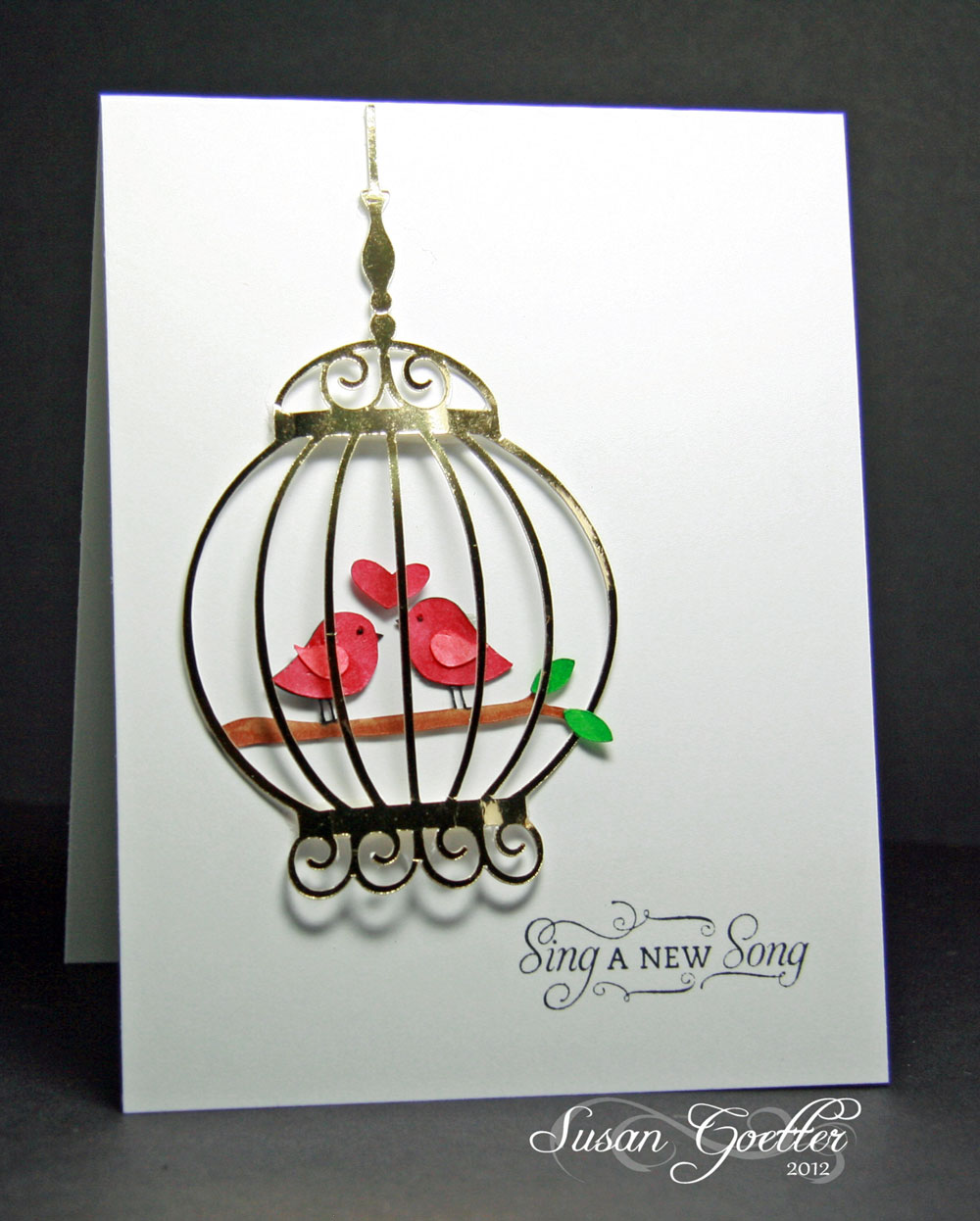
I think my second card might just be my favorite.  I cut the bird cage (with the Cameo) from very shiny gold card stock.  The birds, heart, limb, and leaves were also cut with the Silhouette (Cameo).  I curved the cage and popped up just the centers on each end to give it a rounded look.  The birds, leaves, heart, and limb were colored with Copics and adhered straight to the card.  I did lift the bottom of the limb to the outside of the card. Sentiment is from a Flourishes set.


This is a new stamp from Lily of the Valley that was part of my prize for winning last month's challenge from St. Luke's Charity Challenge. I was so excited to win! Isn't this a fab stamp!  I actually won two different stamps.  This image actually was the little girl carrying a birthday cake.  I stamped the image and cut away the cake and arranged the strings from the balloons through her hands.  I sponged a little ground under her feet, and added a couple of tuffs of grass with a GinaK stamp. I colored the image with Copics.  The balloons were cut with the Silhouette (Cameo).  In order to have "shiny" on this card, I coated each of the balloons with some glossy accents.  It's very difficult to get it to show up right though!


This last card was just something I was playing around with. Not too sure I really like the finished product...but I thought I'd show it to you anyway.  I stamped the circles using a PTI image.  Then I punched small circles with a hole puncher from all the different shiny papers I had laying on my desk.  In retrospect, I probably shouldn't have popped them up on the card, and just adhered them to the circles.  The shiny white spots are made with stickles.  Birthday sentiment is a PTI stamp that I stamped in red then heat embossed it with clear.  I tried to heat emboss with red, but made a MAJOR mess of several cards, so I finally gave up and stamped in red and embossed in clear! 

Sharing a layout I did recently of my Daddy and two of my sister's children.  


I used My Mind's Eye papers Follow your Heart for this layout. The border on the Kraft colored paper is purposely crooked, and it totally messed with my mind trying to get my layout on straight! LOL! I cut three large banners to layer behind my photo. The round lacy circle behind the photo was made by cutting about a 6 inch circle and then using one of my corner punches to punch around the edges. Circles on the top left corner were punched with circle punches. I also added two brads from the Follow Your Heart collection. Butterflies were punched with a MS punch, and I added a little glitter and glossy accents to each of them...as well as a red dot of liquid pearls for the body. The title tag and the brown piece backing it was made on the Cameo. I added a couple of lines of red stitching down the side of one of the banner strips. The "unique" scalloped piece on the bottom right was cut from a matching piece of paper and layered over one just like it with pop dots to give it a little dimension. Journaling is tucked behind the photo and reads: 

From my earliest memories, swinging with my Daddy (your Grandpa Perdue) was something we all looked forward to at the end of the day. He would always sing to us and keep that swing moving. The tradition carried on to all of our children, and any time we went to visit, there would always be a grandchild or two swinging with Grandpa. Sarah and Benjamin were so lucky to live next door to Grandpa and Grandma….that meant they got LOTS of extra swing time! Just look at the smiles on their faces. We were all so fortunate to have such a loving and fun-loving Daddy and Grandpa! 


That's all for me tonight.  Thanks so much for stopping by.  Your comments always make me happy...and I sincerely appreciate you taking the time to leave a comment!  Until next time...

Hugs!
Photobucket


Pin It!

LinkWithin

Related Posts with Thumbnails