Thursday, March 29, 2012

Challenge 64 - String Theory

On Mondays of each week, Laura from I am the Diva issues a new challenge.  This week for our String Theory challenges, everyone is to use a common string in their work.  For this challenge, we've divided our tile into 4, then divided it again with diagonals, creating 8 special-right triangles. (Each triangle has a 90 degree and two 45 degree angles).  Here's my take on the challenge:


I'm loving the ribbon across the middle....and I tried another couple of tangles that I haven't tried before....so it's all good!

Thanks a bunch for stopping by! Your comments are always appreciated!! Until next time..

Hugs!
Photobucket


Pin It!

LIM60 - Pick 3

Wow....where has my week gone! I can't believe it's Thursday already and I am just now getting my cards for the Less is More challenge posted!  I just don't seem to have enough hours in the day! I'm going to try to get around to some of the wonderful cards that are always posted for this challenge, but if I don't make it to your card, please forgive me!  I'll try to do better next week!

This week we've been challenged to make a card picking 3 of the previous 59 challenges and combining those three into one card. Here's my take on the challenge:


For this first card, I decided to use challenge 56 - don't scrap it, 54 - stripes, and 55 - die cuts or punches (and it also fits challenge 25 - ribbon or button).  The "happy" is  cut with a die from PTI.  The bottom edge is punched with a MS punch.  The pink punched edge piece is a scrap from my scrap bin, the background for the "happy" was a piece I colored months ago with my Copics (playing with a new technique) and it was laying in my basket with leftover bits and pieces.  The "birthday" part of the sentiment was computer generated on a scrap of white paper and cut with a Spellbinder banner die.  I guess this also fits the touch of bling challenge too (43).  I also made this a 4.25 x 4.25 card -- mostly because the piece I'd colored with my Copics was an odd shape and I need it to fit the card! LOL!


This next card fits challenge 42 - silhouette, 28 - Use ink, and 59 - masking.  I masked off the water and sponged two shades of blue DI across the bottom.  I reversed the mask and sponged in a tiny bit of sky using a torn edge for my clouds.  The silhouette image is from Flourishes and I stamped it last using archival ink.  Sentiment is also from Flourishes. This would also fit week 29 - things that move...little boys move...right?


This card fits challenge 55 - die cut, 28 - use ink, and 26 - butterflies.  My butterfly is cut with a Memory Box die from a piece of card stock that I had inked with varying shades of pink (not sure you can see the different shades here).  The sentiment is from PTI and stamped in pink.  I cut the pieces across the bottom using a Memory Box die (Tessatina).  I ran it through my sticker maker and adhered two of them across the bottom.  I matted the white background on a piece of bright pink, then adhered it to the card. 


For my last card, I used techniques from challenge 14 - white on white, 15 - embossing, 55 - die cuts, and 43 - bit of bling.  The background piece was embossed with a TH embossing folder.  The heart was cut with a Memory Box die and for the finishing touch, I added one large pearl in the center of the heart. 

Sorry my photos are not too good this week.  I've been a bit hurried trying to get something posted before next week's challenge is posted. Between doctor visits for my hubby, phone conversations with my sister (we're trying to get my mama moved into an assisted living facility), and my job...whew! Like I said earlier...just not enough hours in the day!

I did get a layout finished a few days ago.  I think I was working on it for 4 or five days before I finally finished it!


Photo of my grandson, Pierce. I used Echo Park A Boy's Life Collection for this layout. The photo is approx 5 x 7". It's matted with navy blue card stock. I used an old corner punch to make the photo corners to hold the photo. The title work "smile" is chipboard letters (Thickers) and the rest of the title work was cut with the Cameo. The tugboat is an EP image that I colored and cut with the Cameo. The waves were cut using my cloud scissors (really old tool!) I just cut thin strips with the scissors. I also coated them with glossy accents, but it's difficult to see here. The birds were cut on the Cameo and colored with Copics and then pop dotted on the layout. I cut four panels of the ppr and layered it on a piece of the navy ppr. The border strip across the middle was cut with a QK die and then I punched small circles from the red circle paper and popped them over the green strip. I also coated each of the circles and the "you make me" with glossy accents. The tag at the top "my beautiful boy" is one of the tags from the paper collection. I also cut 3 blank tugboats out and layered them for a 3-d effect. I added a bit of faux stitching to the edges of the light colored background paper. Journaling is tucked behind the photo with a pull tab and reads: 


Pierce, you are such a happy little boy! Look at that beautiful smile! At 5 months old, you always have a smile for everyone. You rarely ever cry…you’re just happy! It never seems to bother you to be passed around for everyone to get their chance to hold you…you just keep smiling and cooing. Your smiles are contagious…you make me smile just looking at this adorable photo of you! 

Now, I need to get busy...I have so much to do!! We have my daughter and her children visiting for the weekend...so I'll really be busy then!! Thanks a million for taking the time to stop by and visit! If you've left me a comment, please know that I truly appreciate it!!  Until next time....

Hugs

Photobucket


Pin It!

Thursday, March 22, 2012

St Lukes Charity Card Challenge - Spring

The challenge this month from St. Luke's Charity Card Challenge is to spring into Spring!   Anything spring related goes - fresh spring colors, flowers, animals, Easter, mother's day - whatever floats your springtime boat - banish the grey of winter and look forward to the joys of Spring.   Here's my take on the challenge...


For my card, I used an image from Flourishes Cherry Blossoms collection.  I colored the blooms with Copics. Sentiment is also from Flourishes and is stamped in Memento brown.  I layered the stamped panel on a deep pink paper (it also has a shimmer to it, but it's difficult to see here) and then layered it again on a pink card stock.  I added a punched strip across the bottom that was punched with a MS punch.  Tied a pink picot edged ribbon and bow across the bottom...and all done!

Thanks so much for stopping by! Your comments are greatly appreciated.  Until next time....

Hugs! 
Photobucket


Pin It!

OLW84 - Pink and Orange

This week's One Layer Wednesday challenge is hosted by Susan at Simplicity.  I must say the challenge this week is not a favorite of mine.  I really don't care for pink and orange together.  Susan's card is fabulous, but I can never get these two colors to go together! Of course, my other problem is that I really don't like to stamp images in color....I much prefer to stamp in black or brown and color my images.  But...it is a challenge and so I wanted to give it a chance.  Here's my take...such as it is. 

 This first card is made using a background stamp from Paper Smooches.  I can't decide if I like these stamps or not.  I can never seem to get a clean stamped image when I use them.  I stamped the image in pale pink, then filled in several of the hexagons with an orange marker and then others with a pink marker.  The sentiment is from Flourishes and was stamped in black.  I also added a touch of glossy accents to the orange hexagons...and for some reason that made them look red, but honestly, they are orange!


My second attempt isn't much better.  I used an image from PTI and stamped it in pink and orange.  I was going to just use it as a border with two lines of the image, but then decided that looked "unfinished", so I added some random stamps across the card, leaving a space to insert the sentiment. Sentiment is from Flourishes and is stamped in orange.

Like I said...not too happy with my cards this week and they may end up in the trash, but I did give it a try!

Thanks so much for stopping by!! Your comments are much appreciated!! Until next time...

Hugs! 
Photobucket


Pin It!

Challenge #63 - Fengle

The challenge this week from Laura at I am the Diva are to create a tile or ZIA using the new tangle from Rick and Maria called Fengle. There are instructions to this tangle in the Zentangle Newsletter here, along with some beautiful examples of Rick and Maria playing with this tangle.  

I've noticed that all the curves are gentle "s" curves.  It took me a bit to get it, but I think I finally got the hang of it.  Here's my tangles using Fengle.


This first tangle was my first attempt at drawing Fengle.  I like the Nzeppel used as a filler and I love the Fife background, but I think the end result is a little too busy.

So, I thought I'd give it another try and this is the results.  I didn't "close" my Fengle, but allowed the ends to flutter, then filled the background with Tipple.  I believe I like this one much better.

This third tangle is just a new tangle called Providence, that I wanted to try out..and I really love the dimension that can be achieved with this one.


Edited to add: I just wanted to let you all know.  I've tried to comment on quite a few blogs, but for some reason, I just cannot seem to get the letters right in the new word verification.  On some of the blogs I've put in what I Think it is and ended up putting it in three and four times.  I'm so sorry, but I just don't have that much time for comments, so instead of beating myself over the head because I can't read the word verification, I'll have to move on.  There is definitely some beautiful work posted each week, and I do go to every blog to take a peek, but if word verification is on, I'm not going to be able to leave a comment for you even though I want too.  So sorry!!

That's all for right now.  I'll be back later with a couple of cards to share.  Thanks so much for your wonderful comments! Until next time...

Hugs!
Photobucket


Pin It!

Sunday, March 18, 2012

Create For Fun Color Challenge 50


I've been looking at this challenge for a while and finally decided to jump in and play along.  The challenge is called CR84FN (Create for Fun) and is a color challenge.  This week the challenge is to create a card using the colors pink, orange, and yellow.

 Strange combination, but it worked out better than I'd envisioned.  Here's my take on the challenge.

 I made this card by adhering strips of pink, orange, and yellow to a piece of card stock, then punching the shaped edge.  The ribbon slots were also punched using a MS punch.  The sentiment is from PTI.  I found three different sized flowers in my stash in the colors I needed, and stacked them and added a piece of pink bling for the center. I also added some green leaves behind the flower. Leaves were cut with a Memory Box die.


I wanted to try something a bit different for this card, so I used my largest Spellbinder die for the flourished square cut in orange.  The finished size of this card is approximately 4.25 x 4.25 inches.  I added a layer of yellow in a 3 inch square.  I used some 1/8 inch score tape to adhere the bright pink ribbon around the card and added a bow with the same ribbon.  To make the back of the card, I cut a square piece the width of the solid area of the front of the card plus 1/2 inch extra.  I scored the piece at 1/2 inch and folded it down. This is the area I attached to the back of the card for the fold.  The ribbon hides where the two pieces are joined. The sentiment is from PTI and was stamped on white card stock.  I cut it out using a Spellbinder die, then cut a small bright pink border for the banner.  The sentiment is pop dotted for a little added dimension.  I added three tiny pieces of bright pink bling to finish it off.

That's my take on the challenge.  Thanks so much for stopping by!! Your comments are always appreciated and welcomed.  Until next time...

Hugs!
Photobucket


Pin It!

Saturday, March 17, 2012

LIM59 - We're all using Masks!

It's Saturday and time once again for the wonderful Less is More challenge.  This week, Chrissie and Mandi have challenged us to show some evidence of MASKING but we still need to have some white space plus a clean and simple design.

I did a little masking for last week's challenge, and it was a nightmare! LOL!  For some reason, using a mask this week wasn't nearly so difficult.  I've made four totally different cards...you decide which is your favorite.  Here's my take on the challenge:

This was the first card I made and I really like how it turned out.  I masked off a section on the left side of the card, then tore some post it notes to use as masks for the hills.  I sponged in the hills with DI - Peeled Paint and then stamped my trees in the same ink. I added a mask for the moon on top of the trees and then sponged in the night sky with DI - Broken China. To finish off the scene, I added little stars with my white signo pen.
This is the second card I made.  I used a single bloom from the Pretty Peonies set from PTI.  I sponged the background with DI - Spun Sugar, then stamped each one of the peonies by moving my post it note mask around on the card stock.  I ended up cutting it down a bit in order for it to look right on the card (and I'd originally had it on the left and decided to move it to the right.  I wanted my sentiment to fit in the indention.  I cut out one edge of the blooms and pop dotted the piece onto my card base.  The peonies were colored with Copics in three shades of pink. I added some micro beads to the center of each bloom with some glossy accents and colored them with Copics after they dried.

I think I liked this card in my head better than on paper, but it was my daughter's favorite of the bunch.  I used one of my Magnolia stamps.  Several years ago, I was crazy about these little Magnolia children and bought quite a few of the images...and then didn't use them.  I LOVE this little girl!  I stamped the little girl, then cut a mask for her and added the grass with a stamp I've had forever.  It looked a little plain, so I decided to sponge in some green and add a few hand drawn blades of grass.  The butterflies were punched with a MS punch and a little glitter was added to each one.  The sentiment is from PTI.  I colored the little girl with Copics.  The clouds were an after thought, but I like them.  This might just be a little "too" much for the challenge...but hopefully not.  I guess it's kind of cute and will work beautifully for one of our many granddaughters!


This was my last card.  I''ve done something similar to this before, but I added a few more shells.  Each shell is a different stamp, so there was LOTS of masking going on!  I even had to mask to added the ground!  Again, the images are from SU and were colored with Copics.

Since I'm posting, I'll go ahead and share another layout I finished recently.
This is our two youngest granddaughters, Helen Grace and Maggie. For this layout I used MME On the Bright Side collection. I made a pattern for hexagon and hand cut each of the hexagons on the page out of different papers from this collection. I adhered them to the white background, leaving a small gap between them and then added some faux stitching in red between all the hexagons. The zig zag strips on the red mat were cut from one of the papers used for the hexagons. Title work was cut with a QK font. I used a technique I've used previously for making faux chipboard letters (cut out 4 or 5 of each letter from white card stock and glue the stacks together with the letters cut from the ppr as the top layer). I made "hexagon" flowers by shrinking my pattern for the hexagon and then putting 6 of them together to form a circle. I cut between each petal and added some white doodling. The hexagon centers of the blooms were hand cut, pop dotted and then coated with glossy accents. I hand cut the flower stems and the leaves are cut with a Spellbinder die. Then I added a little red gingham bow on the bouquet. No journaling on this layout...I just added some random words to the hexagon areas where there was no ppr. Three little banner tags on the bottom attached with three red brads. To get perfect points on the tag on the bottom, I used a square punch and just punched out the end.  (The black border was added in photoshop to keep the edges from fading away)

Thanks a million for popping in! Which card is your favorite?  I appreciate all your fabulous comments...they make my day!  Until next time...

Hugs!
Photobucket


Pin It!

Wednesday, March 14, 2012

Challenge 62 - Spiral vs Paradox

The challenge this week from Laura at I am the Diva is to use spiral(s) together with paradox. The basic string should be a spiral and tangled with paradox. More than one spiral string can be used.  Sounds simple enough...right?  So...here's my take on the challenge.


I drew spirals in a figure 8 shape and had them cross in the middle...then happily filled my spirals with paradox!  

Thanks so much for stopping by! I appreciate all your comments! Until next time...

Hugs!
Photobucket


Pin It!

Tuesday, March 13, 2012

LIM58 - One Layer Week...

I'm later than usual with my entry for the Less is More challenge this week. I got a new computer last week, and I've been trying to get everything reloaded and transferred.  You just don't realize how much "stuff" you have on your computer until you upgrade and have to re-install everything!  Takes a while.  Anyway, I spent a very frustrating Saturday trying to make a one layer card for this week's challenge.  

If there was an Inky Fingers of the Week award...I would have won it..hands down!  I lost count of how many cards ended up in the trash bin!  I made several cards that were really pretty...until I managed to drop them on the ink pad...or add a inky fingerprint to the front of the card!  GAAH!!! 


This first card looks relatively simple...right?  Well, I won't even tell you how many times I messed up before I finally got a halfway decent card finished! For this one, I stamped the flowers (Flourishes) then cut out a mask to cover them.  I tore an oval (somewhat) shape from the center of a post it not and then stamped the script "behind" the flowers.  The sentiment is from PTI.  The sentiment is one long stamp and I was trying to mask part of the sentiment and stamp it in sections. I think I stamped it crooked about 4 or 5 times before I finally gave up, cut the sentiment stamp in half and stamped each portion separately!  I really didn't want to cut my stamp in half....but I'll get over it! LOL!

This next card was stamped with some stamps from Flourishes that I've had for a while but never used.  Coloring this thing took forever!....then cut out a mask so that I could add the script.  I finally decided to just use this card, even though all the script is crooked.  Sentiment is from Flourishes and the background script is from SU - French Foliage.  Coloring was done with Copics.  


These pears are from the same set from Flourishes, and the script background is a very old set I found in my stash that is a Hampton Arts set.  The script looked kind of lost in the middle of the card, so I added a couple of lines of scoring on either side of the script.  The sentiment is from Flourishes (and I managed to stamp it crooked several times too...) Image was colored with Copics.


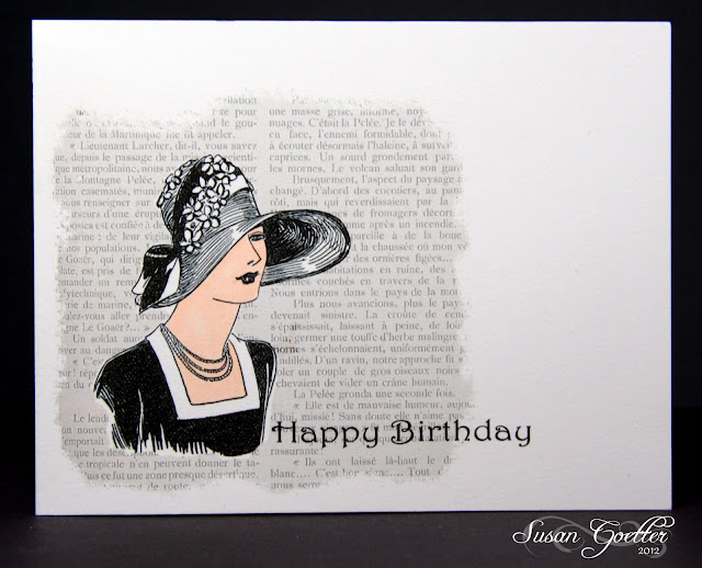
I finally figured out how to make a card that I couldn't leave my inky fingerprints all over...I make this one on the computer!  The background script was an image with everything written in French. Since I don't read or speak French...I hope it's "nice" words! LOL!  The lady was a free digi image that I downloaded from somewhere, but I have no idea where I got it.  The sentiment was computer generated with a font called Teepee.  And..look at that...NO inky fingerprints! Woohoo!!

Here's a layout I did a week or so ago, of my newest grandson, Pierce, taken when he was just a few hours old.


I used MME On the Bright Side collection for this layout. To make the bottom portion of the layout, I cut 2x2 inch squares and a 3/8 inch plaid strip and adhered them to a piece of solid orange (from an older collection from MME). I punched the edge of the strip with a MS punch prior to dry embossing. Then I embossed the 12 inch strip with an embossing folder from Stampin Up. To do this, you have to run the strip through the cuttlebug lengthwise, with the folder going across it. The tag for the title was cut with a Spellbinder die, and then I traced the white tag on the inside of the orange one and hand cut it. I added a lot of faux stitching to the "quilt" and around the white edges. The bear hanging over the edge of the quilt was cut with the Cameo. The giraffe, the blue bear, and the baby shoes were stamped and then hand cut after stamping. I made photo corners for the top of the photo (using a tutorial that you can find on my blog). Title letters are chipboard letters that I colored with Copics, then added a layer of glossy accents. The butterflies were punched with a MS punch and glittered up with stickles. Journaling is tucked behind the top of the photo and reads: 

Pierce, you were born on October 10, 2011. I wasn't at the hospital on the day you were born, because your Grandpa was in the hospital, too, and I was with him. I came to the hospital where you were born later that evening because I couldn't wait to see you and hold you in my arms. You weighed 7 lbs 11.2 ounces and were 19.25 inches long….but you felt so tiny in my arms! I was amazed at how bright-eyed you were. You seem to be aware of everything around you. In this photo, you are just a few hours old…but look how alert you are! You are such a beautiful little boy…and I'm so happy that you're finally here! 

Thanks so much for stopping by!  Maybe all your wonderful comments will help me get over the trauma of making my cards this week!  Not sure what the problem was this week (well, except for the inky fingers! LOL), but I'm hoping that next week's challenge will be much easier for me! Until next time...

Hugs!
Photobucket


Pin It!

OLW82 - Swirly Fun?

I'm really late playing in the One Layer Wednesday challenge this week!  I finished my cards over the weekend but just haven't had a chance to get them uploaded.  This week, Susan challenged us to create a one layer card with "swirls".  I have lots of swirly stamps...but my brain just wasn't working with the theme this week.  I really struggled with this and can't say that I'm totally happy with the end results.  Anywho....here's my cards...


This card was my first attempt...the flowers are too bright...and the swirls should have been shorter....sigh....
The sentiment is not blurry, I just didn't take a very good photo of this one! 


 So...I went back to the drawing board and gave it another try.  This airplane and the fly high sentiment are some stamps I picked up from the dollar bin a year or so ago and have never used.  Now I know why...the really don't stamp very well.  I had a terrible time getting the stamps to hold the ink and not give me a smudged look! The swirl is from a very old set of Rhonda Farrar stamps.  I colored the airplane with Copics and then added a few red lines with a red pen. The "and reach for your dreams" was computer generated and added to the card front prior to stamping the fly high sentiment....still not totally satisfied, so I tried another card.


I think this might be my favorite of the three...maybe.  The dragonfly, swirl and sentiment are all from a PTI set that I've had forever and never used...so at least this set has seen ink now!  I colored the dragonfly with Copics and then to add a little sparkle, I covered him with stickles.  

That's it for me today...I really appreciate you stopping by, and I appreciate all your wonderful comments.  Until next time...

Hugs!
Photobucket


Pin It!

Friday, March 9, 2012

Challenge 61 - Use My Tangle - Golven

I'm late getting my ZIA posted for this week's challenge at I am the Diva.  I meant to post it earlier in the week, but my new computer arrived on Tuesday, so I'm still trying to get things "set up" on the new computer!  Now....on to the challenge.

The first Monday of each month our challenges will feature a home-made tangle - chosen at randomThe challenge, then, is to learn the new tangle and to use it on tile or Zentangled inspired piece.   This week's tangle is from Mariët, and is called GOLVEN, which is the Dutch word for waves..  you can find instructions for her tangle here.


I had no plan in mind when I started this piece, just drew some random pencil lines and started tangling!  I really like the way this turned out.  Maybe random is good!

I thought I'd go ahead and post a few of my other recent tangles too.  
This second piece is just a combination of several new tangles I wanted to try.  Malacca by Molossus is in the top left corner and Plaited by Sue Jacobs in the bottom right corner. I also added Golven in this piece, but I wasn't overly confident that I'd done any of them "right"...but I'm really going to enjoy practicing each of them!


This third one is just a bunch of swirly lines all jumbled together.  No rhyme or reason to it, just messing around.
This last one I really love!  I saw something similar somewhere, but for the life of me I can't remember when I saw it!  This tangle just seems to float on the page! 

Thanks so much for stopping by!  Your comments are much appreciated and welcomed! Until next time.....

Hugs!
Photobucket


Pin It!

Saturday, March 3, 2012

LIM57 - Neutrals

It's Saturday and time once again for this week's challenge at Less is More.  The challenge this week is Neutrals.  According to our challenge hosts...this could be anything from off white to black with any shade of beige, brown or grey in between. At first, I was drawing a total blank...but once I got started, the ideas kept flowing!  The funny thing is, I just finished my cards for the OLW challenge yesterday...and had a terrible time trying to create using just cream, black, and a touch of bling!  Go figure!

I've made four cards today.  I don't know why I do this, I guess I think if I make just one more card it'll be something that really wows me! LOL!

This is the first card I made.  I made a chevron strip using direction from Jennifer McGuire's post here.  I cut it out and adhered it to my card, then added a little faux stitching on either side.  Sentiment is from Flourishes.
This card was made with a Kraft card base.  I used a Spellbinder die for the brown square.  I cut a beige square with another Spellbinder die, and stamped the Papertrey sentiment on the beige piece.  The butterfly is from Memory Box and is the smaller butterfly.  Kind of a pain to cut out, but I finally got a metal shim and it works a bit better. I just got the lacy die that I used for the brown piece....and I LOVE it!  I'll be using it quite a bit I'm sure!
This next card just kind of fell together.  I used a Kraft card base.   I had scraps left over from making the chevron, and I just adhered them to a piece of card stock and cut it about 5/8 inch wide.  I punched a hole in the strip on the left hand side and wrapped the string around the strip and up through the hole...then just ran it through the button and tied a bow.  Sentiment is from Papertrey Ink and is stamped in brown.  I initially had the striped piece on a white card base, but managed to stamp the sentiment crooked, so instead of throwing  it away, I peeled the strip off, cut the white card front down so that the sentiment was straight.  Then I realized that the strip was too long to fit just the white, and I didn't want to have to re-do the twine, so I just plopped it all down on the Kraft card base...and I really like the way it turned out...much better than just a white card base!  Mistakes can sometimes work out pretty good!
This last card was inspired by a card I saw on Pinterest.  I made three tags from Kraft paper, inked the edges with some dark brown, then adhered them to a strip of card stock.  I stamped the images in both brown and black on to the tags.  The image is from Papertrey Ink.  I used a sentiment from Papertrey also...stamped on Kraft paper, cut out with a Spellbinder die, then pop dotted over the tags.  I added three black bling pieces on the tag.  The ribbon couldn't have been more perfect...how cool is that!

Thought I'd also add in a recent layout of our granddaughters, Camilah and Georgia. You can see that I also used the chevron tutorial for the larger chevron on this layout.
Photos of two of our granddaughters, Camilah and Georgia. I used My Mind's Eye Miss Caroline Fiddlesticks collection for this layout. The title work was cut with the Cameo. The quote is a stamp from Flourishes. Butterflies are all MS punches. The pink leaves are a stamp and die cut from Papertrey Ink called Harvest Berries. Flowers are all from my stash, and I layered them and added a pearl for the center of each. The polka dot background shape was hand cut using a shaped background piece for the pattern. The "rick rack" border around the pink background was made with a scalloped punch (again...found the directions for the how-to on Pinterest). I added quite a bit of faux stitching and inking. Journaling is tucked behind the pink mat at the top with the string of pearls on the pull tab and reads: 

You two have grown up so fast. Camilah, in just a few months you will be making decisions about what you want to do with your life…and Georgia, you won’t be far behind her. You both have so much potential and I know that each of you can achieve anything you set your mind to. As you move ahead and make those decisions about your life, I hope you’ll always remember Proverbs 3:6 which says: “Seek his will in all you do, and he will show you which path to take.” (New Living Translation)

Bet you thought I'd never finish! LOL! Thanks so much for stopping by! Your comments are truly appreciated!  Until next time...

Hugs!

Photobucket


Pin It!

LinkWithin

Related Posts with Thumbnails