Monday, September 3, 2012

It's All About Couples

The St. Luke's Charity Cards challenge is a monthly card making challenge that supports a Sheffield hospice through the sales of handmade cards that have been donated to the cause.

This month's challenge is to create a card with "couples".  The instructions say.... we just want to see couples - not necessarily of the romantic kind...as long as your card features a couple in some form - people or animals - it all counts.   This month's challenge is definitely easier than last month's Olympics challenge!  I've made two cards for the challenge.  Both of my cards today are one layer cards...meaning that it's just a single layer of card stock folded. 


For my cards this month, I found a couple of digital images from Mo's Digital Pencil that were perfect for a "couples" challenge.  This first one would make a great anniversary card, don't you think?  I printed the image on to white card stock, then colored with Prismacolor pencils.  Sentiment is a Hero Arts sentiment, I think.  I added a touch of blue Copics for shadowing around the image.


This card is also an image from Mo's Digital Pencil.  Aren't these two just adorable!  This is also a one layer card. Image was printed on the card base, then colored with Prismacolor pencils.  I lightly colored in a "floor" to ground the image.  Then, I added a bit of background shadow with a Copics marker.  Sentiment is from Hero Arts (I think).

Maybe I'll come up with another card of two for this challenge later in the month.  Thanks a million for stopping by!  I appreciate you taking the time to pop in and I always enjoy your wonderful comments!  Until next time.....

Hugs!
Photobucket


Pin It!

In the Pink - with Wings

This week's challenge at In the Pink, is to create a card using lots of pink and the card should feature something with wings.....and it just so happens that I found a digi image that would be perfect for this challenge!  Here's my take on the challenge:


I wish I could tell you where I got the digi image, but I didn't label it so I have no idea!  I printed the image on white card stock, colored it with Copics and cut it out.  I embossed the background with a PTI texture plate, the stamped a little grass, sponged a green "hill" and added a few plants with the SU silhouettes, then popped the fairy over the hill.  The sentiment is from PTI. Quick...easy...and fun!

Thanks so much for stopping by!  Your comments are always welcomed and greatly appreciated!  Until next time....

Hugs!
Photobucket


Pin It!

Thursday, August 30, 2012

OLW103 - Score!

This weeks One Layer Wednesday challenge is hosted by Karen Dunbrook.  You can visit her blog "Snippets" and see her great cards and check out all the other entries for this weeks OLW challenge!  This week, Karen has challenged us to create a one layer card that includes scoring.  Here's my take on the challenge.


This is a digital image that I've had for several years.  I printed the image onto Kraft card stock, then colored with Prisma color pencils.  The sentiment was computer generated and printed at the same time I printed the image.  To finish off the card, I simply scored three lines to help "ground" the image.  Super easy-peasy!

Thanks a million for stopping by!  I haven't been visiting blogs this week, due to circumstances beyond my control. (Further explanation here).  I truly appreciate each and every comment...and I hope to get back into my normal routine soon!

Until next time.....

Hugs!
Photobucket


Pin It!

CASology - Cue word - Relax

The challenge this week at CASology has a cue word  -  "Relax".  There are many, many ways to relax, but one of my favorite ways to relax, is to sit on a quiet beach and listen to the waves.  Here's my take on the challenge.


Hope this one is CAS enough.  Super simple...stamped the image on white card stock, then stamped it again on white, yellow and red.  Cut out the images and did some paper piecing on the umbrella, and pop dotted the chair for added dimension.  Sentiment was stamped using Lawn Fawn alphabet letters.  Colored the image (Sweet and Sassy Stamps) with Copics.  I had to "extend" the image a bit with Memento markers to get it to fit like I wanted it to.

Thanks a million for stopping by!  I apologize for not visiting blogs this week, but we were so busy prepping for Hurricane Isaac that I just didn't have the time I need to get everything done.  Thankfully, Isaac was barely a blip around here...but those over in Louisiana weren't so lucky.  I always feel better when we are prepared...you never know where those hurricanes will actually end up!  I do appreciate all your comments, and hopefully, this week will be a little calmer around here!

Until next time...

Hugs!
Photobucket


Pin It!

Saturday, August 25, 2012

LIM82 ...3-2-1

It's recipe week at the Less is More challenge.  Our challenge from Chrissie and Mandi this week is create a card and incorporate 3 of something, 2 of something and 1 of something else. Gotta get my thinking cap on for this one!

Here's what I came up with for this week's challenge:

Thought I might as well start off with my favorite card from all the cards I've made today.  For this card...there are...3 flowers, 2 apertures, and 1 word sentiment.  The flowers are from Flourishes and were colored with Copics and then I did a little fussy cutting (whew!).  I used two sizes of Spellbinder square dies, and cut the apertures in two pieces of card stock, one the same size as the card base front (5.50 x 4.25).  I masked off part of the card base that would be showing behind the second aperture and sponged it with wild honey DI.  The sentiment is stamped in black and is a stamp from Flourishes. Then I adhered the top panel with the largest aperture centered over the smaller aperture before adhering to the card base.  Slipped the flowers between the 2 apertures and popped them up a touch with some dimensional tape.  


This was actually the first card I made.  It just didn't do it for me.  I punched three apertures with a stamp punch in a white panel cut slightly smaller than the card base.  Then I stamped some flowers (PTI) in angel pink Mementos ink on the card base so that they would show through the openings.  The sentiment is also from PTI and is stamped in black.  So...we have...3 apertures, two words in the sentiment (and two inks), and 1 piece of pink bling.


Since I had the 3 "stamps" punched from the first card, I decided to use them for my second card.  I stamped each of the "stamps" with an image from PTI in Memento teal.  Then I used a matching pen and put dots around each edge of the "stamps".  The sentiment is from Flourishes.  So...we have...3 "stamps", 2 score lines (or two words in the sentiment), and 1 piece of bling (or one punched edge).


For this card I was playing around with DI again.  I've used...3 colors of ink - wild honey, worn lipstick, and chipped sapphire DI - to create the background. Then I spritzed the background with a little mister to give it a mottled look.  The "grass" at the bottom is a PTI stamp.  The butterflies are punched with a MS punch and colored with Copics.  I layered the inked piece on a piece of dark blue and adhered it to the card base.  Here's the 3-2-1....3 words in the sentiment (or three ink colors), 2 scored lines (or 2 butterflies), and 1 piece of bling.


And, last of all (and I probably shouldn't have posted this as it is SO simple!).  Recipe...3 strips of washi tape, 2 words in the sentiment, and 1 heart brad.  The white panel was cut slightly smaller than the card base, and then I added red card stock strips around the edges before layering it directly to the card base.  The sentiment is stamped using the Paper Smooches alphabet letters.  I didn't have a red heart brad, but I did have a white one.  I coated the brad with versamark ink, then dipped it into red embossing powder.  After I heat set it, I dipped it another couple of times in the embossing powder to get a good shiny surface on the heart.  Really loved how well this worked out.

That's all for me right now.  Thanks a million for popping in!  I appreciate your thoughtful comments!! Until next time.

Hugs!
Photobucket


Pin It!

Wednesday, August 22, 2012

OLW102 - School and such....

This week's challenge at One Layer Wednesday is hosted by the talented, Ardyth at MASKerade.  Ardyth does a fabulous job with CAS cards...and I love all the bright colors she uses!  Once again, another challenge looking for "school related" cards!  I really have no need for a school related card, but since Ardyth has told us that the theme for our card should not only be school...but include our favorite subject....YAY!  I can make a card for this!


Okay...first of all....can you guess what MY favorite subject was?  LOL!! Why...RECESS of course! That was my favorite time of the day.  I don't think kids have "recess" per se anymore, but when I was a kid (many, many) moons ago, we were allowed to go outside to play for 30 minutes each morning and 30 minutes each afternoon (and sometimes a full hour in the afternoon!).  Of course we were in school from 8:00 am until 3:00 pm...so it was a long day!  Some of the friends I made during my early school years are still my friends today.  Recess was an important part of growing up when I was a kid...you learned about winning and losing, playing fair, letting everyone have a turn, including everyone in whatever game we were playing, but most of all we learned how to play.   Sometimes I think that the children of today have lost the art of "playing" unless it's connected to an electronic game!

But I digress....oh, yeah...my favorite class...RECESS!

The image and sentiment are from Flourishes.  I stamped the image in black archival ink and heat embossed with clear embossing powder.  Then I sponged in a little sky and ground with DI.  I cut this card down a bit...the finished size is 4.25 x 4.25 inches.

Thanks so much for stopping by!  Your comments are greatly appreciated!! Until next time....

Hugs!
Photobucket


Pin It!

CASology - Going Green

The challenge this week from CASology is create a card using GREEN.  I've given it a bit of thought, and this is what I've come up with.


The lattice work was punched with a MS deep edge punch.  The leaves (vine) was cut with a Sizzix die, and the small flowers were punched with an EK Success retro flower punch.  The centers for the flowers was done with Liquid Pearls.  Sentiment is from PTI and stamped in Mementos Cottage Ivy.  The white background was embossed with the PTI texture embossing plate.  The trellis was raised slightly using clear dimension tape.  The white panel was also pop dotted on to a green card base.


I thought I'd share the inside of the card with you too. I rarely do anything to the inside of my cards until I'm ready to use them, but since I had a couple of the leave/branches already cut out I thought I'd decorate the inside of the card too.

Thanks a bunch for stopping by!  I appreciate your visit and if you leave a comment, please know that I truly appreciate it! Until next time....

Hugs!
Photobucket


Pin It!

Monday, August 20, 2012

More Tearing....

Just another quick card I did today for the LIM challenge. I rarely make more than one post for this challenge, but this card turned out so cute, I decided to post it.


I stamped the music background in Memento brown on white card stock, then trimmed it down and tore off one corner.  For the butterfly, I stamped three different distress inks on my craft mat...sprayed them with a little water, then just smooshed my card stock around in the colors.  I dried it with my heat gun, then smooshed it around in the colors some more.  After it was completely dry, I stamped the butterfly (HA) in black ink, and cut it out.  Then I added just a touch of glitter to the butterfly and popped him up on the music.  The sentiment is from PTI and is stamped in Memento brown.

Super quick and simple card! Thanks so much for stopping in! Hope to see you again soon....Until next time...

Hugs!
Photobucket


Pin It!

Saturday, August 18, 2012

LIM81 - Tearing it Up!

This week's challenge at Less is More is a themed challenge...and the theme is tearing ... in this instance, it means ripping paper...not shedding tears (although to be honest, sometimes I make such a big mess of things that it makes me want to shed a tear! LOL!) I love tearing paper...it's very therapeutic!  I've had a good time today getting my card(s) made for this week's challenge.

So...off we go....


This first card is the last card I made today....so what does that tell you?  I keep on trying until I get something done that I really like!  The stamp is an Inkadinkado stamp that I've had for several years.  I inked it with Mementos black and stamped on white card stock.  I highlighted around the image with a Copics B000 and then a touch of Y000 on the "halos".  I also added a touch of glamour dust to the halos. I cut around the image on three sides and then tore the bottom edge.  I added a blue and a gold layer behind the image and tore the bottom edges of each layer.  I stamped the sentiment (PTI) in Versamark and heat embossed it with WOW gold.  I tore around the sentiment and layered it across the stamped image, adding two small pieces of bling to each end.  I might also add that this was the easiest card I made too!


This is the first card I made.  It didn't quite turn out like I'd envisioned.  I really thought my torn edges would show up a bit more.  I cut the word "happy" from white card stock.  I tore pieces of red, yellow, blue, and green paper and adhered the strips to a piece of blue card stock, then popped the word "happy" over the torn strips.  The word "birthday" is a PTI sentiment and was stamped in black.  I also edged the white "happy" layer with small strips of red, and the blue layer with small strips of yellow.  Too many layers??? There is still a lot of white space, right?


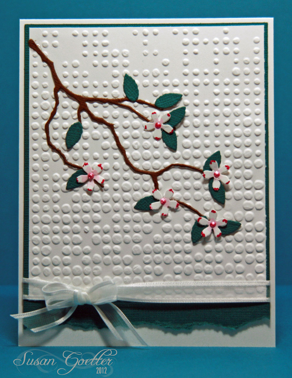
For this card, I embossed the white background, layered it on a piece of teal paper, and adhered it to the white card base.  The branch was cut with a MB die, as were the leaves.  The flowers were punched with a small flower punch.  I painted the centers of the flowers with some distress ink and touched the edges of each petal with a red Copics marker.  Tied a little bow around the piece before adhering it to the card base.  No sentiment....that way I can use it for any number of occasions.


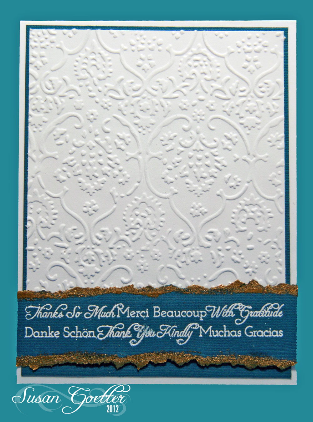
This card was super quick and so simple to make.  I embossed the white background and edged it with a piece of teal card stock.  I stamped the sentiment (Flourishes) with Versamark, and heat embossed with white WOW powders.  Then...I tore the edges of the sentiment and inked them with Versamark and embossed with WOW gold EP.  I see I smudged the white a bit...guess I need a little more practice with the heat embossing.


This last card was an after thought....I had some scraps of paper on my table from a project I finished last night, and I decided to "tear" a few blooms.  I tore the centers also. The stems were cut with a QK die (part of the string for a banners set), the leaves are a MB die.  Stamped the HA sentiment and cut it out with a Spellbinder die....Put the pretty (Ha!) flowers on a dotted embossed background...and it's done!

Finished a layout last week too...


These are photos of me and my grandson, Allen, when he was about 9 months old.  I used Echo Park - Paradise Beach papers for this layout.  The title work was cut with the Cameo (several layers stacked and glued together)  The top layer of the title work was cut by adhering strips of paper to another sheet of paper and then putting it through the Cameo - giving me tri-colored letters. Then I just made that my top layer on the letters. The peachy-orange paper was punched with a EK Success "holey" punch and then I trimmed around the edges to make it kind of scalloped.  The chevron strips were cut with a MFT die. The borders under the title work and under the little boy at the top were punched with a MS Victorian flowers punch. The little boy at the top is a digital image from Mo's Digital Pencil.  I added quite a bit of faux stitching with a Memento pen.  No journaling on this one...it's kind of self explanatory.  I did have to go back and check the date on the pictures to make sure it was Allen...because it looks just like Pierce! 

That's it for me right now.  Thanks a million for stopping by!  If you leave a comment, please know that I really appreciate it!  Until next time...

Hugs!
Photobucket


Pin It!

Thursday, August 16, 2012

OLW101 - Feeling Blue

This week's OLW challenge is hosted by the talented Heather Telford at Bits and Pieces.  Heather is the master of sponging inks and creating gorgeous scenes.  I can only hope that I can be that talented!!  Heather has challenged us to create a one layer card using lots of blue.  Here's my take on the challenge:


I masked off a section of the card with post it notes, then sponged in my blue sky, using a torn piece of paper to put in a few clouds.The butterflies are from HA, and the sentiment is from PTI.  I added a scored line over and under the sponged sky.  The butterflies and the sentiment are stamped in DI - salty ocean.

Very simple...and quick! (and I only messed up one card before this one!! - that's probably some kind of record for me! LOL!)

Hop on over to Heather's blog and play along with us this week.  Thanks for stopping by and if you leave a comment...please know that it's greatly appreciated!! Until next time...

Hugs!
Photobucket


Pin It!

LinkWithin

Related Posts with Thumbnails