
Another Saturday, another great challenge from Chrissie and Mandi at Less is More. This week the dynamic duo (that would be Chrissie and Mandi!) have challenged us to create a card(s) using the colors green and blue. Simple, you say...well....maybe!

For this first card, I used a MB die and cut the flower from both blue and green and then paper pieced the blooms with the blue pieces. I cut a section off the bottom of the card and attached a punched edge (MS punch). I jointed the two pieced with a blue ribbon and added a small bow. The sentiment is stamped in blue and is from PTI.

I really love how this card turned out. I was playing around with some distress inks on plain card stock. I pressed my ink pads on my craft sheet then spritzed them with water. I laid the card stock on top of the watered ink and moved it around to mix the colors a bit. I dried it with my heat gun, but I couldn't get it dry enough so I just let it sit overnight. I cut a section from the inked up panel, backed it with green and adhered it to the card. The sentiment is from SU and is stamped in the Salty Ocean blue DI. I cut around it and made it a tag backed in green and added three small blue pieces of bling. Oh...I also added just a touch of Sakura Silver Star squiggly lines to the inked (abstract) piece. Kinda cool, huh!

Another good, ol' standby design for this card. I sponged the ground and sky on a piece of card stock (it started off much bigger than this). Then I stamped a few trees and added a touch of grass. Sentiment is from PTI. Then I trimmed the inked and stamped panel to a more appropriate size, backed it in dark green and also backed the sentiment in dark green. I smudged a little of the Peeled Paint DI on the tag.

This card was much cuter in my head than it turned out on paper. I simply cut a piece of green card stock, die cut some flowers in it (MB dies). I added the birthday sentiment (I heat embossed it with white and didn't get it all over the green! YAY ME!). I added a small blue border, then popped the panel up on pop dots. Finally...added a piece of blue bling to each of the blooms...done!
I started not to show you this next one...but changed my mind. See what a difference there is when a different colored card stock is used?

I actually did this one first, but really didn't like it at all! That green is just putrid!...ah, well...live and learn!
So..I also have another layout to share with your today...(I know...you just thought I was finished!)
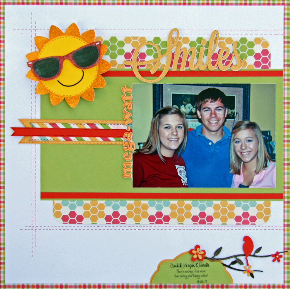
This is three of our grandchildren, Camilah, Morgan, and Natalie. The papers are from Fancy Pants Designs - Time for Spring collection. I made a border from the gingham piece, then used the solid green for backing the photo. I added three border strips behind the photo. The title work was cut with the Cameo (3 times on plain card stock and then again on the bright yellow from the collection). I stacked the letters for a chip board effect. The journaling tag on the bottom was cut with the Cameo. The bird is a MB die as are the flowers. The branches are an old QK die. The centers of the flowers are pearls that I colored with Copics. The big happy sun was cut with the Cameo from the FP collection. The sunglasses were cut separately and added using pop dots. I coated the "lens" of the glasses with glossy accents before adhering them to the glasses which I had added a little glitter to. I also added some yellow stickles to the sun "rays".
Thanks so much for stopping by today! I appreciate each and every comment...and especially that you take the time to leave one! You all are the best! Until next time...
Hugs!


32 comments:
i'm constantly repeating myself... but once again another outstanding set of cards, susan! love the first one using the MB dies! and the layout??? fantastic, as they always are!!
Susan, I struggle to come up with one idea for a challenge, and here you are churning out several each time! And they're all fabulous! You amaze me. :-)
WOW - you've been inspired this week-end! What a set of lovely CAS cards! The first one, with the die cut flower, blue ribbon and punched border, is a classic beauty. I also find yhe one with the landscape very claming, and you've collored the clouds so nicely!
I always looks forward to seeing what beauties you will come up with for our challenges each week Susan... and I am NEVER disappointed.
These are all great, although I agree about the shade of green on the last card. Your watered ink background it superb and the sky on the one with the little scene is wonderful. The crispness of the first one is so pretty!
Another terrific set of cards.
Thanks so much
Chrissie
"Less is More"
Another productive day for you, Susan, and lots of inspiring and beautiful cards (and layout) and tips for all of us! Mucho mm-waugh!!
Fabulous cards Susan, hard pressed to chose a favourite the week cos they do different and the scrapbook page is gorgeous too.
luv
Debby
Whooooo Susan - what a prolific crafter you are. Your cards and layout are beautiful (as usual) but love the DI spritzed panel and, of course, the MB dies. Thanks for showing the first attempt at the diecut card......totally agree that the shade of green is particularly yucky(!).....but, it's amazing to see the difference between the two cards.
Karen x
Beautiful all cards, hard to choose which I like best. Thank you for your kind words.
A wonderful set of cards you have been busy. My fav is the first one so very pretty and delicate.
Linbyx
Such fantastic ideas for a tricky colour combination. I especially love the first two - the crisp lines of the first are beautiful and the inky panel is simply fabulous. I do love the bright and cheerful feel to your layout too - the perfect colours for such happy faces!
Another fab selection for our inspiration Susan, my favourite is the second one, I can almost see a Tuscan hillside in the ink:) lovely layout, a very good looking family!
Val x
Absolutely stunning Susan as is your design page simply beautiful xx
Wow what a selection of beautiful creations ! Hard to pick favourites, but I sure love the first 3. The die cut & paper piercing is great on the 1st, LOVE the effect of the DI & water on your craft mat and the 3rd 'scene' is awesome ! Your lay-out is also fabulous. Have a great day and thanks for visiting my Blog, Shirleyx
WOW - fabulous selection of cards and scrap layouts but my personal fave has to be the distress swirly background
Kathyk
Fantastic set of cards Susan, and a layout to treasure!
Love
Maarit
Fantastic cards and the colours go so well together xxx
Beautiful cards, as always, Susan. The first one is so pretty and the inked panel on the second is just stunning. Love them. Ann Y.
Well, thanks for commenting on my one little card Susan. You have outdone yourself with these lovely cards, (well maybe that green is a bit objectionable). And then to top it off with a gorgeous layout. OK, back to the drawing board to see if I can come up with at least one more card. I love the "Imagine The Possibilities" best for its technique. It's all about just that sometimes.
Lovely set of cards as always Susan. I love your memory box pieced flowers and your imagine inky panel. Super layout page too. I finally got a bit of scrapbooking done and thoroughly enjoyed it.
Aileen x
Beautiful collection, so much inpiration. Thanks for your visit and sweet luv. Hugs
Beautiful cards - love the first one as it is so elegant with the punched bottom. Also love your distress inky panel - nice and bright!
Another Saturday and another fabulous showcase of cards - you really have some brilliant ideas of your LIM entries. My fave this week by far is the inky panel - love how you created it too so may have to have an inky play myself.
Tara
x
Another fabulous selection Susan. Love them all but especially the first one.
Lynne xxx
Where do you get you're inspiration because I would like some!!! these are all fab and all so different! x
Oooh Susan, all the cards are fabulous. You certainly were a busy gal *smile* Carole xox
What an amazing assortment, Susan! I especially love the abstract and the beautifully sponged and stamped scene! You always inspire, my friend.
Wow...wow...wow Susan you have been busy! All the cards are fabulous.
Fantastic as always Susan
you really have to be applauded every week for all your efforts
Love them all, the simplicity of the one from last appeals to me
Thanks very much
mandi
"Less is More"
More fabulous cards again Susan :) Viv xx
Such wonderful work as always Susan. I'm fascinated by the inky background on the second card and can't wait to try this technique myself.
these are gorgeous creations Susan! absolutely love the Imagine card with the distressed inks, great job with the technique!!
Susan.........Amazing again as always and everything you do is done to perfection thank you for sharing these and the page layout is stunning gorgeous children too you must be really proud, xx
Post a Comment